
The EditorWithMask and EditorWithText, which are the base classes for all mask and text based editors, expose two button collection properties (ButtonsLeft and ButtonsRight). These collections can be used to add one or more custom buttons to the left or right of the edit area of these editors. The buttons provide the ability to add custom functionality to the existing editors.
All of the editor buttons derive from a common base class (EditorButtonBase) and therefore they all have certain functionality in common. Each button may be hidden or disabled using the Visible and Enabled properties respectively. The width of each button is automatically calculated based on its contents (image, text, check indicator, etc.) but may be overridden by explicitly setting the Width property. Most importantly, the button exposes an Editor property that can be used to access the associated owning Editor.
The current implementation includes 5 generic button types.

 EditorButton -- The EditorButton is a standard button element that can be used to display image and/or text.
image::Images/WinEditor_Editor_Buttons_Overview_03.gif[example of auto repeat editor button]
 AutoRepeatEditorButton -- Similar to the EditorButton, the AutoRepeatEditorButton can display image and/or text. It also includes auto repeat functionality - the click event is invoked multiple times while the button is pressed.
image::Images/WinEditor_Editor_Buttons_Overview_04.gif[example of state editor button]
 StateEditorButton -- The button can be displayed as a state button, checkbox or option style button and may also display image and/or text.
image::Images/WinEditor_Editor_Buttons_Overview_05.gif[example of drop down editor button]
 DropDownEditorButton -- Similar to the EditorButton, the DropDownEditorButton also provides the ability to drop-down any element.
image::Images/WinEditor_Editor_Buttons_Overview_06.gif[example of spin editor button]
SpinEditorButton -- Provides a horizontal or vertically oriented spin elements.
Each button object exposes its own set of events. The events of the included editor button classes are also raised from the containing Editor and stand alone editor elements. The latter is especially significant since it means that if a standalone editor element is specified as the EditorControl for another object, such as the column of an UltraGrid, the editor button events of the standalone element will also be raised when the a button in the editor provided to the UltraGrid column is clicked. The event arguments for the EditorButton events have a Context property which provides an object that can be used to identify the source of the action. In the case of the UltraGrid column, the Context would be an UltraGridCell object.
The following is a list of the events exposed from the editor class and standalone editor elements relating to the editor buttons.
EditorButtonClick — This event is associated with the Click event of the EditorButton class and is invoked whenever an EditorButton or derived button is clicked.
EditorSpinButtonClick — This event is associated with the SpinButtonClick event of the SpinEditorButton class and is invoked whenever one of the spin elements is clicked. The ButtonType property of the event arguments indicates which spin button element was clicked.
BeforeEditorButtonDropDown — This event is associated with the BeforeDropDown event of the DropDownEditorButtonBase class and is invoked before the drop-down is displayed.
AfterEditorButtonDropDown — This event is associated with the AfterCloseUp event of the DropDownEditorButtonBase class and is invoked after the drop-down has been closed.
BeforeEditorButtonCheckStateChanged — This event is associated with the BeforeCheckStateChanged event of the StateEditorButton class and is invoked when the checked state of the element is about to change.
AfterEditorButtonCheckStateChanged — This event is associated with the AfterCheckStateChanged event of the StateEditorButton class and is invoked when the checked state of the element has changed.
InitializeEditorButtonCheckState — This event is associated with the InitializeCheckState event of the StateEditorButton class. This event is used primarily for when the editor is supplied to another element - such as the WinGrid - so that the CheckState of the different cells may be specified.
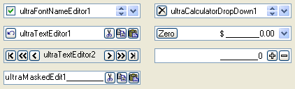
Since the base editor classes provide the editor button functionality, all the standalone elements that utilize these editors have these collections as well including the EditorWithMask (WinMaskedEdit™, WinNumericEditor™, WinDateTimeEditor™, and WinCurrencyEditor™) and EditorWithText (WinTextEditor™, WinComboEditor™, WinCalculatorDropDown™, WinColorPicker™, and WinFontNameEditor™) editor elements.