
The WinExplorerBar™ control has a Style property that lets the developer choose between three different elements' layouts and behaviors. The three available Styles are:
ExplorerBar — emulates the look and feel of the ExplorerBar in the Windows XP Explorer.
Listbar — emulates the look and feel of the OutlookBar in Microsoft Outlook and the Infragistics UltraListbar element.
Toolbox — emulates the look and feel of the Toolbox in Visual Basic 6 and Visual Studio .NET
OutlookNavigationPane — emulates the look and feel of the Navigation Pane in Outlook 2003.
VisualStudio2005Toolbox — emulates the look and feel of the Toolbox in Visual Studio 2005.
Though the styles are very similar, each style has unique behavioral and layout characteristics as described in the following paragraphs.
The element displays as many Groups as it can in the available element space. If there is not enough space to display all the Groups, a scrollbar can be displayed to allow scrolling of the element. The element’s Scrollbars property determines whether a scrollbar is automatically displayed when needed.
Individual Groups can be expanded or collapsed. When expanded, the Item Area of the Group is displayed, when collapsed the Item Area of the Group is hidden. An expansion indicator is displayed in the Group header to indicate whether the Group will be expanded or collapsed when the Group Header is clicked.
Since each Group always displays all of its Items, there is no Item scrolling necessary within the Group.
When using the ExplorerBar Style only you can have the Groups arranged in columns. By setting the ColumnCount property on the element, Groups can be displayed in columns within the element. By setting the ColumnsSpanned property on the Group, a Group can be forced to span 2 or more columns. Since the element does not scroll horizontally, the columns must fit within the width of the element. Therefore, to avoid columns that are too narrow to effectively display a Group, the width of the element should be taken into account when determining the optimum number of columns.
For element Style ExplorerBar and VisualStudio2005Toolbox, the default style for the Items is 'SmallImagesWithText'.
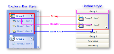
Since Group scrolling is not supported in Listbar and Toolbox styles all Groups are always visible, though only the Selected Group is opened up to reveal the Items it contains. All other Groups show only their headers. When a Group Header is clicked, it becomes the Selected Group and 'opens up' to reveal the Items it contains. The previously Selected Group 'closes up'. There can only be one Selected Group in the element at any given time.
Item Scrolling is supported within a Group if there is not enough space to display all the Group’s Items. In Listbar Style, the scroll buttons are displayed along the right edge of the Item Area. In Toolbox style, the 'scroll up' button is displayed in the Group’s header, and the 'scroll down' button is displayed in the header of the following Group.
As the keyboard is used to navigate between Groups and Items, they become active. Active Groups are distinguished by a focus rectangle around the text in the Group’s Header, and active Items are distinguished by a focus rectangle around the Item text. Only one Group or Item can be active at any given time. If individual Groups or Items are disabled, they cannot become active and they do not participate in the keyboard navigation.
When Groups or Items are active, pressing Enter or the space bar will have the same effect as clicking the Group Header or Item. As a result, the keyboard can be used exclusively to navigate through the element and select Groups and Items.
When the element Style is Listbar, the default style for the Items is 'LargeImagesWithText'. When the control style is Toolbox, the default style for the Items is 'LargeImages.
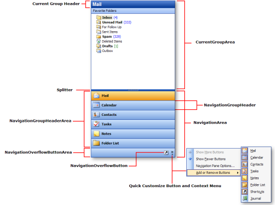
As with the Listbar and Toolbox element styles, only 1 Group is open and 'current' at any given. This Selected Group is the only Group that displays its Items. When the style is set to OutlookNavigationPane the client area of the element is divided into 2 areas separated by a user-movable splitter bar:
CurrentGroup Area — The Items for the current selected Group are displayed in the top portion of the element. The amount of space allocated to the CurrentGroupArea is determined by the NavigationCurrentGroupAreaMinHeight and NavigationMaxGroupHeaders properties
Navigation Area — The bottom portion of the element displays headers and/or buttons for each Group including the selected Group. The current selected Group is displayed using the Selected appearance. Clicking on a Group header or button in the Navigation Area makes that Group the current selected group. The Navigation Area is further divided into 2 areas:
NavigationGroupHeaderArea — headers for each group are displayed using the same UI as normal group headers. When a Group is selected and made the 'current Group' it remains in the NavigationGroupHeaderArea and is displayed using the 'selected' appearance. Headers for each group are displayed from top to bottom in the NavigationGroupHeaderArea based on their position in the Groups collection. This area will not appear (i.e., it will have a zero height) if the splitter bar is used to resize the NavigationGroupHeaderArea so that it contains no NavigationGroupHeaders. In this case all buttons will be 'bumped' to the NavigationOverflowButtonArea .
NavigationOverflowButtonArea — NavigationOverflowButtons for each group that cannot fit in the NavigationGroupHeaderArea are displayed in a toolbar-like row at the bottom of the NavigationArea. This area is always visible even if there are no buttons in it. Buttons for each group that cannot be displayed in the NavigationGroupHeaderArea due to lack of space are displayed from left to right in the NavigationOverflowButtonArea based on their position in the Groups collection. If the NavigationOverflowButtonArea is not wide enough for all the buttons to be displayed, buttons are removed from the right and added to the QuickCustomize popup menu.
The GroupSettings object contains a number of properties that control the look and behavior of Groups. The GroupSettings object is found on both the Group object and the element itself.
Since most of the properties on the GroupSettings object have a 'default' setting it is possible set properties on the element’s GroupSettings object and then selectively override those settings on the Group’s GroupSettings object for specific Groups. This provides great flexibility when setting up Group appearances and behaviors.
The ItemSettings object contains a number of properties that control the look and behavior of Items. The ItemSettings object is found on the Item object, Group object and the element itself.
Since most of the properties on the ItemSettings object have a 'default' setting it is possible set properties on the element and/or Group’s ItemSettings object and then selectively override those settings on the Group and/or Item’s ItemSettings object. This provides great flexibility when setting up Item appearances and behaviors.
Groups in UltraExplorerBar serve as 'holders' for Items. A Group contains a header that displays the group name and an image, and an Item Area that displays the Items defined to the Group. With element style ExplorerBar there is also an arrow graphic that can be clicked to expand or collapse the group.
You can add any number of Groups to an UltraExplorerBar element at design-time (via the UltraExplorerBar Designer) or at runtime via code.
Note Note that with element styles Listbar and Toolbox there is a practical limit to the number of Groups that should be added to the element. This is because with element styles Listbar and Toolbox, all Group headers are always visible and the amount of screen space available to display them is fixed since Groups do not scroll in these element styles.
The GroupSettings object contains a Style property that determines the style of the Group. The Style of the Group determines what is displayed in the Item Area of the Group. When Items are being displayed in the Item Area of a Group, the Style also determines how the Items are laid out within the Item Area.
The available Group styles include:
Default - the Group Style is automatically chosen based on the element Style. The list of element Styles and their associated default Group style is:
Element Style ExplorerBar — uses Group Style 'SmallImagesWithText'
Element Style Listbar — uses Group Style 'LargeImagesWithText'
Element Style Toolbox — uses Group Style 'LargeImages'
Element Style OutlookNavigationPane — uses Group Style 'SmallImagesWithText'
Element Style VisualStudio2005Toolbox — uses Group Style 'SmallImagesWithText'
SmallImages — Items within the Group are rendered using the Item’s small image. Items are arranged in rows and columns - left to right, top to bottom. This style is typically used when the element style is 'Toolbox'.
SmallImagesWithText — Items within the Group are rendered using the Item’s small image and the Item’s Text. The text is displayed to the right of the image. Items are arranged vertically, one on top of the other. This is the default style for element style 'ExplorerBar'.
LargeImages — Items within the Group are rendered using the Item’s large image. Items are arranged in rows and columns - left to right, top to bottom. This is the default style for element style 'Toolbox'.
LargeImagesWithText — Items within the Group are rendered using the Item’s large image and the Item’s Text. The text is displayed to the right of the image. Items are arranged vertically, one on top of the other. This is the default style for element style 'Listbar'.
LargeImagesWithTextBelow — Items within the Group are rendered using the Item’s large image and the Item’s Text. The text is displayed below the image. Items are arranged vertically, one on top of the other. This style is typically used when the element style is 'Listbar'.
ControlContainer — The Group’s Items (if any) are not displayed, and instead an UltraExplorerBarContainerControl is automatically placed in the Group. This enables the Group to host any .NET WinForms control .
Groups behave differently depending on the element style.
The element displays as many Groups as it can given the space available in the element. If there is not enough space to display all Groups, a scrollbar is provided. The element’s Scrollbars property determines whether the scrollbars are automatically displayed when needed.
Any displayed Group can be expanded or collapsed. When a Group is expanded its Item Area is visible, when a Group is collapsed its Item Area is hidden.
Groups cannot be selected - this is a Listbar and Toolbox style behavior.
When using the ExplorerBar style Groups can be displayed in multiple columns, which spreads the display of the Groups horizontally across the element.
All Groups are always displayed in the element - there is no scrolling of Groups.
At any given time, only one Group is Selected. The Selected Group is open and displays its Items. The amount of space assigned to the Selected Group is based on the space left over in the element after displaying the Headers for the non-selected Groups.
Groups cannot be expanded or collapsed - this is an ExplorerBar style behavior.
If there is not enough room in a Group to display all its Items, scroll buttons are automatically provided.
The element displays as many Groups as it can given the space available in the element. The Selected Group is displayed in the top portion of the element, followed by the remaining Groups which are displayed in the NavigationArea. In the event that there is not enough room to display a Group in the NavigationArea, the Group will appear in a flyout QuickCustomize menu accessible by clicking the QuickCustomize button in the NavigationOverflowButton Area.
At any given time, only one Group is Selected. The Selected Group is open (i.e. it shows its Items) and displayed in the CurrentGroup Area. The amount of space assigned to the Selected Group in the CurrentGroup Area is determined by the NavigationCurrentGroupAreaMinHeight and NavigationMaxGroupHeaders properties. The Selected Group may also be displayed (space permitting) in the NavigationGroupHeaderArea (as a GroupHeader) or the NavigationOverflowButtonArea (as a button)
Groups cannot be expanded or collapsed - this is an ExplorerBar style behavior.
If there is not enough room in the CurrentGroup area to display all the Items for the SelectedGroup, scroll buttons are automatically provided in the Group’s item area.
Group Selection is a concept that is only valid when the element style is Listbar, Toolbox or OutlookNavigationPane. The 'Selected Group' is defined as the Group that is currently 'open' and displaying its Items. Only one Group can be selected at any given time.
Expanding/Collapsing Groups is only valid when the control style is ExplorerBar. When a Group is expanded its Item area is visible. When a Group is collapsed its Item area is hidden. There is no limit on the number of Groups that can be expanded and/or collapsed at any given time.
Items in UltraExplorerBar are displayed in the Item Area of the Group to which they belong. An Item contains text and optionally an image. The style assigned to the Group containing an Item determines how that Item is displayed. There are a number of different Group Styles available.
For example, if the Style of the Group containing an Item is 'LargeImagesWithText', then the Item will be displayed with the Item’s large image (if one has been assigned) followed to the right by the Item’s text.
Items can be rendered in several different styles. The Style property of the ItemSettings object determines the Style of an Item. Available Item styles include:
Button — the item behaves like a button, firing a Click event when clicked with the mouse
StateButton — the item behaves like a radio button, toggling its checked state when clicked with the mouse. The value of the Item’s Checked property reflects the Item’s checked state. The element’s StateButtonCheckStyle property determines the range within which Items of type StateButton are toggled. Settings for StateButtonCheckStyle are:
Default — the StateButtonCheckStyle value is automatically set based on the element Style:
ExplorerBar, Listbar, OutlookNavigationPane, and VisualStudio2005Toolbox — the StateButtonCheckStyle used is 'ExclusiveWithinControl'.
Toolbox — the StateButtonCheckStyle used is 'ExclusiveWithinGroup'.
ExclusiveWithinControl — only 1 StateButton-type Item can be checked across all Groups in the element at any given time.
ExclusiveWithinGroup — 1 StateButton-type Item per Group can be checked at any given time.
Label — the item behaves like a label. It displays text but does not respond or change state when clicked with the mouse.
Separator — the item behaves like a separator in a menu. It displays a 1 pixel line but does not respond or change state when clicked with the mouse The SeparatorStyle property of the ItemSettings object determines whether the separator displays vertically or horizontally.
When using the OutlookNavigationPane element style a special built-in dialog is available to the end user and the developer. The Navigation Pane Options dialog lets the end user show/hide individual Groups as well as reorder the Groups.
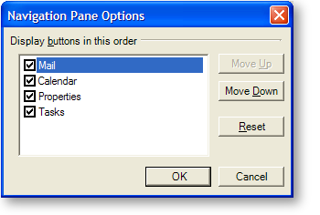
Key features of the dialog are:
Groups are listed in the order in which they are displayed on the screen which is the same order that they appear in the Groups collection. The checkbox next to each entry indicates whether the Group is visible or not.
If the element’s NavigationAllowGroupReorder property is set to true, the dialog displays 'Move Up' and 'Move Down' buttons which let the user change the order of the Groups in the list.
If the NavigationAllowHide property of a Group’s GroupSettingsResolved object returns true, the use can set/clear the checkbox next to a Group in the list to show/hide the Group. If the property is set to false, the checkbox will still be shown but clicking on the checkbox will not affect its setting or the visibility of the associated Group.
Resetting the order of each Group to its 'default' position is an application defined function. As a result the Reset button is not visible by default. If you want to show the Reset button in the dialog you must process the NavigationOptionsDialogDisplaying event and set the e.Dialog.ResetButton.Visible property to true. Additionally, you will want to add an event listener for the button’s Click event so you can provide reset functionality that makes sense for your application when the button is clicked.