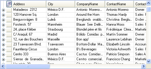
The Column Chooser feature lets you display a dialog box from which the user can select columns to display in the WinGrid™ control. This feature emulates Microsoft Outlook’s Field Chooser dialog box.
The Column Chooser feature is comprised of the following two key components:
UltraGridColumnChooser : This component is derived from the .NET Control class. It displays the list of available columns. It embeds an UltraGrid inside it for rendering the column headers. The WinGrid’s DisplayLayout is exposed via the UltraGridColumnChooser’s DisplayLayout property. The DisplayLayout property can be used to control the appearance aspects of the column chooser control.
ColumnChooserDialog : This component is derived from the .NET Form class. This is the dialog box that is displayed by the WinGrid control when the UltraGridBase’s ShowColumnChooser method is invoked.
The UltraGridColumnChooser can be embedded into a custom form to create a custom Column Chooser dialog box.
A user interface is available to allow the user to display the Column Chooser dialog box. It can be enabled by setting the existing RowSelectorHeaderStyle property of the Override object to the new enum member ColumnChooserButton. This will expose a button in the row selector header area. When the user clicks the button, the Column Chooser dialog box is displayed.
The following properties of the UltraGridColumnChooser are described below:
You can use this property to associate an UltraGridBase to the UltraGridColumnChooser. The UltraGridColumnChooser will display the columns of this UltraGridBase.
You can use this property to specify the band whose columns are to be displayed in the Column Chooser dialog box. If you enable the combo box that allows the user to select a different band (by setting the MultipleBandSupport property to ShowBandSelectionUI) and then select a different band, this property will reflect the newly selected band.
You can use this property to specify whether or not to display a combo box that allows the user to select a different band. This property also controls whether columns from all bands are displayed at once. The options are as follows:
ShowBandSelectionUI — Columns from all bands are displayed in the columns list, grouped by band. This is the default value of the property.
DisplayColumnsFromAllBands — The combo box that allows the user to select a different band is not available; however, columns from all bands are displayed in the Column Chooser dialog box.
SingleBandOnly — This option displays only columns from a single band. The combo box that allows the user to select a different band is not available.
You can use this property to specify the style of the Column Chooser. The options are as follows:
HiddenColumnsOnly — This option displays only hidden columns. The user can double-click a column to unhide it. When a column is made visible, it no longer appears in the Column Chooser dialog box. Therefore, when a column is unhidden the only way to hide it by dragging it back over the column chooser.
AllColumnsWithCheckBoxes — This option displays all columns, regardless of whether or not they are hidden. For each column, this option also displays a checkbox that the user can select or deselect to unhide or hide the column, respectively. The user can also toggle the hidden state of a column by double-clicking on the column. This option also allows the user to drag and drop a column into the grid to unhide it, and drag and drop a column into the Column Chooser dialog box to hide it.
AllColumnsAndChildBandsWithCheckBoxes — This option is the same as AllColumnsWithCheckBoxes (specified above) except that this option also allows the user to hide child bands. This is the default value of the property.
The columns in the list are sorted by their captions. You can control the caption of the column by setting the new ColumnChooserCaption property of the column.
You can force a column or a whole band to be excluded from the Column Chooser control by setting its ExcludeFromColumnChooser property to "true". This also means that the user won’t be able to hide the column.
The user can unhide a column in either of the following ways:
Double-click the column in the column chooser. This will have the same effect of setting the Hidden property of the column to ".
Drag the column from the Column Chooser control and drop it into the WinGrid control. The user can drop the column anywhere in the WinGrid control, however, if the user drops the column onto the column headers, the dropping behavior will follow the current built-in drag-and-drop functionality. In other words, the column will be dropped at the location where the drag-and-drop indicator arrows are displayed. If the user does not drop it over a column header, the column will be made visible by setting its Hidden property to ". The behavior in that case is not any different than what would happen if a column’s Hidden property were set to " in the code.
To hide a column, drag the column from the WinGrid control and drop it anywhere in the Column Chooser control. When dropped, the column will be hidden from the WinGrid control and displayed in the Column Chooser control. When this column is unhidden, it will return to its original location in the WinGrid. Again, this behaves the same as hiding/unhiding columns via the code.
A column can be dragged and dropped outside of the WinGrid control to hide it. This follows the Microsoft Outlook behavior. Note that the WinGrid allows the user to do this only if it can determine that the user interface for Column Chooser dialog box is available. It determines that the Column Chooser dialog box is available if one of the following conditions is true:
Override’s RowSelectorHeaderStyle is set to ColumnChooserButton.
UltraGridLayout’s ColumnChooserEnabled property is set to "true". This property allows you indicate to the WinGrid that the application provides an external way of allowing users to unhide columns.
The Column Chooser dialog box has been displayed at least once.
You can drag a column from the Column Chooser control into the group-by box. The column will be grouped, however, it will retain its hidden state, regardless of the GroupByColumnsHidden settings. The behavior follows the Microsoft Outlook.
You can drag a column from a group-by box into a Column Chooser control, in which case it will have the same effect as ungrouping the column. Again, this follows the same behavior as Microsoft Outlook.
