
This topic explains, with code examples, how to add a tooltip in XamSparkline™ control.
The following table lists the topics required as a prerequisite to understanding this topic.
This topic contains the following sections:
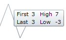
The tooltip is added by setting the ToolTipVisibility property. If this property is set to visible, the tooltip displays the following default values:
The first data point value.
The last data point value.
The highest data point value.
The lowest data point value.
By default (if no customization settings have been applied) the tooltip displays as the four values listed above, first, last, highest and lowest data points. For details about configuring XamSparkline tooltips, refer to the Configuring the Tooltip topic.
The following table maps the Sparkline Tooltip to property settings.
The screenshot in the Overview text block demonstrates how the Sparkline Tooltip looks as a result of the following settings:
In XAML:
<ig:XamSparkline ToolTipVisibility="Visible" />In C#:
this.XamSparkline1.ToolTipVisibility = System.Windows.Visibility.Visible;In Visual Basic:
Me.XamSparkline1.ToolTipVisibility = System.Windows.Visibility.VisibleThe following topics provide additional information related to this topic.