
This topic explains, with code examples, how to configure and customize a tooltip in a XamSparkline™.
The following table lists the topics required as a prerequisite to understanding this topic.
This topic contains the following sections:
Before any customization, the tooltip needs to be enabled, making it visible by setting the ToolTipVisibility property to true .
There are two ways to customize the tooltip, depending on what the ToolTip property is set to display:
String – By setting the ToolTip property to a string such as:
ToolTip="Testing the Tooltip"
In most cases, it is recommended to use a Data Template for the customization. Using a string is not as useful as the Data Template, because the Data Template provides more flexibility to implement the appearance of the tooltip than simply setting the Tooltip to a string. For example, you can
The following table lists the configurable aspects of the tooltip.
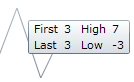
In the following code, a data template uses all available properties in the SparklineToolTipContext object ( First, Last, High and Low) to achieve the following customized look:
Font size – 10
Different color for the different data points:
The first and last data point – red
The highest and lowest data point – blue
The following table maps the Sparkline Tooltip to property settings.
In XAML:
<ig:XamSparkline ToolTipVisibility="Visible" />
<ig:XamSparkline.ToolTip>
    <DataTemplate>
        <Grid>
            <Grid.RowDefinitions>
                <RowDefinition />
                <RowDefinition />
                <RowDefinition />
                <RowDefinition />
            </Grid.RowDefinitions>
            <Grid.ColumnDefinitions>
                <ColumnDefinition />
                <ColumnDefinition />
            </Grid.ColumnDefinitions>
            <TextBlock Grid.Row="0" Grid.Column="0" Text="First: " Foreground="Red"/>
            <TextBlock Grid.Row="0" Grid.Column="1" Text="{Binding First}" Foreground="Red" />
            <TextBlock Grid.Row="1" Grid.Column="0" Text="Last: " Foreground="Red"/>
            <TextBlock Grid.Row="1" Grid.Column="1" Text="{Binding Last}" Foreground="Red"/>
            <TextBlock Grid.Row="2" Grid.Column="0" Text="High: " Foreground="Blue"/>
            <TextBlock Grid.Row="2" Grid.Column="1" Text="{Binding High}" Foreground="Blue"/>
            <TextBlock Grid.Row="3" Grid.Column="0"
Text="Low: " Foreground="Blue"/>
            <TextBlock Grid.Row="3" Grid.Column="1" Text="{Binding Low}" Foreground="Blue"/>
         </Grid>
     </DataTemplate>
</ig:XamSparkline.ToolTip>The following topics provide additional information related to this topic.