The following table summarizes the new features of the Ultimate UI for WPF 2013 Volume 2. Additional details are available following the summary table.
The xamBulletGraph control is an Ultimate UI for WPF control that allows for visualizing data in the form of a bullet graph. Linear by design, it provides a simple and concise view of a primary measure compared against a scale and optionally, some other measure.

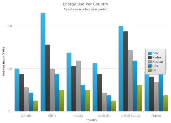
You can now add titles, subtitles or both to the top section of the chart control.
When adding a title or subtitle to the chart control, the content of the chart is automatically resized to allow for the title and subtitle information.

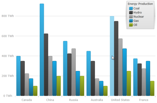
You can now add information to the x-axis and y-axis.

You can now highlight an entire series or some individual items within the series.
The highlighting capabilities are series-specific. With single-shape series, such as Line series the entire line is highlighted, while with series consisting of multiple shapes, such as Column series, each individual shape (column) can be highlighted. In all supported series, individual markers can be highlighted.
The series highlighting feature is support for the following series types:
Category Series
RangeCategory Series
Financial Series
Financial Indicators

This feature allows the series to animate during the initialization of the xamDataChart control.
You can now display axis tick marks outside the chart plot area. This allows displaying tick marks for each of the labels and may serve for simplifying the chart look by replacing the axes gridlines with tick marks.

Default tooltips are now available meaning that a more informative tooltip is displayed for the series without any additional configuration being necessary. The default tooltip templates are different for the different series types in order to present information optimally.

This feature exposes a simplified API for setting a drop shadow effect on a series.

A new xamDataChart style featuring multiple visual changes and new property settings improving the overall look and feel of the chart is now available.
The following screenshots compare the chart default style to the new style.


Applying the New Style (In the 14.1 release, this became the default style, for more information see the What’s New in 2014 Volume 1 topic)
This feature adds two types of curves to the straight lines used for the callout lines in the xamDoughnutChart and xamPieChart . You may choose whether to use a straight line or one of the curves, change the line style and control the spacing between the label and the end of the line.

The new geographic High-Density Scatter series allows you to bind and show scatter data ranging from hundreds to millions of data points requiring exceedingly little loading time.
Because of the sheer number of data points, the series displays the scatter data as tiny dots (as opposed to full-size markers) and the areas the most data-intensive areas – higher color density representing clusters of data points.

The xamLinearGauge control allows visualizing data in the form of a linear gauge. It provides a simple and concise view of a primary value compared against a scale and one or more comparative ranges.

The xamRadialGauge™ control is a data visualization tool capable of displaying a gauge containing a number of visual elements, such as a scale with tick marks and labels, a needle, and a number of ranges. Create a scale by supplying MinimumValue and MaximumValue values and point the needle to a value by setting the Value property. The gauge also supports ranges providing visual cues for the scale, for more information see the Configuring Ranges topic.

The xamRichTextEditor is a cross platform control providing the user with a rich text content displaying and editing experience, which includes but is not limited to text, lists, images and tables.
The following screen shot shows the xamRichTextEditor , in split mode editing rich content :

The xamSyntaxEditor control now supports XAML definitions of classification types.

In addition to the themes provided for all Ultimate UI for WPF controls, Infragistics provides implicit themes for all Microsoft controls. You can use these themes for convenience keeping your application’s styling consistency when using both Infragistics and Microsoft controls in one application.
