
Traditional Views have proven limiting because they can overwhelm novice users with their volume of data displayed, or the type of data being displayed is not suited for a traditional presentation. Consequently, more sophisticated layouts are necessary to impress users increasingly jaded with simple list-like presentations, and express your data in ways that effectively leverage the modern multimedia capabilities of today’s desktop machines.
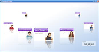
Carousel View emphasizes the proximity, sequence, and movement of your data. Classic artistic principles such as perspective, and creating the sense of depth, are used in Carousel Views to create the appearance of a pseudo-3D environment on flat video displays. Users immersed into this experience employ real-life visual sensibilities to intuitively draw conclusions from how items of information are displayed in relation to each other. It can add significant value when information is characterized by factors that include:
the nearness of two data items to each other
their relative position in a sequence
their animated motion along a path
All of these factors come together to convey additional information to users in ways unachievable using a more traditional user interface.
The Carousel View can induce a sense of awe, when users first see it, and that sets your application apart. These benefits make Carousel View views a popular option in usage scenarios where you must sell, or impress, or entertain. For more routine tasks, it still raises the user’s appreciation of your application if you can deliver the same kind of elegance they are accustomed to seeing in modern user interfaces like Microsoft® Windows® Vista™ or Apple® Aqua™ on the Mac.
The xamCarouselPanel™ container control implements the Carousel View that is leveraged by several of the other controls included in the Ultimate UI for WPF product, including:
xamCarouselListBox™ - Improves the user experience delivered in scenarios where you would formerly use a Listbox control.
xamDataCarousel™ - Combines management of multi-field data records for which you might previously have used a GridView control with the rotisserie behavior of xamCarouselPanel.
xamDataPresenter™ - A pluggable view-based architecture that allows you to assign a CarouselView object to the View property to present data in the Carousel View.
While it is a strength, the flashy appearance of the Carousel View can also be a drawback. Some applications may feature the information displayed in Carousel View as a centerpiece. In these cases, its visual flair is a virtue. However, you should carefully consider whether introducing the Carousel View into an environment (for example, a legacy application) that makes extensive use of more conventional controls is going to be well received by your users. It is most important that your application present a consistent and thought-out user experience, one in which data presented in Carousel View is seamlessly integrated into the rest of your user interface. Animation for animation’s sake alone should be avoided.
Another concern when displaying information in the Carousel View is that it uses a lot of screen real estate. Many of the paths (i.e., circles, ellipses, diagonals, zig-zags, heart-shaped, V-shaped, and U-shaped) your data items can move along will consume a greater height and width than would have been required to display the same content in a straight, horizontal or vertical list. This screen real estate may be at a premium in some high information-density applications, or on small form factors. In these cases, you can conserve the amount of space on the screen that is required by the Carousel View through limiting yourself to straight horizontal and/or vertical paths.

In the above diagram, notice that the Chevron-shaped (or inverted V-shaped) path resulted in a less-than-optimal use of the available space. Most curved paths will also fall into this category. The second path, which we will call the Conveyor path, used only straight vertical and horizontal line segments. This makes the space it requires more rectangular, which is more efficient in terms of space use. Consequently, although it consumes the same amount of space as the Chevron-shaped path on the left, its path is 50% longer, and it uses a greater percentage of the available space to display carousel items. On the right is a straight Vertical path (straight Horizontal paths would also fall into this category). Its path is 50% shorter than that of the Chevron-shaped path (consequently, its carousel items appear more closely packed together), but it takes up only about one-third of the space.
When designing your Windows® Presentation Foundation applications, evaluate whether the Carousel View adds to the information you present users. Apply it where it adds value, and integrate it into your application’s overall user interface the user experience is seamless.