
This topic explains how to configure the caps of the diagram connections of the xamDiagram™ control by either selecting a pre-defined cap or applying a custom cap.
The following topics are prerequisites to understanding this topic:
This topic contains the following sections:
The caps of a diagram connection are the shapes that indicate its start and end. By default the start of a connection has no cap and its end is a filled arrow cap.
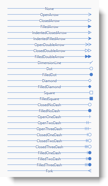
The xamDiagram provides a number of pre-defined shapes for the caps. (See the Visual Elements Overview ( xamDiagram) topic for details.) A pre-defined cap is selected through the StartCapType/ EndCapType properties. These properties accept as a value the respective cap shapes available as a DiagramConnectionCapType enumeration. When using one of the pre-defined cap types, you can additionally specify the cap size through the StartCapSize/ EndCapSize properties.
If you need entirely custom caps, a custom Style with target type of DiagramConnectionCapPresenter can be set to the StartCapStyle/ EndCapStyle properties. In this, style any custom ControlTemplate can be specified for achieving the desired look.
The following table maps the desired node shape to the property settings that manage it.
The following table maps the desired connection cap configuration to the property settings that manage it. The aspects highlighted in green are available in detail in this help content.
To set the desired cap shape for the diagram connection, specify the corresponding enum value as the value of the StartCapType/ EndCapType property. To change the size of the cap, set the StartCapSize/ EndCapSize property accordingly.
The following table maps the desired configuration to the property settings that manage it.
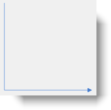
The screenshot below demonstrates how a xamDiagram with several connections with various EndCapType and EndCapSize settings would look as a result of the code listed after it (The StartCapType and StartCapSize properties are not set in the example for simplicity as they work in the same way):
Following is the code that implements this example.
In XAML:
<ig:XamDiagram >
      <ig:DiagramConnection StartPosition="20,0"   EndPosition="300,0"   EndCapSize="10,10" EndCapType="None" Content="None" />
      <ig:DiagramConnection StartPosition="20,20"  EndPosition="300,20"  EndCapSize="10,10" EndCapType="OpenArrow" Content="OpenArrow" />
      <ig:DiagramConnection StartPosition="20,40"  EndPosition="300,40"  EndCapSize="10,10" EndCapType="ClosedArrow" Content="ClosedArrow"  />
      <ig:DiagramConnection StartPosition="20,60"  EndPosition="300,60"  EndCapSize="10,10" EndCapType="FilledArrow" Content="FilledArrow" />
      <ig:DiagramConnection StartPosition="20,80"  EndPosition="300,80"  EndCapSize="10,10" EndCapType="IndentedClosedArrow" Content="IndentedClosedArrow"  />
      <ig:DiagramConnection StartPosition="20,100" EndPosition="300,100" EndCapSize="10,10" EndCapType="IndentedFilledArrow" Content="IndentedFilledArrow" />
      <ig:DiagramConnection StartPosition="20,120" EndPosition="300,120" EndCapSize="20,10" EndCapType="OpenDoubleArrow" Content="OpenDoubleArrow"  />
      <ig:DiagramConnection StartPosition="20,140" EndPosition="300,140" EndCapSize="20,10" EndCapType="ClosedDoubleArrow" Content="ClosedDoubleArrow" />
      <ig:DiagramConnection StartPosition="20,160" EndPosition="300,160" EndCapSize="20,10" EndCapType="FilledDoubleArrow" Content="FilledDoubleArrow"  />
      <ig:DiagramConnection StartPosition="20,180" EndPosition="300,180" EndCapSize="10,10" EndCapType="DimensionLine" Content="DimensionLine" />
      <ig:DiagramConnection StartPosition="20,200" EndPosition="300,200" EndCapSize="10,10" EndCapType="Dot" Content="Dot"  />
      <ig:DiagramConnection StartPosition="20,220" EndPosition="300,220" EndCapSize="10,10" EndCapType="FilledDot" Content="FilledDot" />
      <ig:DiagramConnection StartPosition="20,240" EndPosition="300,240" EndCapSize="10,10" EndCapType="Diamond" Content="Diamond"  />
      <ig:DiagramConnection StartPosition="20,260" EndPosition="300,260" EndCapSize="10,10" EndCapType="FilledDiamond" Content="FilledDiamond" />
      <ig:DiagramConnection StartPosition="20,280" EndPosition="300,280" EndCapSize="10,10" EndCapType="Square" Content="Square"  />
      <ig:DiagramConnection StartPosition="20,300" EndPosition="300,300" EndCapSize="10,10" EndCapType="FilledSquare" Content="FilledSquare" />
      <ig:DiagramConnection StartPosition="20,320" EndPosition="300,320" EndCapSize="10,10" EndCapType="ClosedNoDash" Content="ClosedNoDash"  />
      <ig:DiagramConnection StartPosition="20,340" EndPosition="300,340" EndCapSize="10,10" EndCapType="FilledNoDash" Content="FilledNoDash" />
      <ig:DiagramConnection StartPosition="20,360" EndPosition="300,360" EndCapSize="10,10" EndCapType="OpenOneDash" Content="OpenOneDash"  />
      <ig:DiagramConnection StartPosition="20,380" EndPosition="300,380" EndCapSize="20,10" EndCapType="OpenTwoDash" Content="OpenTwoDash" />
      <ig:DiagramConnection StartPosition="20,400" EndPosition="300,400" EndCapSize="20,10" EndCapType="OpenThreeDash" Content="OpenThreeDash"  />
      <ig:DiagramConnection StartPosition="20,420" EndPosition="300,420" EndCapSize="20,10" EndCapType="ClosedOneDash" Content="ClosedOneDash" />
      <ig:DiagramConnection StartPosition="20,440" EndPosition="300,440" EndCapSize="20,10" EndCapType="ClosedTwoDash" Content="ClosedTwoDash"  />
      <ig:DiagramConnection StartPosition="20,460" EndPosition="300,460" EndCapSize="20,10" EndCapType="ClosedThreeDash" Content="ClosedThreeDash" />
      <ig:DiagramConnection StartPosition="20,480" EndPosition="300,480" EndCapSize="20,10" EndCapType="FilledOneDash" Content="FilledOneDash"  />
      <ig:DiagramConnection StartPosition="20,500" EndPosition="300,500" EndCapSize="20,10" EndCapType="FilledTwoDash" Content="FilledTwoDash" />
      <ig:DiagramConnection StartPosition="20,520" EndPosition="300,520" EndCapSize="20,10" EndCapType="FilledThreeDash" Content="FilledThreeDash"  />
      <ig:DiagramConnection StartPosition="20,540" EndPosition="300,540" EndCapSize="10,10" EndCapType="Fork" Content="Fork" />
</ig:XamDiagram>By setting the StartCapStyle and EndCapStyle properties to a custom style for DiagramConnectionCapPresenter with custom ControlTemplate, almost any cap can be specified. In addition to this, the DiagramConnectionCapPresenter exposes a set of additional properties for controlling the cap’s display. The following screenshot illustrates these properties relative to a node (1), connection point (2), and a custom cap (3):
The following table maps the desired configuration to the property settings that manage it.
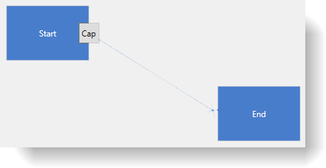
The screenshot below demonstrates how a diagram connections looks as a result of the code below:
Following is the code that implements this example.
In XAML:
<ig:XamDiagram x:Name="Diagram">
    <ig:DiagramNode Key="Node1"
                    Content="Start"
                    Position="100,20" />
    <ig:DiagramNode Key="Node2"
                    Content="End"
                    Position="320,150" />
    <ig:DiagramConnection x:Name="Connection1"
                          StartNodeKey="Node1"
                          EndNodeKey="Node2"
                          ConnectionType="Straight">
        <ig:DiagramConnection.StartCapStyle>
            <Style TargetType="ig:DiagramConnectionCapPresenter">
            <!-- The button will be centered over the connection's EndPosition -->
                <Setter Property="PlacementOffset"
                        Value="0" />
            <!-- The button will always stay horizontally positioned-->
                <Setter Property="UseRotation"
                        Value=" />
                <Setter Property="Template">
                    <Setter.Value>
                        <ControlTemplate>
                            <Button Content="Cap"
                                    Width="30"
                                    Height="30" />
                        </ControlTemplate>
                    </Setter.Value>
                </Setter>
            </Style>
        </ig:DiagramConnection.StartCapStyle>
        <ig:DiagramConnection.EndCapStyle>
            <Style TargetType="ig:DiagramConnectionCapPresenter">
            <!-- Offset the end of the line to the center of the cross shape -->
                <Setter Property="LineOffset"
                        Value="8" />
                <!-- The cross shape will be offset by half of
                        its width along the connection line -->
                <Setter Property="PlacementOffset"
                        Value="8" />
                <Setter Property="Template">
                    <Setter.Value>
                        <ControlTemplate>
                            <Path Stretch="Fill"
                                  Width="16"
                                  Height="16"
                                  Stroke="{Binding Connection.Stroke, RelativeSource={RelativeSource TemplatedParent}}">
                                  <Path.Data>
                                      <GeometryGroup>
                                          <LineGeometry StartPoint="0,0"
                                                        EndPoint="10,10" />
                                          <LineGeometry StartPoint="0,10"
                                                        EndPoint="10,0" />
                                      </GeometryGroup>
                                  </Path.Data>
                              </Path>
                          </ControlTemplate>
                      </Setter.Value>
                  </Setter>
              </Style>
        </ig:DiagramConnection.EndCapStyle>
    </ig:DiagramConnection>
</ig:XamDiagram>The following topic provides additional information related to this topic.