
This topic explains how to configure the Navigation pane of the xamDiagram™ control.
The following topics are prerequisites to understanding this topic:
This topic contains the following sections:
The xamDiagram control has the capability to display a reduced-size overview of its full content in a separate pane positioned inside the diagram space, by default at its bottom-right corner.
This feature comes handy when a diagram is displayed only partially in the diagram space due to its current zoom settings or sheer size. In addition to that, the Navigation pane allows users to navigate and change the zoom level of the diagram by an interaction with its UI.
The Navigation pane is implemented as a separate control – xamOverviewPlusDetailPane™ – which is embedded in xamDiagram .
The visibility (shown/hidden) and the position of the Navigation pane on the diagram space are configurable. They are managed with properties that belong to the xamDiagram control. By default, the Navigation pane is not displayed but, if visibility is enabled (NavigationPaneVisibility = “Visible”), it will be shown at the bottom-right corner of the diagram space (this is the default positioning). The position of the Navigation pane within the diagram space is configurable by specifying the horizontal and vertical alignment of xamOverviewPlusDetailPane through a couple of alignment properties.
The diagram’s internal instance of the xamOverviewPlusDetailPane control can be accessed via the XamDiagram.NavigationPane property and can be further customized through the properties of xamOverviewPlusDetailPane . For example, the default size of the Navigation pane is 220 px wide and 150 px high, but it can be changed to any desired dimensions with the Width and Height properties of xamOverviewPlusDetailPane , (For information on all xamOverviewPlusDetailPane properties that can be configured, see the XamOverviewPlusDetailPane class members.)
The following table explains briefly the configurable aspects of the navigation pane of the diagram and maps them to the properties that manage them. The aspects highlighted in green are covered in detail after this summary table.
The visibility (shown/hidden) of the Navigation pane is managed with NavigationPaneVisibility property. The valid settings are:
“Hidden”
“Visible”
“Collapsed”
By default, the Navigation pane is collapsed.
The following table maps the desired configuration to the property settings that manage it.
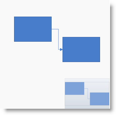
The screenshot below demonstrates how the diagram would look as a result of the following settings:
Following is the code that implements this example.
In XAML:
<ig:XamDiagram Width="350"
               Height="350"
               Background="#F9F9F9"
               NavigationPaneVisibility="Visible">
<ig:DiagramNode Key="node0" Position="45,55"/>
<ig:DiagramNode Key="node1" Position="200,120"/>
<ig:DiagramConnection StartNodeKey="node0"
                      EndNodeKey="node1"/>
</ig:XamDiagram>The position of the Navigation pane on the diagram space is achieved as combination of its horizontal and vertical alignment, each managed with a separate property ( NavigationPaneHorizontalAlignment and NavigationPaneVerticalAlignment).
In addition to using the respective alignment values ( “Left” , “Right” , “Top” , “Bottom” , “Center” ), the position can be configured also by setting the respective alignment property to “Stretch” .
The following table maps the desired configuration to the property settings that manage it. For a stretched layout, the respective dimensioning property of the xamOverviewPlusDetailPane control (Height or Width) must not be set.
The screenshot below demonstrates how the diagram looks as a result of the following settings:
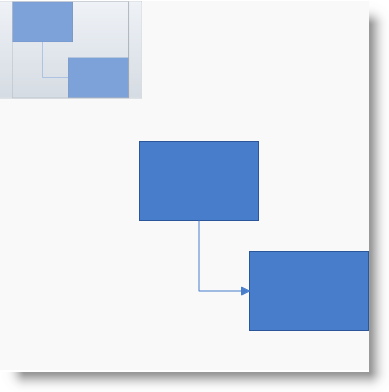
Following is the code that implements this example.
In XAML:
<ig:XamDiagram x:Name="diagram"
               Width="370"
               Height="370"
               Background="#F9F9F9"
               NavigationPaneVisibility="Visible"
               NavigationPaneHorizontalAlignment="Left"
               NavigationPaneVerticalAlignment="Top">
<ig:DiagramNode Key="node0" Position="140,140"/>
<ig:DiagramNode Key="node1" Position="250,250"/>
<ig:DiagramConnection StartNodeKey="node0"
                      EndNodeKey="node1"/>
</ig:XamDiagram>The following material (available outside the Infragistics family of content) provides additional information related to this topic.