
This topic explains how to configure the shape of the diagram nodes of the xamDiagram control by either selecting a Pre-Defined shape or applying a custom shape. If you choose to use custom shapes or a custom data template, refer to Configuring the Visualization of the Content of the Diagram Items. This topic explains how to set DataTemplates for the content of diagram items and for editing that content.
The following topics are prerequisites to understanding this topic:
This topic contains the following sections:
The xamDiagram provides a number of pre-defined shapes for the nodes. (See the General Overview topic for details.) A pre-defined shape is selected through the ShapeType property. This property accepts as a value the respective node shapes available as ShapeType enumeration. If the desired shape is not available as a pre-defined shape, a custom shape can be set to the Geometry property.
When the Geometry property is set, the ShapeType setting is disregarded. Regardless of whether the Geometry and ShapeType properties are set, the DisplayTemplate is applied; if the ShapeType is set to None or the Geometry is set to an empty geometry, this results in no visible shape (only what is defined in the content and the template will be displayed).
Further customization of diagram nodes is possible through the Content and DisplayTemplate properties which are independent from the Geometry setting. For details on how to configure a template for diagram nodes, refer to Configuring the Visualization of the Content of the Diagram Items.
The following table maps the desired node shape to the property settings that manage it. Further details on the green-highlighted items are available after the table.
To set the desired shape for the diagram nodes, specify the corresponding enum value as the value of the ShapeType property.
The following table maps the desired configuration to the property settings that manage it.
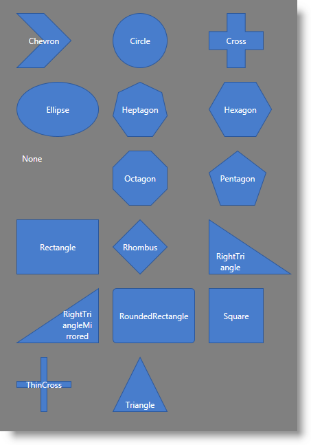
The screenshot below demonstrates how a xamDiagram consisting of several nodes with varying ShapeType settings would look as a result of the following code:
Following is the code that implements this example.
In XAML:
<ig:XamDiagram x:Name="Diagram" Background="Gray">
    <ig:DiagramNode Position="0,0"     ShapeType="Chevron" Content="Chevron"/>
    <ig:DiagramNode Position="140,0"   ShapeType="Circle" Content="Circle"/>
    <ig:DiagramNode Position="280,0"   ShapeType="Cross" Content="Cross"/>
    <ig:DiagramNode Position="0,100"   ShapeType="Ellipse" Content="Ellipse"/>
    <ig:DiagramNode Position="140,100" ShapeType="Heptagon" Content="Heptagon"/>
    <ig:DiagramNode Position="280,100" ShapeType="Hexagon" Content="Hexagon"/>
    <ig:DiagramNode Position="0,200"   ShapeType="None" Content="None"/>
    <ig:DiagramNode Position="140,200" ShapeType="Octagon" Content="Octagon"/>
    <ig:DiagramNode Position="280,200" ShapeType="Pentagon" Content="Pentagon"/>
    <ig:DiagramNode Position="0,300"   ShapeType="Rectangle" Content="Rectangle"/>
    <ig:DiagramNode Position="140,300" ShapeType="Rhombus" Content="Rhombus"/>
    <ig:DiagramNode Position="280,300" ShapeType="RightTriangle" Content="RightTriangle"/>
    <ig:DiagramNode Position="0,400"   ShapeType="RightTriangleMirrored" Content="RightTriangleMirrored"/>
    <ig:DiagramNode Position="140,400" ShapeType="RoundedRectangle" Content="RoundedRectangle"/>
    <ig:DiagramNode Position="280,400" ShapeType="Square" Content="Square"/>
    <ig:DiagramNode Position="0,500"   ShapeType="ThinCross" Content="ThinCross"/>
    <ig:DiagramNode Position="140,500" ShapeType="Triangle" Content="Triangle"/>
</ig:XamDiagram>Any custom shape can be applied to a diagram node by specifying a custom geometry for the desired shape.
The following table maps the desired configuration to the property settings that manage it.
The screenshot below demonstrates how a diagram node looks as a result of the following settings:

Following is the code that implements this example.
In XAML:
<ig:XamDiagram x:Name="Diagram">
    <ig:DiagramNode Name="node2" StrokeThickness="5">
        <ig:DiagramNode.Geometry>
            <GeometryGroup>
                <LineGeometry StartPoint="0,0" EndPoint="40,40"/>
                <LineGeometry StartPoint="40,0" EndPoint="0,40"/>
            </GeometryGroup>
        </ig:DiagramNode.Geometry>
    </ig:DiagramNode>
</ig:XamDiagram>The following topics provide additional information related to this topic.