
Please note that this control has been retired and is now obsolete to the XamDataGrid control, and as such, we recommend migrating to that control. It will not be receiving any new features, bug fixes, or support going forward. For help or questions on migrating your codebase to the XamDataGrid, please contact support.
The xamGrid™columns include a number of points where you can introduce custom styling. The table below explains the style properties that can be applied to specific columns.
The following examples show how you can apply column specific styles.
The following table lists the code examples provided below.
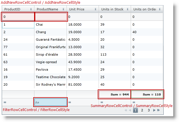
This example demonstrates how the Add New row, Filter row and Summary row can be styled for specific columns.
To complete the example, you need the following:
A CustomStyles.xaml ResourceDictionary.
It lists all used styles in the example for AddNewRowCellStyle, FilterRowCellStyle, and SummaryRowCellStyle.
DataUtil class that provides sample data.
Step 1.
Add the following namespaces:
In XAML:
....
    xmlns:ig="http://schemas.infragistics.com/xaml"
    xmlns:data="clr-namespace:Application1"
....
Step 2.
Next, add a xamGrid control to your application and include the CustomStyles.xaml ResourceDictionary in the Grid MergedDictionaries collection. The code below lists how the AddNewRowCellStyle, FilterRowCellStyle, SummaryRowCellStyle are applied for specific columns.
In XAML:
<Grid x:Name="LayoutRoot">  <Grid.Resources>
      <ResourceDictionary>          <data:DataUtil x:Key="xamGridData" />
          <ResourceDictionary.MergedDictionaries>
              <ResourceDictionary Source="CustomStyles.xaml" />
          </ResourceDictionary.MergedDictionaries>
      </ResourceDictionary>
  </Grid.Resources>
  <ig:XamGrid x:Name="dataGrid" AutoGenerateColumns="False" ColumnWidth="$$*$$"
      ItemsSource="{Binding Source={StaticResource xamGridData},Path=Products}"
      Width="560" Height="380">
    <ig:XamGrid.Columns>
      <!-- Apply column specific AddNewRowCellStyle -$$->$$
      <ig:TextColumn Key="ProductID"
                     AddNewRowCellStyle="{StaticResource addNewRowCellStyle}" />
      <ig:TextColumn Key="ProductName"
                     AddNewRowCellStyle="{StaticResource addNewRowCellStyle}">
        <ig:TextColumn.FilterColumnSettings>
          <!-- Apply column specific FilterRowCellStyle -$$->$$
          <ig:FilterColumnSettings
              FilterRowCellStyle="{StaticResource filterStyle}" />
          </ig:TextColumn.FilterColumnSettings>
        </ig:TextColumn>
        <ig:TextColumn Key="UnitPrice" HeaderText="Unit Price"/>
        <ig:TextColumn Key="UnitsInStock" HeaderText="Units in Stock">
        <ig:TextColumn.SummaryColumnSettings>
          <!-- Apply column specific SummaryRowCellStyle -$$->$$
          <ig:SummaryColumnSettings
              SummaryRowCellStyle="{StaticResource RedSummaryStyle}" />
          </ig:TextColumn.SummaryColumnSettings>
        </ig:TextColumn>
        <ig:TextColumn Key="UnitsOnOrder" HeaderText="Units on Order" >
          <ig:TextColumn.SummaryColumnSettings>
            <!-- Apply column specific SummaryRowCellStyle -$$->$$
            <ig:SummaryColumnSettings
                SummaryRowCellStyle="{StaticResource GreenSummaryStyle}" />
        </ig:TextColumn.SummaryColumnSettings>
      </ig:TextColumn>
    </ig:XamGrid.Columns>
    <ig:XamGrid.AddNewRowSettings>
      <ig:AddNewRowSettings AllowAddNewRow="Top" />
    </ig:XamGrid.AddNewRowSettings>
    <ig:XamGrid.PagerSettings>
      <ig:PagerSettings AllowPaging="Bottom" PageSize="9" />
    </ig:XamGrid.PagerSettings>
    <ig:XamGrid.FilteringSettings>
      <ig:FilteringSettings AllowFiltering="FilterRowBottom" />
    </ig:XamGrid.FilteringSettings>
    <ig:XamGrid.SummaryRowSettings>
      <ig:SummaryRowSettings AllowSummaryRow="Bottom" />
    </ig:XamGrid.SummaryRowSettings>
  </ig:XamGrid>
</Grid>
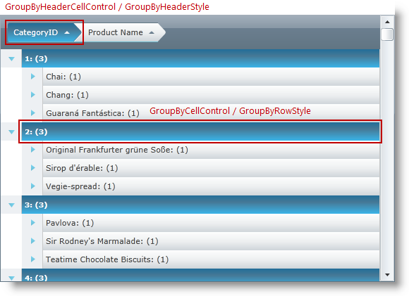
This example demonstrates how the GroupBy header and row can be styled for a specific column.
To complete the example, you need the following:
A GroupBy_Styles.xaml ResourceDictionary.
It lists all used styles in the example for GroupByHeaderStyle and GroupByRowStyle.
DataUtil class that provides sample data.
Step 1.
Add the following namespaces:
In XAML:
....
    xmlns:ig="http://schemas.infragistics.com/xaml"
    xmlns:data="clr-namespace:Application1"
....
Step 2.
Next, add a xamGrid control to your application.
Include the GroupBy_Styles.xaml ResourceDictionary in the Grid MergedDictionaries collection. The code below lists how the GroupByHeader and GroupByRow styles are applied for a specific column.
In XAML:
<Grid x:Name="LayoutRoot">
  <Grid.Resources>
    <ResourceDictionary>      <data:DataUtil x:Key="xamGridData" />
      <ResourceDictionary.MergedDictionaries>
        <ResourceDictionary Source="GroupBy_Styles.xaml" />
      </ResourceDictionary.MergedDictionaries>
    </ResourceDictionary>
  </Grid.Resources>
  <ig:XamGrid x:Name="dataGrid" AutoGenerateColumns="False" ColumnWidth="$$*$$"
            ItemsSource="{Binding Source={StaticResource xamGridData},Path=Products}"
            Width="560" Height="380">
    <ig:XamGrid.Columns>
      <ig:TextColumn Key="ProductID" HeaderText="ID" />
      <ig:TextColumn Key="ProductName" HeaderText="Product Name" />
      <ig:TextColumn Key="UnitPrice" HeaderText="Unit Price"/>
      <ig:TextColumn Key="CategoryID"
                     HeaderText="CategoryID"
                     IsGroupBy="True"
                     GroupByHeaderStyle="{StaticResource groupByHeaderStyle}"
                     GroupByRowStyle="{StaticResource groupByRowStyle}"/>
      <ig:TextColumn Key="UnitsInStock" HeaderText="Units in Stock" />
      <ig:TextColumn Key="UnitsOnOrder" HeaderText="Units on Order" />
    </ig:XamGrid.Columns>
    <ig:XamGrid.GroupBySettings>
      <ig:GroupBySettings AllowGroupByArea="Top" />
    </ig:XamGrid.GroupBySettings>
  </ig:XamGrid>
</Grid>
Following are some other topics you may find useful.