
The xamOverviewPlusDetailPane™ is a navigation control used in the SurfaceViewer controls like xamOrgChart™ and xamNetworkNode™. The control provides panning and zooming functionality and an overview of the contents of the Surface Viewer controls.
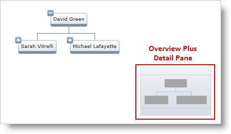
The following image displays the OverviewPlusDetailPane control with xamOrgChart ™ for panning and zooming in on the network node layout.
Figure 1: Overview Plus Detail Pane with xamOrgChart
The following image displays the OverviewPlusDetailPane control with xamNetworkNode ™ for panning and zooming in on the network node layout.
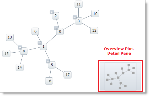
Figure 2: Overview Plus Detail Pane with xamNetworkNode
With the xamOverviewPlusDetailPane, users can:
Zoom in and out
Perform panning
Scale the contents of the Surface Viewer to fit the viewable are or to 100%
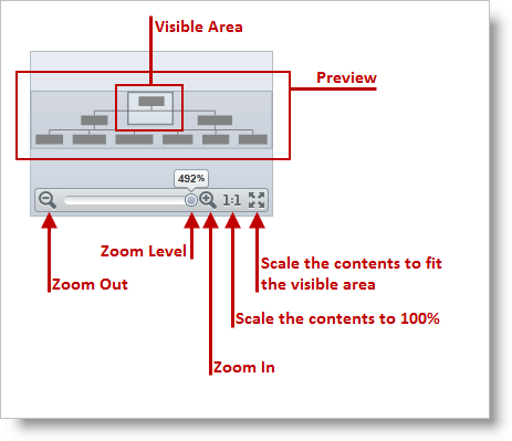
Figure 3: Graphical representation of the main features of the xamOverviewPlusDetailPane
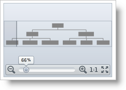
Figure 4: Hovering the mouse pointer over the control brings it into full view
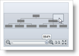
Figure 5: Clicking on the visible area and dragging it performs panning
To position the Overview Plus Detail Pane control, use the following properties of the Surface Viewer controls:
To style the Overview Plus Detail Pane, use the OverviewPlusDetailPaneStyle property.
The following code snippets show how to work with the Surface Viewer’s properties related to the Overview Plus Detail Pane control:
Code example below illustrates the surface viewer properties specified in xamOrgChart control.
In XAML:
Code
<ig:XamNetworkNode
              OverviewPlusDetailPaneVisibility="Visible"
              OverviewPlusDetailPaneStyle="{StaticResource OPDPStyle }"
              HorizontalOverviewPlusDetailPaneAlignment="Center"
              VerticalOverviewPlusDetailPaneAlignment="Bottom">
</ig:XamNetworkNode>
Code example below illustrates the surface viewer properties specified in xamNetworkNode control.
In XAML:
Code
<ig:XamNetworkNode
              OverviewPlusDetailPaneVisibility="Visible"
              OverviewPlusDetailPaneStyle="{StaticResource OPDPStyle }"
              HorizontalOverviewPlusDetailPaneAlignment="Center"
              VerticalOverviewPlusDetailPaneAlignment="Bottom">
</ig:XamNetworkNode>The following topics provide additional information related to this topic.