<ig:XamSliderNumericThumb Value="15" InteractionMode="Push" ToolTipVisibility="Visible">
   <ig:XamSliderNumericThumb.ToolTipTemplate>
      <!-- Add DataTemplate -->
   </ig:XamSliderNumericThumb.ToolTipTemplate>
</ig:XamSliderNumericThumb>

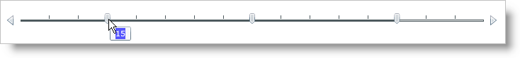
You can display ToolTips on the xamSlider™ control. ToolTips allow your end users to see the value of the slider’s thumb whenever it is moused over. ToolTips for the xamSlider control are also fully customizable.
This topic assumes that you already have a xamSlider control on your page, for more information, see the Getting Started with xamSlider topic.
After following the steps in this topic you have visible ToolTips that have been styled.
Set the xamSliderNumericThumb object’s ToolTipVisibility property to Visible.
Add tags for the ToolTipTemplate property to xamSliderNumericThumb.
In XAML:
<ig:XamSliderNumericThumb Value="15" InteractionMode="Push" ToolTipVisibility="Visible">
<ig:XamSliderNumericThumb.ToolTipTemplate>
<!-- Add DataTemplate -->
</ig:XamSliderNumericThumb.ToolTipTemplate>
</ig:XamSliderNumericThumb>
Create a DataTemplate.
Add a Grid panel to the DataTemplate.
Add a Rectangle to the Grid panel.
Set the following properties on the Rectangle:
Fill – Blue
Opacity – 0.65
In XAML:
<DataTemplate>
   <Grid>
      <Rectangle Fill="Blue" Opacity="0.65"/>
      <StackPanel HorizontalAlignment="Center" VerticalAlignment="Center">
         <!-- Add TextBlock -->
      </StackPanel>
   </Grid>
</DataTemplate>
Add a TextBox control to the StackPanel container. Set the following properties:
Text – {Binding}
Foreground – White
In XAML:
<TextBlock Foreground="White" Text="{Binding}"/>
Save and run your application.