
Doji, or Japanese candle charts , are used extensively in the investment trading industry. These charts are easy to use and integrate into the existing charting systems as the data required to create them is the same as that of more commonly used charts, such as bar and column.
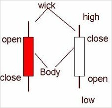
Candle charts consist of visual elements called "candles". Each candle is further made up of two parts: the body and wick. The length of the body shows the difference in the open and close of the session while the color of it shows whether the open was higher or lower than the close. The wick part determines the highest and lowest price on which a particular investment was traded during a session, as shown in the image.
Candle charts provide earlier indications of market turn than traditional charts, as they can send out reversal signals in a few sessions, rather than the weeks often needed for a bar chart reversal signal. Thus, market turns with candle charts will frequently be in advance of traditional indicators.

The main part of the candlestick line is the body. The length indicates the span between a session’s opening and closing value of an investment. If the closing value is lower than the opening, the body is traditionally red, black or any dark color. Conversely, if the closing is higher than the open, the body is typically white or any light color. The lines above and below the body are called the wicks. The upper wick is the highest price during a session and the bottom wick is the lowest price. Therefore, based on the color or the body of the candle as well as the length of the body and wick, one can determine the trend in the market for a particular investment.

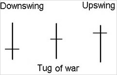
For example, a long, light-colored candle body means the investment’s share prices are in an upswing, signifying a buying trend. By contrast, a long, dark-colored candle body means the investment’s share prices are in downswing, signifying a sell off trend. A small body (dark or light) indicates that the market’s trend may be losing momentum. Moving averages provide excellent clues as to whether a particular investment’s share prices are moving in the upward or downward direction. It is calculated as the average of last n days prices. As the days progress on the time-scale, the oldest day is removed and the current day is added for new average calculation. Changes in trend can be inferred when two moving averages of different periods cross. Charts in these scenarios can have more than one moving average, and there is flexibility in whether the moving average is to be calculated on high, low, open or close values of the day. The chart below shows the moving average for two- and five-day periods. Each average is calculated based on the closing value of the shares.
