A scatter chart is used either to show the relationship among the items in several distinct series of data, or to plot two sets of values as one series of x/y coordinates. A scatter chart draws attention to uneven intervals or clusters of data. This type of chart is often used to plot scientific data, and can highlight the deviation of collected data from predicted results.
A line chart shows trends in changing data values at equal intervals.
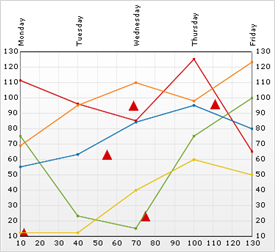
The scatter line chart combines both types of charts, showing both individual values and trends.