The following tutorial is intended to familiarize the developer with the WebImageButton™ control, and its properties and behaviors. Some steps will be diversions from the end result; these steps are intended as an exploration of the basic settings of the control.
Add a WebImageButton to the WebForm and set the Text property.
Setting the Text property is not a requirement, but most buttons will have text on them to indicate their function.
Experiment with settings under the Appearance.Style and Appearance.InnerBorder properties.
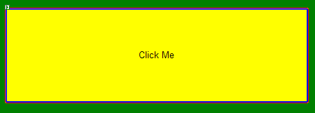
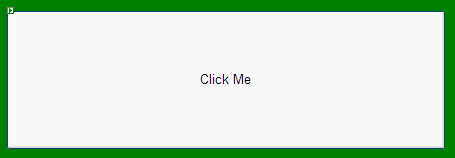
For this experiment, the button was set as follows: Appearance.Style.BorderStyle = Solid, Appearance.Style.BorderColor = Blue, Appearance.Style.BorderWidth = 5px. And for the Appearance.InnerBorder, a 5px Solid Orange border. I chose a 5px Solid Orange border. The result is depicted here; a WebImageButton with two borders … the inner is orange and the outer is blue.

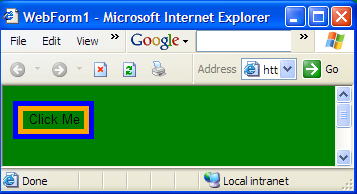
WebImageButton also supports Transparent colors, when the background is a simple bgcolor. To demonstrate, set the Page bgcolor to Green, and set the WebImageButton.Style.BackColor to Transparent. The results can be seen in the designer, but take the time to build the project and view the page in a web browser.
Another important thing to note when the WebImageButton has been customized to this level: it may be a good idea to set the UseBrowserDefaults property to False so that the client browser will no longer fall back on its default style settings when a particular appearance property is not explicitly set.
Set a PressedAppearance for the WebImageButton.
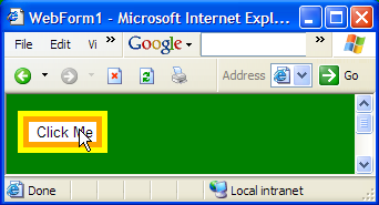
This is done through the PressedAppearance property. In this sample, PressedAppearance.Style.BackColor is set to White, and a 5px Yellow border is used under PressedAppearance.Style. Run this page and click the button to observe how the appearance changes when it is being pressed. Also observe how the InnerBorder color does not change; since no properties were set under PressedAppearance.InnerBorder, the settings under Appearance.InnerBorder are not overridden.
Now that we’ve seen how WebImageButton’s appearance can be affected by setting its Appearance properties, let’s look at some more popular button styles using RoundedCorners.
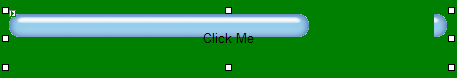
Set the StylePreset property to Mac.

Note how all the borders went away immediately after setting this property. This is because the StylePreset property makes changes across the entire control, resetting properties like Appearance. Scan through the properties grid and notice how the property settings have been changed throughout the control.
It doesn’t matter that the properties we set on the WebImageButton borders were reset, because when using RoundedCorners, these borders are not displayed.
Let’s examine how this works. Look at the properties grid under the RoundedImages property and note the settings which have been made by the Mac preset.
The first thing to notice is the image URL’s which have been set under the various image URL properties. Note that these url’s are relative to the ImageDirectory property of the control. By default this is /ig_common/images/, and if you have run the Ultimate UI for ASP.NET installer, this is a virtual directory which is mapped to C:\inetpub\wwwroot\aspnet_client\infragistics\images (by default). Browse to that folder in Windows Explorer and open the image files to see what images are actually being used to generate this button’s appearance.
Notice that the images are wide, and they are compressed to make a button as small as the one in this demo.
Now is a good time to understand a limitation of using images like this: while they can be compressed to make smaller buttons, they cannot be stretched to make larger buttons. Because of this, the RoundedCorners.MaxWidth and RoundedCorners.MaxHeight properties are now fixed at 23 and 300, respectively. Try changing these values to 50 and 500, and stretching the control out. The result will demonstrate the negative impact of stretching an image-based button beyond the size of its source image.
To create a Mac-styled ImageButton of these dimensions, a new, larger source image would have to be created.
Set RoundedCorners.RenderingType to BordersByTableCells.
Note how all the Mac styling goes away. Rendering via BordersByTableCells overrides the use of file images and creates rounded corners by generating 1-pixel table cells in a rounded shape around the button, to create an XP-styled round button.
The advantages of using this RenderingType instead of the XP style images are that since an images are not being used, properties such as BackColor and Border/InnerBorder can still be customized. With borders however there is a limitation of 1 pixel width, due to the nature of the table cells which serve as the rounded borders.