When you decide to use the WebVideoPlayer™ control in your web application the most common issue you will face is making the Video Player control look and feel according to your application’s style. You can achieve this using the following information about styling and theming for the video player in particular and in broader terms for the jQuery controls available in the Ultimate UI for ASP.NET package.
The WebVideoPlayer control, like other jQuery controls, utilizes the jQuery UI CSS Framework for styling. Included in Ultimate UI for ASP.NET is a custom UI theme called ‘IG Theme’. This theme provides a professional and attractive design to all Infragistics jQuery controls and standard jQuery UI widgets.
The IG and Base themes are located in the installed directory within the ‘jQuery/themes’ folder. To add the themes to your application, copy the ‘ig’ and ‘base’ directories from the ‘themes’ directory to a directory in your site designated for jQuery UI themes or CSS.
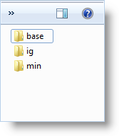
Figure 1: Included theme folders upon product install

Figure 2: Theme folders copied into destination application

The IG Theme is a custom theme which includes all of the styles typically found in a jQuery UI theme. This theme is not required and may be replaced by a different theme. When using a theme other than IG theme, the video player has some additional styling points that may need customization to achieve a complete design.
WebVideoPlayer requires having a link to the stylesheet of a standard jQuery UI theme. For the IG Theme, you must include reference to the theme’s stylesheet in the page:
In ASPX:
<link href="<%= Url.Content("~/themes/ig/jquery.ui.custom.css") %>" rel="stylesheet" type="text/css" />
The Base Theme is referenced after the jQuery Theme. The following stylesheet are required when using the WebVideoPlayer control:
In ASPX:
<link href="<%= Url.Content("~/themes/base/ig.ui.min.css") %>" rel="stylesheet" type="text/css" />
Below you can find the complete list of CSS classes used by the video player. You can get and set classes for the separate elements using the control’s properties shown the first column.