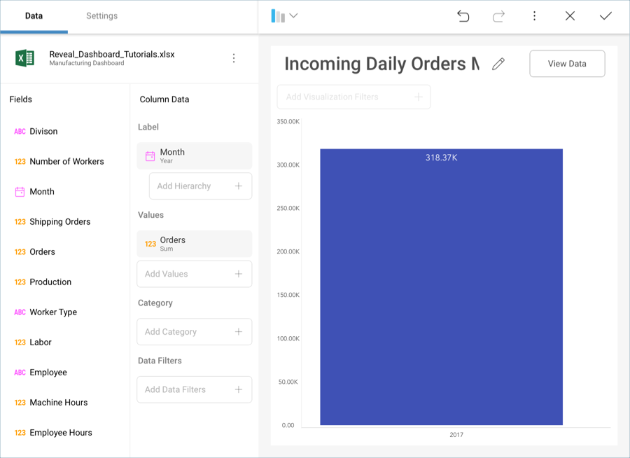
Let’s focus on creating the "Incoming Daily Orders MTD" visualization in the sample dashboard presented at the beginning of this tutorial. The widget displays a Column Chart and, as such, it only requires one field to be dropped into Label and one to be dropped into Values.
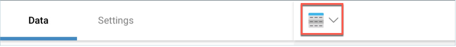
First, open the visualizations picker by selecting the grid icon in the top bar.
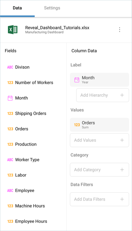
Change your visualization to "Column".

Then, drag and drop:
Month into the Label placeholder of the data editor.
Orders into the Values placeholder.
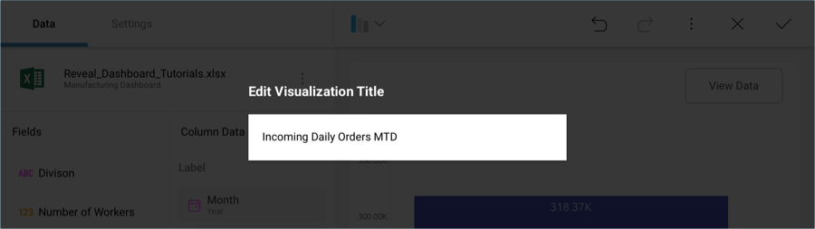
Lastly, change the visualization’s title to "Incoming Daily Orders MTD" by selecting the pencil icon next to the "Manufacturing Dashboard" title.
Your visualization should look like the following one: