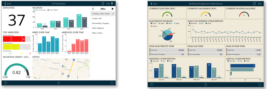

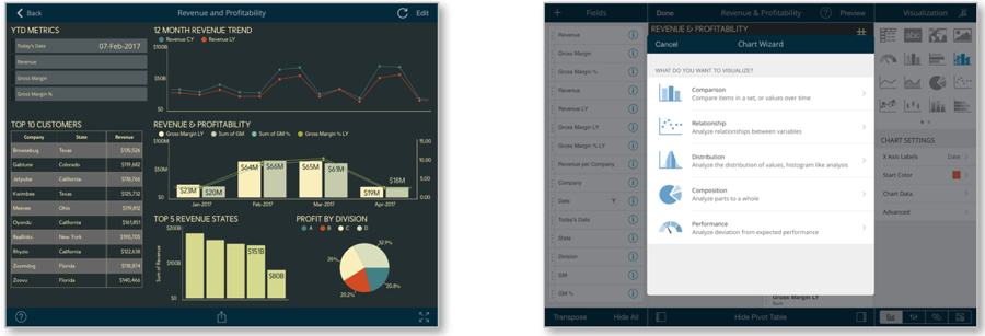
You can use data visualization to communicate insight by creating rich dashboards that consume SharePoint data.
The Visualization options include grid, text, trend line, map, gauge, chart, and financial chart views.
You can connect to data sources like lists and documents, including calendars, contacts, images, Excel files. SharePoint lists and Excel files can apply many different visualization options to their data. With SharePlus Bundle (ReportPlus and SharePlus Enterprise), you have access to more than 20 different data sources.
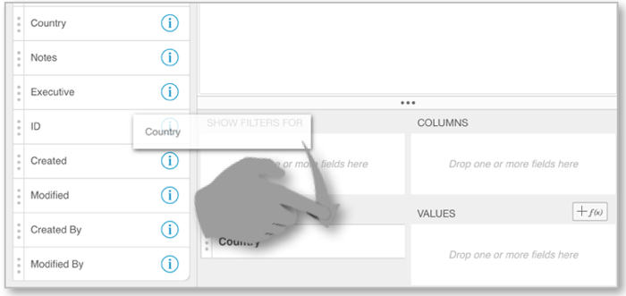
Pivot Tables are very powerful data summarization tools that help you analyze data. To create one is as simple as selecting your data and using the Pivot Table Editor to slice-and-dice data according to your needs.
You can summarize data, hide null values, add quick filters, and also customize the columns to be listed in your pivot table. For further details refer to the Data Visualization section.