Version

Handle User Interaction with Items

Items are the main point of user interaction in the WinExplorerBar™. Users interact with Groups , but only as a means of accessing the Items they contain. WinExplorerBar provides several distinct Item styles that you can use to populate the element. Depending on the type of Item used, you then write event code to provide the desired functionality.

Determining Item Style

The needs of your application will determine which Item style is the best choice. Four item styles are available:

  • Button - The Item appears as a clickable button. The Item will provide visual feedback to the user indicating its clickable state. The user can click the Item to initiate an action.

  • Label - The Item appears as a static label. The Item does not provide visual feedback indicating that it is clickable. However, the user can still click the Item to initiate an action.

  • State Button - The Item works as a toggle button. Selecting one state button de-selects any other state button, either within the Group or across the element. There are special considerations for handling state buttons as outlined below.

  • Separator - The Item appears as a separator line. In this mode, the item does not display either text or a graphic. You use the SeparatorStyle property to specify whether the separator line will be displayed horizontally or vertically. The user can still click the Item to initiate an action.

The Style of an item is determined by the setting of one of three properties. Item styles are defaultable, meaning the style can be set to a default value at any level of the element’s inheritance hierarchy and will receive its value from the next higher object in the hierarchy. At the lowest level, the Style property may be set off the Item object itself:

In Visual Basic:

Imports Infragistics.Win.UltraWinExplorerBar
...
Private Sub Handle_User_Interaction_with_Items_Load(ByVal sender As System.Object, _
  ByVal e As System.EventArgs) Handles MyBase.Load
	Me.UltraExplorerBar1.Groups(0).Items(1).Settings.Style = ItemStyle.Separator
End Sub

In C#:

using Infragistics.Win.UltraWinExplorerBar;
...
private void Handle_User_Interaction_with_Items_Load(object sender, EventArgs e)
{
	this.ultraExplorerBar1.Groups[0].Items[1].Settings.Style = ItemStyle.Separator;
}
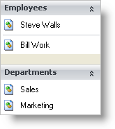
example of ultraexplorerbar and user interaction

If the Style property is set to Default at every level of the hierarchy, the element uses its built-in default setting, which is Button.

Handling Events

The primary event you will have to implement is the ItemClick event. This event occurs whenever a button, label or separator style Item is clicked. Click (and DoubleClick) events receive the Item that has been clicked via the e object, so you can easily determine which Item generated the event:

In Visual Basic:

Private Sub UltraExplorerBar1_ItemClick(ByVal sender As Object, _
  ByVal e As Infragistics.Win.UltraWinExplorerBar.ItemEventArgs) _
  Handles UltraExplorerBar1.ItemClick
	MessageBox.Show("You clicked on " & e.Item.Text & "!")
End Sub

In C#:

private void ultraExplorerBar1_ItemClick(object sender, ItemEventArgs e)
{
	MessageBox.Show("You clicked on " + e.Item.Text + "!");
}

State buttons are handled somewhat differently. Clicking an Item with the state button style does not generate an ItemClicked event. Instead, ItemCheckStateChanging and ItemCheckStateChanged events are fired.

A Note On State Buttons

One more issue you should be aware of is that simply setting an Item to the state button style will not visibly change the Item in any way, and there is no automatic distinction between checked and unchecked state button Items. If you want the checked Item to appear visually distinct from the other Items, you will have to specify how you want the appearance of the checked item to change, using the AppearancesLarge and AppereancesSmall properties of the Item. Through these properties, you can access the CheckedAppearance property and use it to manipulate the Appearance object that is applied to the Item when it is in its checked state.

How you manage this state is up to you - you can change the color (foreground or background) of the Item, alter its transparency, change the look of its border, display a graphic (such as a check box) that changes based on the checked state, or you can change the Item’s text alignment. These capabilities and more are available via the Appearance object which is accessed through the CheckedAppearance property.