Version

Configuring Performance Bar

Purpose

This topic explains, with code examples, how to configure the performance bar of the XamBulletGraph™ control. This includes the value indicated by the bar, its width, position, and formatting.

Required background

The following topics are prerequisites to understanding this topic:

Topic Purpose

This topic provides conceptual information about the XamBulletGraph control including its main features, minimum requirements, and user functionality.

This topic explains how to add the XamBulletGraph control to a WPF application.

Configuring the Performance Bar

Performance bar appearance configuration summary

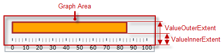
The performance bar always starts at the beginning of the scale range. Only this ending position is configurable, which effectively configures the length of the bar. The ending position is managed by the Value property.

Its position in the across-the-scale dimension is configurable relative to the edges of the Graph area through the ValueInnerExtent and ValueOuterExtent properties. Configuring the position of the performance bar also defines its width.

BulletGraph Configuring the Performance Bar 1.png

The look-and-feel of the bar can be customized in terms of fill color, border color, and border thickness using the respective properties ( ValueBrush, ValueOutline, and ValueStrokeThickness).

Performance bar appearance configuration summary chart

The following table explains briefly the configurable aspects of XamBulletGraph control’s bar and maps them to properties that configure them.

Configurable aspects Property Default value

Name

Not set

Value to indicate

Not set

Width and position (across the scale)

0.5

Width and position(across the scale)

0.65

Fill color

Defined in the default theme

Border thickness

1.0

Border color

Defined in the default theme

Tooltip

Depends on whether ValueName has been initialized

Note
Note

For details in configuring the tooltip, see Configuring a Custom Tooltip for the Performance Bar in the Configuring the Tooltips topic.)

Property settings

The following table maps the desired behavior to its respective property settings.

In order to configure: Details Use this property: And set it to:

Name

A name for the performance bar (for displaying in the tooltip)

A string expressing the name of the performance bar

Value to indicate

The value indicated by the performance bar

The desired value in the measures of the scale

Bottom / right edge position

The position of the lower edge of the performance bar at horizontal orientation or the right edge at vertical orientation.

The desired value as a relative part of the height/width of the Graph area (depending on the orientation) presented as a fraction of 1 (e.g. _0.2 )

Top / left edge position

The position of the top edge of the performance bar at horizontal orientation or the left edge at vertical orientation.

(The difference between the starting and the ending points forms the length of the marks’ line segments.)

The desired value as a relative part of the height/width of the Graph area (depending on the orientation) presented as a fraction of 1 (e.g. 0.2 )

Fill color

Fill color of the bar

The desired color

Border thickness

Thickness of the performance bar’s border

The desired value in pixels

Border color

Color of the performance bar’s border

The desired color

Tooltip

Content of the performance bar’s tooltip

The desired string, UIElement, or DataTemplate (See Configuring the Tooltips.)

Example

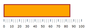
The screenshot below demonstrates how the XamBulletGraph looks as a result of the following settings:

Property Value

“85”

“#ffffa500”

“#ffa52a2a”

“0.3”

“0.8”

“3”

BulletGraph Configuring the Performance Bar 2.png

Following is the code that implements this example.

In XAML:

<ig:XamBulletGraph Value="85"
                 ValueBrush="#ffffa500"
                 ValueInnerExtent="0.3"
                 ValueOuterExtent="0.8"
                 ValueOutline="#ffa52a2a"
                 ValueStrokeThickness="3" />

In C#:

bulletGraph.Value = 85;
bulletGraph.ValueBrush = new SolidColorBrush(Color.FromRgb(255, 165, 0));
bulletGraph.ValueInnerExtent = .3;
bulletGraph.ValueOuterExtent = .8;
bulletGraph.ValueOutline = new SolidColorBrush(Color.FromRgb(165, 42, 42));
bulletGraph.ValueStrokeThickness = 3;

In VB:

bulletGraph.Value = 85
bulletGraph.ValueBrush = New SolidColorBrush(Color.FromRgb(255, 165, 0))
bulletGraph.ValueInnerExtent = .3
bulletGraph.ValueOuterExtent = .8
bulletGraph.ValueOutline = New SolidColorBrush(Color.FromRgb(165, 42, 42))
bulletGraph.ValueStrokeThickness = 3

[[Highlight Value Example]] == Configuring the Highlight Value

Highlight Example

The following screenshot demonstrates how the XamBulletGraph control with the highlight needle enabled looks as a result of the following settings:

Property Property Type

Double

double

BulletGraph highlight value.png

Related Content

Topics

The following topics provide additional information related to this topic.

Topic Purpose

This topic explains, with code examples, how to configure the title and subtitle of the XamBulletGraph control. This includes the title area width the start position of the text and the title/subtitle text itself.

This topic explains, with examples, how to configure the scale of the XamBulletGraph control. This includes positioning the scale inside the control and configuring the scale tick marks and labels.

This topic explains, with code examples, how to configure the comparative measure marker of the XamBulletGraph control. This includes the marker’s value, width, and formatting.

This topic explains, with code examples, how to configure ranges in the XamBulletGraph control. This includes the number of ranges and their positions, lengths, widths, and formatting.

This topic explains, with code examples, how to configure a background for the bullet graph. This includes setting the background’s size, position, color, and border.

This topic explains, with code examples, how to enable the tooltips in the XamBulletGraph control and configure the delay with which they are displayed.