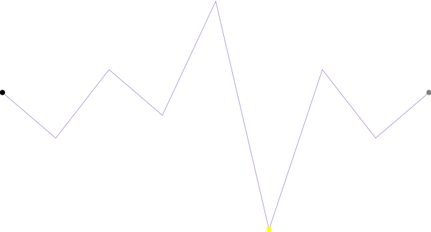
This topic demonstrates, with code examples, how to configure and customize the markers for XamSparkline™ control.
The following table lists the topics required as a prerequisite to understanding this topic.
Markers, as it is explained in Defining Markers topic, are symbols (circular colored icons) overlaid on the Sparkline to indicate the individual data points based on X/Y coordinates.
Markers can be customized to have an appearance of your choice. By default, markers are not set to display. In order to display any marker, you need to set the visibility property to Visible such as the following:`MarkerVisibility``="Visible"`
Markers can be configured in the following aspects:
Brush
Size
The following table maps the configuration tasks to the corresponding markers’ property settings.
The code below demonstrates how to configure the first, last and negative markers.

In XAML:
<ig:XamSparkline x:Name="xamSparkline1" ItemsSource="{StaticResource DataSource}"
    ValueMemberPath="Value"
    DisplayType="Line"
    NegativeMarkerVisibility="Visible"
    NegativeMarkerSize="15"
    NegativeMarkerBrush="#FFFF00"
    FirstMarkerVisibility="Visible"
    FirstMarkerSize="15"
    FirstMarkerBrush="#000000"
    LastMarkerVisibility="Visible"
    LastMarkerSize="15"
    LastMarkerBrush="#808080">
</ig:XamSparkline>The following topics provide additional information related to this topic.