This topic explains how to configure the xamBusyIndicator busy content.
The following topics are prerequisites to understanding this topic:
This topic contains the following sections:
The xamBusyIndicator busy content is the content under the animation area.
Use the XamBusyIndicator BusyContent property to place a text or a FrameworkElement.
Two examples follow to demonstrate both setting text and a FrameworkElement for xamBusyIndicator busy content.
By default, the initial value of the BusyContent property is null.
The following table maps the desired configuration to the property settings that manage it.
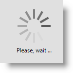
The screenshot below demonstrates how the xamBusyIndicator looks as a result of the following settings:

Following is the code that implements this example.
In XAML:
<ig:XamBusyIndicator IsBusy="True" BusyContent="Please, wait ..." />The screenshot below demonstrates how the xamBusyIndicator looks as a result of the following settings:

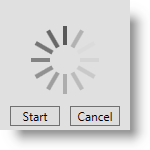
Following is the code that implements this example.
In XAML:
<ig:XamBusyIndicator IsBusy="True">
    <ig:XamBusyIndicator.BusyContent>
        <StackPanel Orientation="Horizontal" HorizontalAlignment="Center">
            <Button Content="Start" Width="50" Margin="5"/>
            <Button Content="Cancel" Width="50" Margin="5" />
        </StackPanel>
    </ig:XamBusyIndicator.BusyContent>
</ig:XamBusyIndicator>Use the XamBusyIndicator BusyContentTemplate property to apply a custom template to the xamBusyIndicator busy content.
The following table maps the desired configuration to the property settings that manage it.
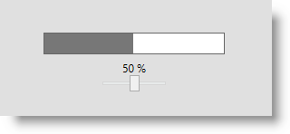
The screenshot below demonstrates how the xamBusyIndicator would look as a result of the following settings:

Following is the code that implements this example.
In XAML:
<ig:XamBusyIndicator IsBusy="True" Animation="ProgressBar"
                     BusyContent="{Binding RelativeSource={RelativeSource Self}}"
                     ProgressValue=".5">
    <ig:XamBusyIndicator.BusyContentTemplate>
        <DataTemplate>
            <StackPanel Orientation="Vertical">
                <TextBlock Text="{Binding ProgressValue, StringFormat={}{0:P0}}" />
                <Slider Maximum="1" Minimum="0" Width="80" Value="{Binding ProgressValue}" />
            </StackPanel>
        </DataTemplate>
    </ig:XamBusyIndicator.BusyContentTemplate>
</ig:XamBusyIndicator>The following topics provide additional information related to this topic.