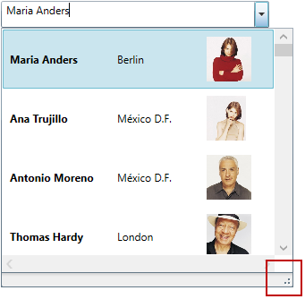
This topic explains how to Enable/Disable resizing of the xamComboEditor™ Drop-Down from the UI, as well as how to set the Drop-Down’s minimum and maximum widths and heights in code.
The following topic is a prerequisite to understanding this topic:
This topic contains the following sections:
The following table briefly explains the configurable aspects of the xamComboEditor Drop-Down resizing functionality and maps them to the properties that configure them. Further details are available after the table.
The xamComboEditor Drop-Down is resizable in order to view all the items information using a resize handle.
The xamComboEditor Drop-Down resizing feature is enabled by default.
The following table maps the desired configuration to the property settings that manage it.
The screenshot below demonstrates how the xamComboEditor would look as a result of the following settings:

Following is the code that implements this example.
In XAML:
<ig:XamComboEditor x:Name="ComboEditor"
                   DisplayMemberPath="ContactName"
AllowDropDownResizing="True" />Specify the minimum Drop-Down width using the xamComboEditor MinDropDownWidth property.
The property’s default value is double.NaN.
If the MinDropDownWidth property’s value is not set, the minimum width of the Drop-Down is limited to the width of the xamComboEditor control text input field.
If the MinDropDownWidth value is greater than the MaxDropDownWidth value, the Drop-Down is no longer resizable horizontally and its width is fixed to the MinDropDownWidth value.
The following table maps the desired configuration to the property settings that manage it.
The screenshot below demonstrates how the xamComboEditor Drop-Down behaves as a result of the following settings:

Following is the code that implements this example.
In XAML:
<ig:XamComboEditor x:Name="ComboEditor"
DisplayMemberPath="ContactName" MinDropDownWidth="150" />Specify the maximum Drop-Down width using the xamComboEditor MaxDropDownWidth property.
The property’s default value is double.PositiveInfinity.
The following table maps the desired configuration to the property settings that manage it.
The screenshot below demonstrates how the xamComboEditor Drop-Down behaves as a result of the following settings:

Following is the code that implements this example.
In XAML:
<ig:XamComboEditor x:Name="ComboEditor"
DisplayMemberPath="ContactName" MaxDropDownWidth="350" />Specify the minimum Drop-Down height using the xamComboEditor MinDropDownHeight property.
The property’s default value is 0.0.
If the MinDropDownHeight property’s value is not set, the minimum height of the Drop-Down is limited to 20px.
If the MinDropDownHeight value is greater than the MaxDropDownHeight value, the Drop-Down is no longer resizable vertically and its height is fixed to the MinDropDownHeight value.
The following table maps the desired configuration to the property settings that manage it.
The screenshot below demonstrates how the xamComboEditor Drop-Down behaves as a result of the following settings:

Following is the code that implements this example.
In XAML:
<ig:XamComboEditor x:Name="ComboEditor" DisplayMemberPath="ContactName"
MinDropDownHeight="70" />Specify the maximum Drop-Down height using the xamComboEditor MaxDropDownHeight property.
The property’s default value is double.PositiveInfinity.
Failure to set this property results in the available space above and below the control being estimated. The Drop-Down list is restricted within the available height of the application.
The following table maps the desired configuration to the property settings that manage it.
The screenshot below demonstrates how the xamComboEditor Drop-Down behaves as a result of the following settings:

Following is the code that implements this example.
In XAML:
<ig:XamComboEditor x:Name="ComboEditor"
                   DisplayMemberPath="ContactName"
MaxDropDownHeight="200" />The following topics provide additional information related to this topic.