This topic explains how to work with the field grouping feature.
The following topics are prerequisites to understanding this topic:
This topic contains the following sections:
The field grouping feature allows you to group several fields under a common field group. You can also nest field groups one under another. The field grouping feature is supported in both horizontal and vertical record orientation.
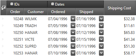
The following screenshot shows the "Order" and the "Customer" fields rendered under a common field group "IDs" and also the "Ordered" and the "Shipped" fields rendered under a common field group "Dates":

The following code snippet demonstrates the definition of the above field group configuration:
In XAML:
<igDP:XamDataGrid>
  <igDP:XamDataGrid.FieldLayouts>
    <igDP:FieldLayout>
      <igDP:FieldGroup Label="IDs">
        <igDP:Field Name="OrderID" Label="Order" Width="55" />
        <igDP:Field Name="CustomerID" Label="Customer" Width="75" />
      </igDP:FieldGroup>
      <igDP:FieldGroup Label="Dates" AllowCollapsing="True">
        <igDP:Field Name="OrderDate" Label="Ordered" Width="90" />
        <igDP:Field Name="ShippedDate" Label="Shipped" Width="90" />
      </igDP:FieldGroup>
      <igDP:Field Name="Freight" Label="Shipping Cost" Width="100" />
    </igDP:FieldLayout>
  </igDP:XamDataGrid.FieldLayouts>
</igDP:XamDataGrid>
The field groups may be collapsed and expanded by the user by clicking the small button located on the left side of the field group label. You can also collapse and expand the field groups programmatically using commands or properties which is discussed later in this topic.
The FieldLayout exposes:
a FieldItems property - a collection of all root level FieldGroups and root level Fields
a Fields property - a flattened collection of all `Field`s
The two collections are internally synchronized both ways.
The following table summarizes the user interaction capabilities of the field grouping feature.
The following table explains briefly the configurable aspects of the field grouping feature and maps them to the properties that configure them.
The following section demonstrates with code examples how to collapse and expand field groups programmatically.
The following code snippet demonstrates how to toggle a field group (named "FieldGroup1") expanded/collapsed using command:
In XAML:
<Button Content="Toggle the field group"
    Command="{x:Static igDP:DataPresenterCommands.ToggleFieldGroupIsCollapsed}"
    CommandParameter="{Binding ElementName=FieldGroup1}"
CommandTarget="{Binding ElementName=xamDataGrid1}" />The following code snippets demonstrate how to set a field group (named "FieldGroup1") as expanded or collapsed using the IsCollapsed property:
In XAML:
…
<igDP:FieldGroup x:Name="FieldGroup1">
…
In C#:
this.fieldGroup1.IsCollapsed = true;This section describes the events associated with the field grouping feature.
The following table maps the desired behaviors to the event that manage it.
To style the field group label you can:
Create an implicit style and target the FieldGroupLabelPresenter type – this will affect all field groups.
Provide a style to the FieldLayoutSettings’ FieldGroupLabelPresenterStyle property – this will affect all field group in the data presenter control in question.
Provide a style to the FieldGroup’s LabelPresenterStyle property – this will the field group in question.
The following code snippet demonstrates how to apply the style on all field groups:
In XAML:
<Page
  …
  xmlns:igDP="http://infragistics.com/DataPresenter"
  …>
…
<Page.Resources>
  <ResourceDictionary>
    <Style TargetType="{x:Type igDP:FieldGroupLabelPresenter}">
      <Setter Property="Background" Value="Orange" />
    </Style>
  </ResourceDictionary>
</Page.Resources>
…
<igDP:XamDataGrid>
…
  <igDP:XamDataGrid.FieldLayouts>
    <igDP:FieldLayout>
      <igDP:FieldGroup>
      …
      </igDP:FieldGroup>
      <igDP:FieldGroup>
      …
      </igDP:FieldGroup>
    </igDP:FieldGroup>
  <igDP:XamDataGrid.FieldLayouts>
…
</igDP:XamDataGrid>
…
</Page>The following code snippet demonstrates how to apply the style only on specific field group(s):
In XAML:
<Page
  …
  xmlns:igDP="http://infragistics.com/DataPresenter"
  …>
…
<Page.Resources>
  <ResourceDictionary>
    <Style x:Key="BGRed" TargetType="{x:Type igDP:FieldGroupLabelPresenter}">
      <Setter Property="Background" Value="Red" />
    </Style>
  </ResourceDictionary>
</Page.Resources>
…
<igDP:XamDataGrid>
…
  <igDP:XamDataGrid.FieldLayouts>
    <igDP:FieldLayout>
      <igDP:FieldGroup LabelPresenterStyle="{StaticResource ResourceKey=BGRed">
      …
      </igDP:FieldGroup>
      <igDP:FieldGroup>
      …
      </igDP:FieldGroup>
    </igDP:FieldGroup>
  <igDP:XamDataGrid.FieldLayouts>
…
</igDP:XamDataGrid>
…
</Page>
In this particular case the style will be applied to the first field group only.
The following topics provide additional information related to this topic.