This topic introduces the xamOrgChart™ control and explains its elements and features.
The xamOrgChart is a data-bound control for rendering organization charts. It supports expanding and collapsing of nodes, panning and zooming, keyboard navigation, custom styles and templates, and various selection types including selection of multiple nodes.
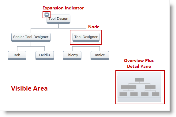
The xamOrgChart control consists of the following elements (Figure 1):
Visible Area
Nodes
Expansion Indicator – each node has an Expansion Indicator
Overview Plus Detail Pane

Figure 1: Elements of the OrgChart
The user can perform panning and zooming with either the mouse or by using the xamOverviewPlusDetailPane™ control:
panning: click and drag anywhere on the chart’s surface
zooming:
use the mouse scroll button
click and drag while holding the Ctrl key
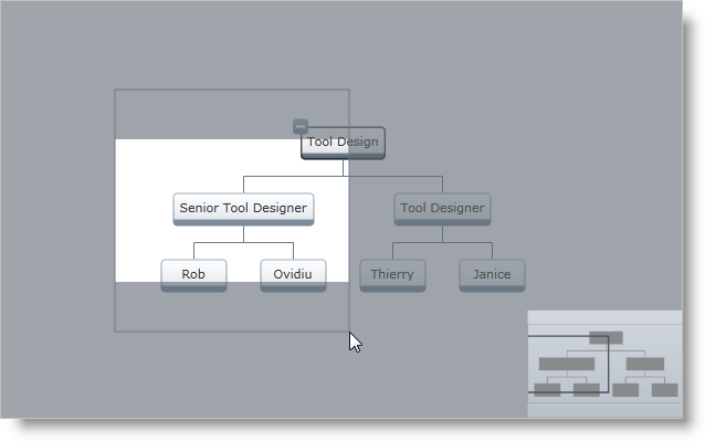
Figure 2: Zooming with dragging while holding the Ctrl key
The user can traverse and focus nodes of the xamOrgChart with the arrow keys on the keyboard.
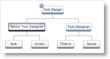
Figure 3: The xamOrgChart with the focus on the Senior Tool Designer node
With the keyboard, the user can:
select the node with the Space key (For details about selecting nodes, see the Selection topic).
expand children nodes with the plus (+) and minus (-) keys
toggle the state of children nodes with the Enter key
zoom in and out with the plus (+) and minus (-) keys while holding down the Ctrl key
The nodes of the xamOrgChart control have the ability to expand and collapse their children nodes. This is done with the Expansion Indicators of the nodes.
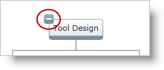
Figure 4: The Expansion Indicators of the nodes expand and collapse their children