
This topic explains how to create and configure the toolbar area positioned next to the tab items.
The following topics are prerequisites to understanding this topic:
This topic contains the following sections:
The xamRibbon control allows you to create a toolbar located next to the tabs. This toolbar extends from the ItemsControl class allowing you to add any kind of content in it.
This toolbar is located on the line where the tab items are placed aligned to the right. If there is not enough space to render all of the toolbar’s content, some of it will be hidden and an overflow button will be rendered on the right. Clicking this button will open a popup containing all hidden toolbar content.
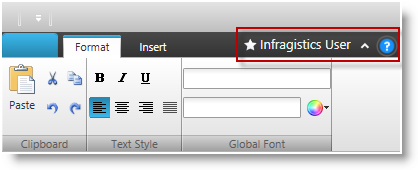
The following screenshot demonstrates a xamRibbon control with the tab item area toolbar:
The following screenshot demonstrates a xamRibbon control with the overflow popup shown. The items in the popup were hidden from the toolbar due to the limited space, which prevented the whole toolbar’s content from being rendered next to the tab items:
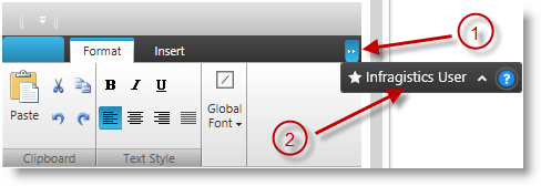
Overflow button
Tab item area toolbar rendered in a popup
The tab items area toolbar is represented by the TabItemAreaToolbar class. You have to instantiate it and set it to the xamRibbon’s TabItemAreaToolbar property. The TabItemAreaToolbar class provides several properties for configuring the toolbar, which are explained in the table below.
The following table maps the desired configuration/behaviors to the property settings that manage it.
The following code example demonstrates how to create and set a tab item area toolbar:
In XAML:
<igRibbon:XamRibbon>
    <igRibbon:XamRibbon.TabItemAreaToolbar>
        <igRibbon:TabItemAreaToolbar TabItemAreaMinWidth="150">
        <!-- add tab item area toolbar content here -->
        </igRibbon:TabItemAreaToolbar>
    </igRibbon:XamRibbon.TabItemAreaToolbar>
</igRibbon:XamRibbon>The following topics provide additional information related to this topic.