
This topic provides conceptual information about the annotations and interactions available on the XamCategoryChart™ control including the different types of interaction layers available.
This topic contains the following sections:
Internally, interactions are implemented through interaction layers which are series that are added to the series collection. These layers are dependent on the touch position. Adding the interaction layers to the XamCategoryChart control disables the default behavior of the crosshairs and/or tooltips (depending on which type of layer added).
The default behavior is disabled because it prevents visual confusion as the interaction layers perform a similar visual function compared to the built in behavior as the touch position moves. You can, however, override this behavior and allow the default crosshair functionality to perform in addition to the interaction layer functionality. Also of note, only target a series by one tooltip layer at a time. If you target more than one tooltip layer at a series, the interaction layers that use tooltips will not function as expected. Using a tooltip for a series in more than one location at once is not allowed.
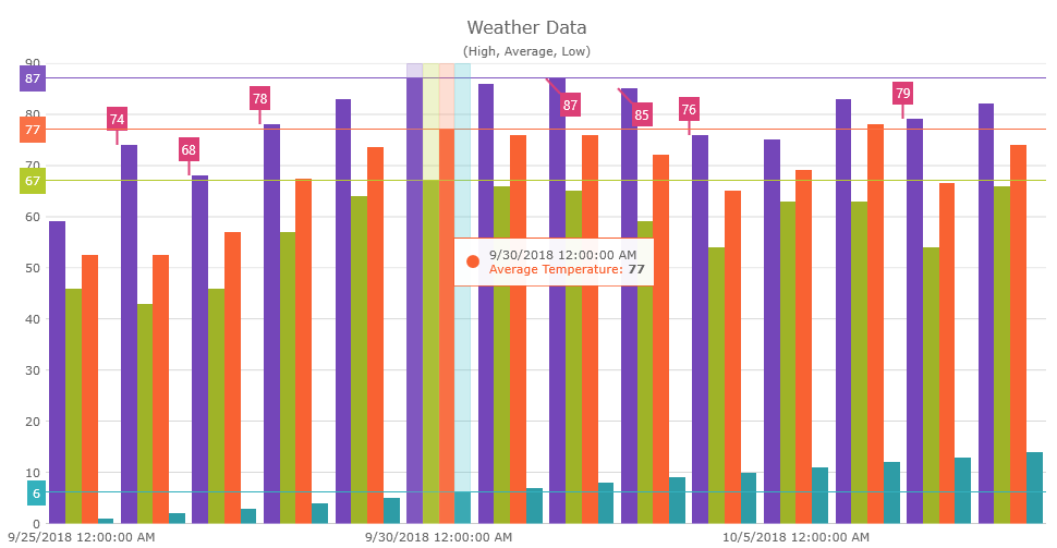
The following screenshot displays the XamCategoryChart control with the category highlight layer, the crosshair layer and the item tooltip layer implemented.
Currently there are five different touch interaction layers and two annotation layers available on the XamCategoryChart control. Each of these interaction layers provides different highlight, touch, and tooltip interactions that may be used individually or combined with one another providing powerful interactions.
The Crosshairs Layer provides crossing lines that follow your touch position and meet at the actual value of every targeted series. This layer is off by default, you can turn them on by setting the CrosshairsAnnotationEnabled property to true. Crosshairs can be displayed vertically, horizontally or both, as determined by setting the CrosshairsDisplayMode property to CrosshairsDisplayMode enum value (Default, None, Horizontal, Vertical, or Both)
The following code example shows how to enable crosshairs displaying both horizontal and vertical crosshairs:
In XAML:
<ig:XamCategoryChart x:Name="categoryChart1"
    CrosshairsAnnotationEnabled="True"
    CrosshairsDisplayMode="Both"
    ChartType="Column"
    ItemsSource="{StaticResource WeatherData}" >
</ig:XamCategoryChart>
In C#:
this.categoryChart1.CrosshairsAnnotationEnabled = true;
this.categoryChart1.CrosshairsDisplayMode = CrosshairsDisplayMode.Both;The Category Highlight Layer targets one or all category axes in the XamCategoryChart control. They draw a shape that illuminates the area of the axis closest to the touch position. It is off by default and can be turned on by setting the IsCategoryHighlightingEnabled property to true.
If the axis contains any series that are aligned between major gridlines of the axis, for example, ColumnSeries series, this will render a shape that fills the current category. For other series, such as LineSeries series, it will render a band with an adjustable thickness at the closest gridline to the touch position. In this situation if the UseInterpolation property is enabled this will cause the x position to become affixed to the x position of the touched point.
The following code example shows how to enable the category highlight layer:
In XAML:
<ig:XamCategoryChart x:Name="categoryChart1"
    IsCategoryHighlightingEnabled="True"
    ChartType="Column"
    ItemsSource="{StaticResource WeatherData}" >
</ig:XamCategoryChart>
In C#:
this.categoryChart1.IsCategoryHighlightingEnabled = true;The Category Item Highlight Layer highlights items in a series that use a category axis either by drawing a banded shape at their position or by rendering a marker at their position. It is off by default and can be turned on by setting the IsItemHighlightingEnabled property to true.
The default highlight depends on the type of series. For example, the highlight for a ColumnSeries and a LineSeries is different; for ColumnSeries it is a rectangle shape, for LineSeries it is a marker.
The following code example shows how to enable the category item highlight layer:
In XAML:
<ig:XamCategoryChart x:Name="categoryChart1"
    IsItemHighlightingEnabled="True"
    ChartType="Column"
    ItemsSource="{StaticResource WeatherData}" >
</ig:XamCategoryChart>
In C#:
this.categoryChart1.IsItemHighlightingEnabled = true;The Category ToolTip Layer displays grouped tooltips for series using a category axis. To enable this layer, set the ToolTipType property to a ToolTipType.Category enum.
The following code example shows how to enable the category tooltip layer:
In XAML:
<ig:XamCategoryChart x:Name="categoryChart1"
    ToolTipType="Category"
    ChartType="Column"
    ItemsSource="{Binding WeatherData}"
    SeriesAdded="categoryChart1_SeriesAdded">
    <ig:XamCategoryChart.Resources>
        <DataTemplate x:Key="highDT">
            <Label Text="{Binding Item.High, StringFormat=\{0:n2\}}" />
        </DataTemplate>
        <DataTemplate x:Key="lowDT">
            <Label Text="{Binding Item.Low, StringFormat=\{0:n2\}}" />
        </DataTemplate>
    </ig:XamCategoryChart.Resources>
</ig:XamCategoryChart>
In C#:
this.categoryChart1.ToolTipType = ToolTipType.Category;
//=======================================================

private void categoryChart1_SeriesAdded(object sender, Infragistics.XamarinForms.Controls.Charts.ChartSeriesEventArgs args)
{
    ColumnSeries series = args.Series as ColumnSeries;

    if (series != null)
    {
        switch (series.ValueMemberPath)
        {
            case "High":
                {
                    series.ToolTipTemplate = categoryChart1.Resources["highDT"] as DataTemplate;
                    break;
                }
            case "Low":
                {
                    series.ToolTipTemplate = categoryChart1.Resources["lowDT"] as DataTemplate;
                    break;
                }
        }
    }
}The Item ToolTip Layer displays tooltips for all target series individually. To enable this layer, set the ToolTipType property to ToolTipType.Item enum.
The following code example shows how to enable the item tooltip layer
In XAML:
<ig:XamCategoryChart x:Name="categoryChart1"
    ToolTipType="Item"
    ChartType="Column"
    ItemsSource="{Binding WeatherData}"
    SeriesAdded="categoryChart1_SeriesAdded">
    <ig:XamCategoryChart.Resources>
        <DataTemplate x:Key="highDT">
            <Label Text="{Binding Item.High, StringFormat=\{0:n2\}}" />
        </DataTemplate>
        <DataTemplate x:Key="lowDT">
            <Label Text="{Binding Item.Low, StringFormat=\{0:n2\}}" />
        </DataTemplate>
    </ig:XamCategoryChart.Resources>
</ig:XamCategoryChart>
In C#:
this.categoryChart1.ToolTipType = ToolTipType.Category;
//=======================================================

private void categoryChart1_SeriesAdded(object sender, Infragistics.XamarinForms.Controls.Charts.ChartSeriesEventArgs args)
{
    ColumnSeries series = args.Series as ColumnSeries;

    if (series != null)
    {
        switch (series.ValueMemberPath)
        {
            case "High":
                {
                    series.ToolTipTemplate = categoryChart1.Resources["highDT"] as DataTemplate;
                    break;
                }
            case "Low":
                {
                    series.ToolTipTemplate = categoryChart1.Resources["lowDT"] as DataTemplate;
                    break;
                }
        }
    }
}The Final Value Layer provides an annotation along the axis of the ending value displayed in a series. To enable this layer, set the FinalValueAnnotationsVisible property to true.
The following code example shows how to enable the final value layer:
In XAML:
<ig:XamCategoryChart x:Name="categoryChart1"
    FinalValueAnnotationsVisible="True"
    ChartType="Column"
    ItemsSource="{StaticResource WeatherData}" >
</ig:XamCategoryChart>
In C#:
this.categoryChart1.FinalValueAnnotationsVisible = true;The Callout Layer displays a callout annotation at an X/Y position. It can show a label and some extra content on mouse-over. The callout layer is off by default, you can turn it on by setting the CalloutsVisible to true.
The following code example shows how to add a callout layer to the category chart:
In XAML:
<ig:XamCategoryChart
    x:Name="categoryChart1"
    CalloutsVisible="True"
    CalloutsItemsSource="{StaticResource WeatherData}"
    CalloutsXMemberPath="Index"
    CalloutsYMemberPath="Value"
    CalloutsLabelMemberPath="Info"
    ChartType="Column"
    IncludedProperties="Month, High, Low"
    ItemsSource="{StaticResource WeatherData}" >
</ig:XamCategoryChart>
In C#:
this.categoryChart1.CalloutsVisible = true;
this.categoryChart1.CalloutsItemsSource = WeatherData;
this.categoryChart1.CalloutsXMemberPath = "Index";
this.categoryChart1.CalloutsYMemberPath = "Value";
this.categoryChart1.CalloutsLabelMemberPath = "Info";The following topics provide additional information related to this topic: