
This topic explains, with code examples, how to display tooltips in the XamDataChart™ control.
In the XamDataChart control, tooltips are displayed when the tap and hold gesture is performed within the chart’s plot area. Also, tapping and holding and then moving the finger without releasing will update tooltips values.
Tooltips can be customized in the following aspects:
tooltip content
tooltip look-and-feel
The tooltip content is provided through the ToolTipTemplate property of the Series object. In Xamarin.Forms this is done using a DataTemplate which contains the visual elements that make up the tooltip.
Additionally you can further customize the look and feel of the tooltip by setting the ToolTipBackgroundColor, ToolTipBorderColor and ToolTipBorderThickness properties.
Note: Tooltips are not currently supported for Scatter Series and Polar Series.
If your application has implemented navigation and it is possible for you to navigate away from the XamDataChart while a tooltip is visible then the tooltip will remain on screen during the transition until it has finished. The XamDataChart has a method called HideToolTip which you can call before navigation starts if you want to hide the tooltip before then.
When you call HideToolTip you may need to follow it with a call to Flush depending on whether the framework gives the XamDataChart a chance to act before it transitions away. Many actions are deferred in the XamDataChart including the act of hiding the tooltips so if the framework doesn’t give the control a chance to act the tooltips won’t hide right away. In these cases calling Flush will execute the deferred actions immediately and hide the tooltip.
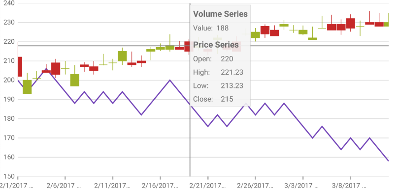
This example demonstrates how to display tooltip information about the open, high, low, and close sales volumes for any point in a financial graph. This is achieved by creating custom tooltips that will display the volume value on LineSeries and the open, high, low, and close values on FinancialPriceSeries.
Figure 1: The XamDataChart control with custom tooltip showing values of Financial Price Series
Set the tooltip background and border settings.
In XAML:
<ig:XamDataChart x:Name="dataChart1"
                   ToolTipBackgroundColor="#80F4F4F4"
                   ToolTipBorderColor="#1E000000"
                   ToolTipBorderThickness="2">
   <!--TODO: Add Series with custom tooltip content -->
</ig:XamDataChart>
Add custom tooltip content to the ToolTipTemplate property of the Series object.
In XAML:
<ig:XamDataChart.Series>
  <ig:LineSeries ItemsSource="{Binding}"
                 ValueMemberPath="Volume"
                 XAxis="{x:Reference commonXAxis}"
                 YAxis="{x:Reference volumnYAxis}"
                 Title="Volume Series">
    <ig:LineSeries.ToolTipTemplate>
      <DataTemplate>
        <StackLayout Orientation="Vertical" Margin="5">
          <Label Text="{Binding Series.Title}" FontAttributes="Bold" />
          <StackLayout Orientation="Horizontal">
            <Label Text="Value:" FontSize="12"/>
            <Label Text="{Binding Item.Volume}" FontSize="12"/>
          </StackLayout>
        </StackLayout>
      </DataTemplate>
    </ig:LineSeries.ToolTipTemplate>
  </ig:LineSeries>
  <ig:FinancialPriceSeries DisplayType="Candlestick"
                           ItemsSource="{Binding}"
                           OpenMemberPath="Open"
                           CloseMemberPath="Close"
                           HighMemberPath="High"
                           LowMemberPath="Low"
                           VolumeMemberPath="Volume"
                           XAxis="{x:Reference commonXAxis}"
                           YAxis="{x:Reference priceYAxis}"
                           Title="Price Series">
    <ig:FinancialPriceSeries.ToolTipTemplate>
      <DataTemplate>
        <StackLayout Orientation="Vertical" Margin="5">
          <Label Text="{Binding Series.Title}" FontAttributes="Bold" />
          <StackLayout Orientation="Horizontal">
            <Label Text="Open:" WidthRequest="40" FontSize="12"/>
            <Label Text="{Binding Item.Open}" FontSize="12"/>
          </StackLayout>
          <StackLayout Orientation="Horizontal">
            <Label Text="High:" WidthRequest="40" FontSize="12"/>
            <Label Text="{Binding Item.High, StringFormat='{0:N2}'}" FontSize="12"/>
          </StackLayout>
          <StackLayout Orientation="Horizontal">
            <Label Text="Low:" WidthRequest="40" FontSize="12"/>
            <Label Text="{Binding Item.Low, StringFormat='{0:N2}'}" FontSize="12"/>
          </StackLayout>
          <StackLayout Orientation="Horizontal">
            <Label Text="Close:" WidthRequest="40" FontSize="12"/>
            <Label Text="{Binding Item.Close}" FontSize="12"/>
          </StackLayout>
        </StackLayout>
      </DataTemplate>
    </ig:FinancialPriceSeries.ToolTipTemplate>
  </ig:FinancialPriceSeries>
</ig:XamDataChart.Series>