<ig:XamDataGrid RowSeparatorHeight="4"
                RowHeight="50">
    <ig:XamDataGrid.RowSeparator>
        <ig:RowSeparator Background="Blue"/>
    </ig:XamDataGrid.RowSeparator>
</ig:XamDataGrid>This topic is designed to get you up and running as quickly as possible with customizing the visual appearance of the XamDataGrid Control, by describing the basic steps required for styling textual and associated elements of the XamDataGrid control.
This topic contains the following sections
The following topics are prerequisites to understanding this topic:
The XamDataGrid control exposes the following properties for styling row elements:
The following example will walk you through modifying all these styling behaviors to customize the high level appearance of the XamDataGrid control.
Add to the following code snippet to the main code file.
In XAML
<ig:XamDataGrid RowSeparatorHeight="4"
RowHeight="50">
<ig:XamDataGrid.RowSeparator>
<ig:RowSeparator Background="Blue"/>
</ig:XamDataGrid.RowSeparator>
</ig:XamDataGrid>In C#:
DataGrid.RowSeparator = new RowSeparator();
DataGrid.RowSeparator.Background = new SolidColorBrush(Color.Blue);
DataGrid.RowSeparatorHeight = 5;
DataGrid.RowHeight = 50;
Save and run your application to verify the change in appearance. The RowSeparator will appear with a blue background with a height of five pixels.

The XamDataGrid control’s Header object exposes several methods for modifying the visual appearance of its Header as well as its text.
The following example will walk you through a basic scenario for customizing the appearance for the XamDataGrid control’s Column headers, by utilizing several appearance methods for the header element and the headers text.
Add to the following code snippet to the main code file.
In C#:
TextColumn nameColumn = new TextColumn();
nameColumn.PropertyPath = "FirstName";
nameColumn.HeaderText = "FirstName";

NumericColumn salesColumn = new NumericColumn();
salesColumn.PropertyPath = "Sales";
salesColumn.HeaderText = "Sales";

TextColumn territoryColumn = new TextColumn();
territoryColumn.PropertyPath = "Territory";
territoryColumn.HeaderText = "Territory";

DataGrid.Columns.Add(nameColumn);
DataGrid.Columns.Add(salesColumn);
DataGrid.Columns.Add(territoryColumn);
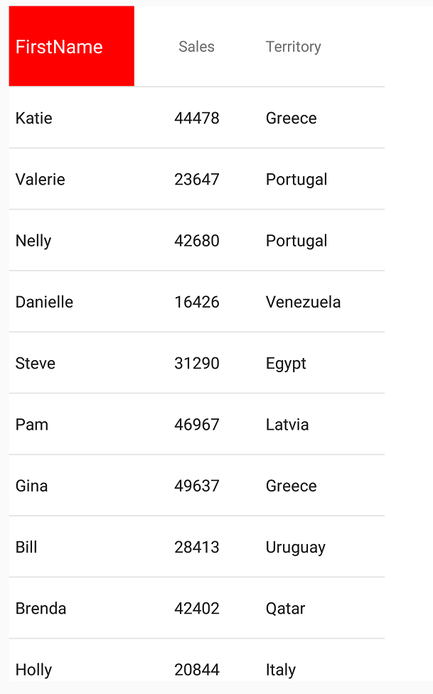
Create an instance of the TextHeader class with following properties:
font size - 15
background color - red
text color - white
In C#:
var header = new TextHeader();
header.Background = new SolidColorBrush(Color.Red);
header.TextColor = new SolidColorBrush(Color.White);
header.FontSize = 15;
nameColumn.Header = header;
Alternatively, you could also get the exact instance of the Header object that represents the nameColumn, and modify that instance directly; all property changes using this approach will propagate to the XamDataGrid control’s UI; the following code snippet demonstrates this approach.
In C#:
var header = nameColumn.Header;
header.Background = new SolidColorBrush(Color.Red);
header.TextColor = new SolidColorBrush(Color.White);
header.FontSize = 15;
Save and run your application to verify the result, as demonstrated in the following screenshot.

The Column object also exposes several methods for modifying the visual components of its contained cells in aggregate, including the Column’s width, text alignment and text appearance.
This example walks through the customization of the appearance for columns within the XamDataGrid for column elements as well as the content contained within the column’s associated cells.
This example assumes you have created the SampleGridApp project as demonstrated in the Working with Columns topic.
Add to the following code snippet to the main code file.
In C#:
TextColumn nameColumn = new TextColumn();
nameColumn.PropertyPath = "FirstName";
nameColumn.HeaderText = "FirstName";

NumericColumn salesColumn = new NumericColumn();
salesColumn.PropertyPath = "Sales";
salesColumn.HeaderText = "Sales";

TextColumn territoryColumn = new TextColumn();
territoryColumn.PropertyPath = "Territory";
territoryColumn.HeaderText = "Territory";

DataGrid.Columns.Add(nameColumn);
DataGrid.Columns.Add(salesColumn);
DataGrid.Columns.Add(territoryColumn);
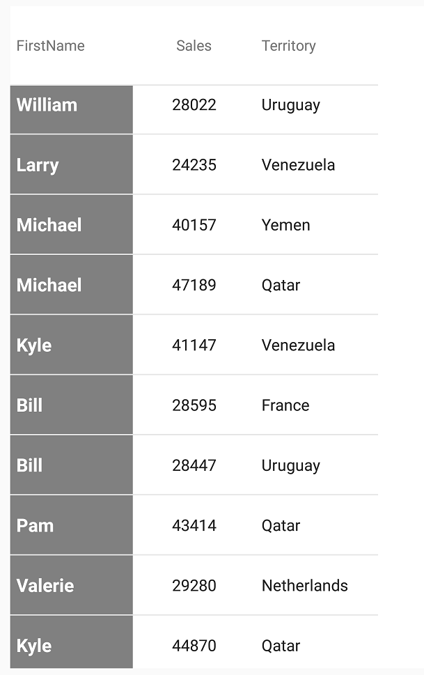
Modify the style of the nameColumn’s Column by setting the following properties:
background color - gray
text color - white
font style - bold
font size - 15
In C#:
nameColumn.FontSize = 15;
nameColumn.FontAttributes = FontAttributes.Bold;
nameColumn.Background = new SolidColorBrush(Color.Gray);
nameColumn.TextColor = new SolidColorBrush(Color.White);
Save and run the SampleGridApp to verify the result.

The following table lists topics that are related to this topic: