This topic explains, with code examples, how to configure the needle of the XamLinearGauge™ control. This includes the value indicated by the needle, its width, position, and formatting.
The following topics are prerequisites to understanding this topic:
This topic contains the following sections:
Configuring the needle includes specifying the needle’s shape and size and its position across and along the scale. Further customizations can include configuring the look-and-feel of the needle (in terms of border thickness and color and fill color) .The shape of the needle is specified by setting the NeedleShape property to one of the pre-defined needle shape types or to the custom needle type. The pre-defined needle shapes are
Needle
Rectangle
Trapezoid
Triangle
The default needle shape is Needle which defines a rectangular needle body with a triangular point, like this:

The custom needle shape type is specified by setting the NeedleShape property to “Custom” .
The pre-defined shapes are customizable. If you use any of the pre-defined needle shapes without customizing the shape, you are configuring a basic needle. Selecting either a custom shape or further customizing a pre-defined shape through its extent-type or width-based properties is considered configuring a custom needle.
Along the scale, the needle is always positioned at the value specified by the Value property.
The needle’s position in the across-the-scale dimension is configurable relative to the edges of the Graph area through the NeedleInnerExtent and NeedleOuterExtent properties. The needle shape is configured through the NeedleShape property. There are multiple predefined shapes that can be used for the needle. Custom shapes are also supported.

The look-and-feel of the needle can be customized in terms of fill color, border color, and border thickness using the respective properties ( NeedleBrush, NeedleOutline, and NeedleStrokeThickness).
The following table explains briefly the configurable aspects of XamLinearGauge control’s needle and maps them to properties that manage them.
The following table maps the desired behavior to its respective property settings.
Configuring the needle shape can be done for either the existing pre-defined shapes or to a custom shape. In the latter case, you can create an entirely new needle shape.
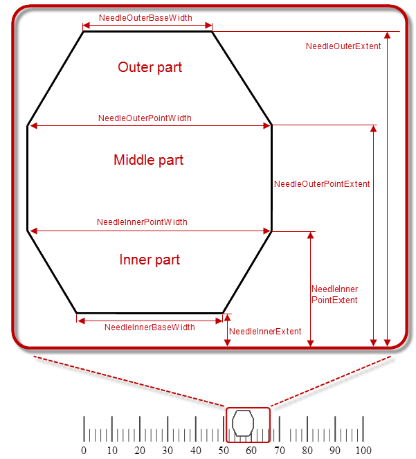
The needle shape is configured by setting the properties controlling the various widths and extents. These properties define the three basic parts which form the desired needle shape. The basic parts are (from top to bottom at vertical orientation):
Outer part – the part of the needle that is farthest from the scale
Middle part – the part between the Outer segment and the Inner segment. It shares its width-related properties with the other two segments.
Inner part – the part of the needle that is closest the scale
The following picture illustrates the properties related to the needle shape when horizontal orientation is used. For explanations of the properties, refer to Property reference.

The properties configuring the needle fall into two general types based on whether they configure the breadth of the needle or its extent from the scale:
Extent-type properties ( NeedleInnerExtent, NeedleInnerPointExtent, NeedleOuterPointExtent, NeedleOuterExtent)
Configure the needle shape and position in the across-the-scale dimension, relative to the inner edge of the Graph area. Their values represent the relative part of the breadth of the Graph area in the across-the-scale dimension presented as a decimal fraction of 1 (e.g. _0.2 ), with 0 denoting the inner edge of the graph area and 1 – its outer edge.
Width-related properties ( NeedleInnerBaseWidth, NeedleOuterBaseWidth, NeedleInnerPointWidth, NeedleOuterPointWidth)
Denote settings defined as a relative part of a base value set with the NeedleBreadth property. That relative part is presented as a decimal fraction of 1, for example, if the NeedleBreadth is set to 20 and the NeedleOuterBaseWidth is 0.5 , the actual size of the outer base segment will be 10 pixels (20 x 0.5 = 10).
The full set of the properties applies when you are configuring a custom shape(the NeedleShape property is “Custom” ). To pre-defined shape types, only a subset of these widths and extents apply because drawing these shapes do not require all three basic shapes.
Following are the properties you need to use to use to configure the basic parts of a custom needle:
Outer part properties:
NeedleOuterPointExtent – common for the Outer and Middle basic parts
NeedleOuterPointWidth – common for the Outer and Middle basic parts
Middle part properties:
NeedleOuterPointExtent – common for the Outer and Middle basic parts
NeedleInnerPointExtent – common for the Inner and Middle basic parts
NeedleOuterPointWidth – common for the Outer and Middle basic parts
NeedleInnerPointWidth – common for the Inner and Middle basic parts
Inner part properties:
NeedleInnerPointExtent – common for the Inner and Middle basic parts
NeedleInnerPointWidth – common for the Inner and Middle basic parts
The following table shows which shape configuration properties you need to set when customizing a particular needle shape type. For details on the meaning of the properties and their settings, see Property reference.
The following table explains briefly the properties that configure the needle shape and maps them to the shape types and parts to which they apply. The properties are listed alphabetically.
The following table lists the code examples included in this topic.
This example demonstrates setting the default needle with customize look-and-feel (brown border, 3 pixels thick, and orange fill).
The screenshot below demonstrates how the XamLinearGauge looks as a result of the following settings:

Following is the code that implements this example.
In XAML:
<ig:XamLinearGauge x:Name="linearGauge"
               Value="85"
               NeedleBrush="Orange"
               NeedleOutline="Brown"
               NeedleStrokeThickness="3"/>
In C#:
linearGauge.NeedleBrush = new SolidColorBrush(Color.FromRgb(255, 128, 0));
linearGauge.NeedleOutline = new SolidColorBrush(Color.FromRgb(102, 51, 0));
linearGauge.NeedleStrokeThickness = 3;
linearGauge.Value = 85;The screenshot below demonstrates defining a custom (butterfly-shaped) needle as a result of the following settings:

Following is the code that implements this example.
In XAML:
<ig:XamLinearGauge x:Name="linearGauge"
                     NeedleShape="Custom"
                     Value="50"
                     NeedleInnerExtent=".4"
                     NeedleOuterExtent=".6"
                     NeedleInnerPointExtent="0.1"
                     NeedleOuterPointExtent=".9"
                     NeedleInnerBaseWidth="0"
                     NeedleOuterBaseWidth=".1"
                     NeedleInnerPointWidth=".3"
                     NeedleOuterPointWidth=".35"/>
In C#:
linearGauge.NeedleShape = LinearGraphNeedleShape.Custom;
linearGauge.Value = 50;
linearGauge.NeedleInnerExtent = .4;
linearGauge.NeedleOuterExtent = .6;
linearGauge.NeedleInnerPointExtent = .1;
linearGauge.NeedleOuterPointExtent = .9;
linearGauge.NeedleInnerBaseWidth = 0;
linearGauge.NeedleOuterBaseWidth = .1;
linearGauge.NeedleInnerPointWidth = .3;
linearGauge.NeedleOuterPointWidth = .35;The following topics provide additional information related to this topic.