You can open existing dashboards by selecting the dashboard thumbnail image in the initial view.
In this view, all the visualizations in a dashboard are in minimized state.
You can interact with visualizations in various ways. For instance, if the visualization is in grid view, you can scroll horizontally and vertically. The chart view supports zooming and panning. Also drill down & drill up actions become possible if the underlying data model supports it.
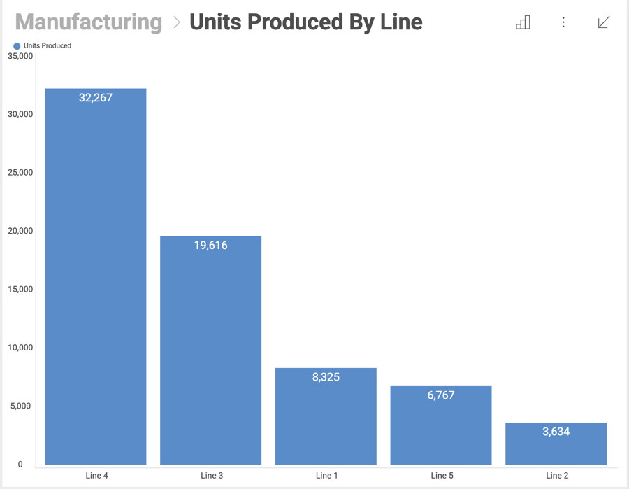
Once the dashboard is opened, you can maximize any of the dashboard visualizations by hovering over them and click/tap on the arrow in the right top corner.
The maximized view allows a larger display of the information.
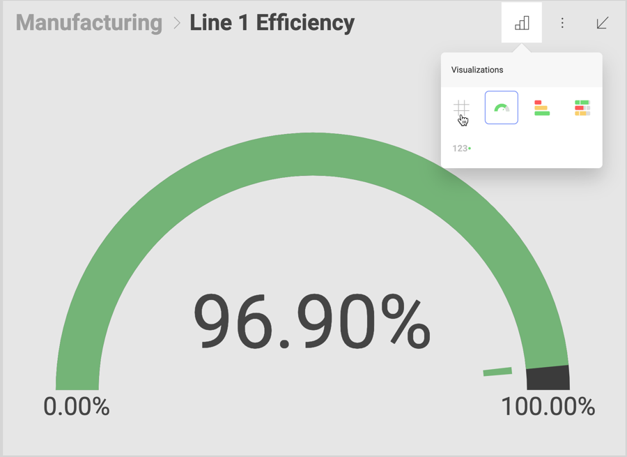
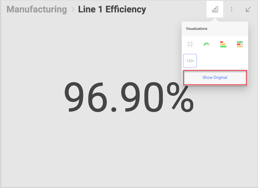
In this mode, you can also switch the maximized view to other visualizations or look at the data behind your chart by selecting the small chart icon in the top right corner. Different possibilities will be displayed depending on the starting visualization. The changes to the visualization will not be saved, unless you enter Edit mode (by selecting Edit from the overflow menu) and explicitly save the changes.
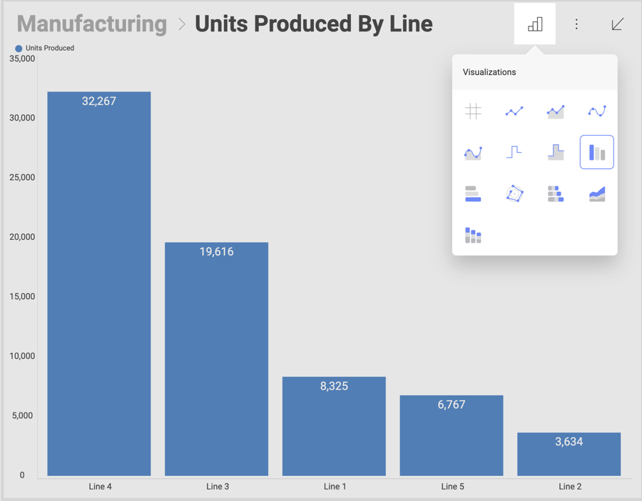
You can also switch views and look at the data behind your chart if you select on the hash sign icon in the top right corner of the Visualizations menu.
When viewing the data behind your visualization, you can apply sorting (ascending or descending). For more information on applying sorting to grids, check the Grid View topic.
If, at any point, you want to revert back to the original visualization, you can select the "Show Original" link.
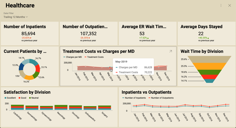
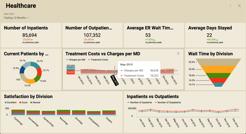
By clicking on particular visualizations (press and hold in touch environments), you can see tooltips popups. Tooltips help you see values at a particular point of your chart like:

To close regular tooltips just click or tap away.
In the Interactions menu you can enable two options: Hover tooltips and Crosshairs. Both are only available in Dashboard View mode. They can’t be used in Dashboard Edit mode.
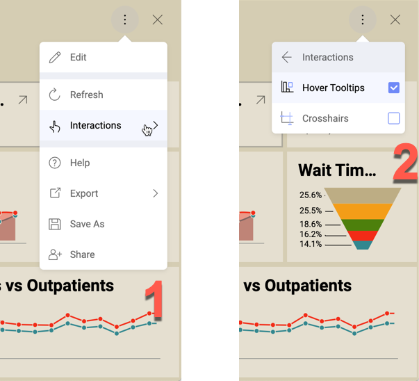
With Hover Tooltips enabled, you can see tooltips popups when you hover over data (press and hold in touch environments).
By clicking the data (releasing drag tooltips in touch environments), you can access the Tools section with tooltip interactions like drill down, drill up, or linked dashboards if applicable.
With Crosshairs enabled, Reveal shows crosshairs elements along with the tooltips. Giving more context to the tooltip.
Crosshairs are currently supported for the following data visualizations: Scatter, Bubble, Area, Candlestick, Line, Ohlc, Spline, SplineArea, StepArea, StepLine.
Candlestick and OHLC visualizations only display horizontal crosshairs. Including a vertical crosshair would make it difficult to see the lines on the data point.
When displaying tooltips, you can configure them to display total values by Category.
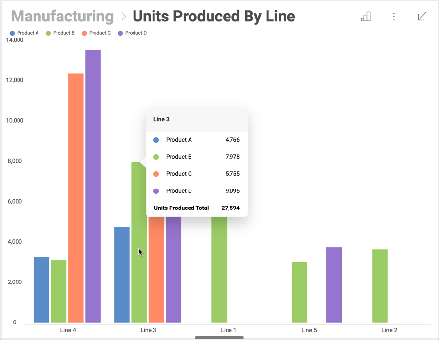
To enable this feature, go to Settings > Show Totals on Tooltip, like shown below:
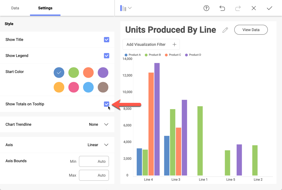
When enabling totals, make sure you added a Category to show multiple values in your visualization.
When first opening a dashboard, you will be browsing it in View mode. This mode allows you to navigate and filter the information displayed in it, but you won’t be able to change the dashboard definition.
In order to apply changes to a dashboard, you must switch to Dashboard Edit mode. You can do this by selecting Edit from the overflow menu in the top right corner of the dashboard. This enables editing options such as applying Auto Layout, a dashboard Theme or exporting the dashboard.
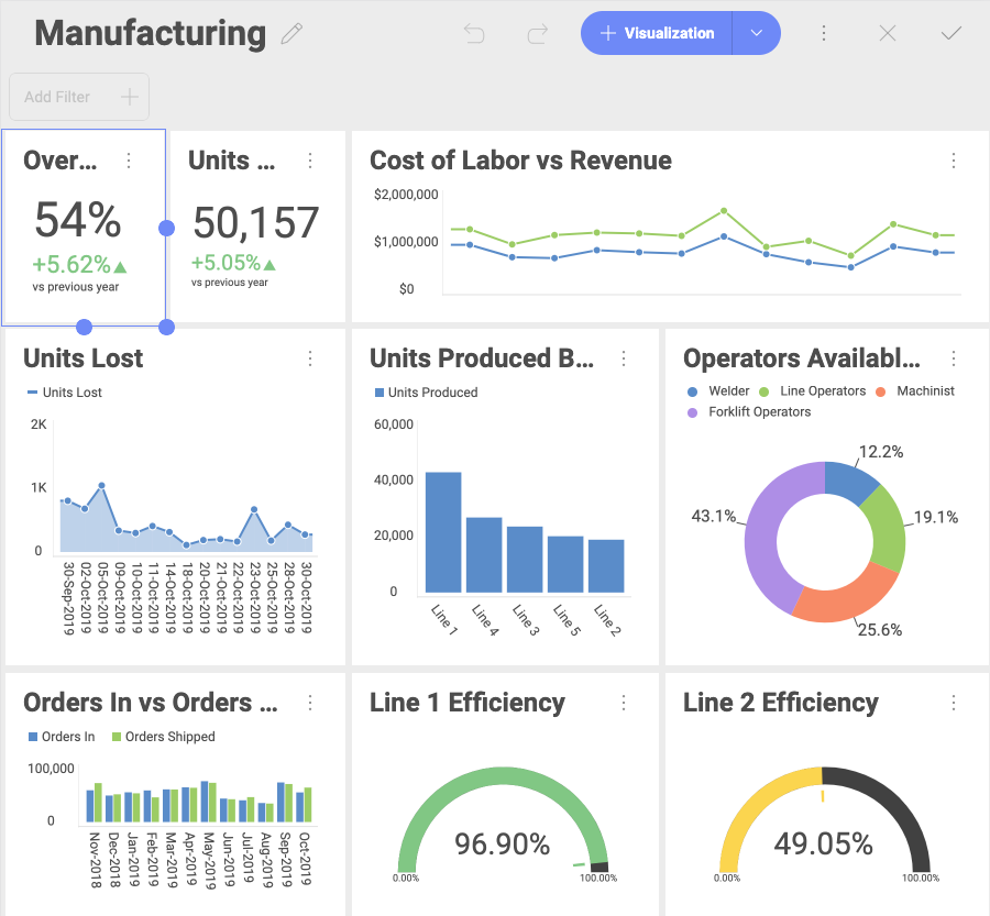
Shown below is a dashboard in Dashboard Edit mode:
To exit Edit mode, you only need to select the tick icon in the top right-hand corner. This switches back to View Mode.
It is possible to filter information at a dashboard or a visualization level.
Dashboard filters are available, when you open Dashboard Edit mode (select Edit from the overflow menu of your dashboard to access this mode). In the left top corner of the screen, you will see the current dashboard filters and an option to add new ones.
Visualization filters (a.k.a. Quick Filters) are displayed in maximized mode. You can find them in the top section of the visualization under the visualization’s name.
For more information on dashboard or visualization Filters, check out this section.
Reveal’s Auto Layout dynamically sizes all visualizations in your dashboard based on the size constraints of your device and on the amount of visualizations it has.

You can still resize visualizations while Auto Layout is enabled by dragging their corners downwards or the side.