Using the XamPieChart™ control to visualize OLAP data.
The following table summarizes the capabilities f the XamPieChart to control user interactions. Additional details follow.
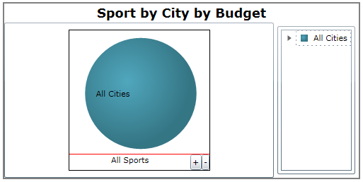
The XamPieChart that is bound to OLAP data contains sets of cubes (three dimensional data) consisting of rows, columns and measures.
In this example, the OlapAxisSource is set to Columns , meaning that the pie represents the columns and the slices represent the rows.
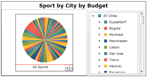
Each slice containing additional hierarchical data can be further expanded.
In the previous illustration, we stated that the XamPieChart contains three dimensional data. When you expand the rows dimension, all rows for a column will appear as slices on the pie.
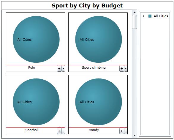
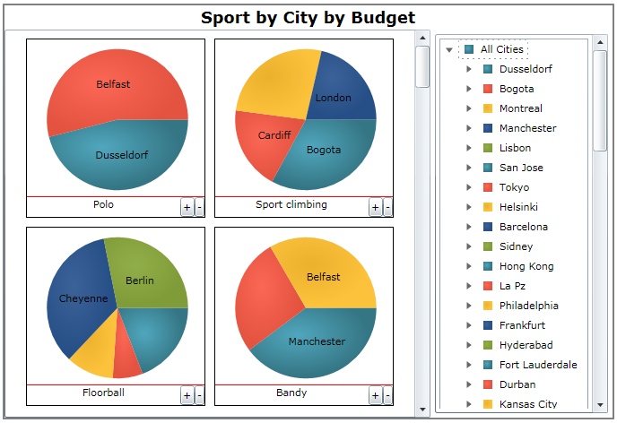
When you expand the columns dimension, depending on the number of columns, you will observe multiple pie charts per column. The reason for this is that the pie chart is not 3-dimensional. One PieChart can only have one column with one or more rows. So in order to represent a cube with a pie chart, the control needs to render multiple pies per column dimension.
Each pie chart can be expanded by clicking on the Plus/Minus symbol at the bottom of the pie or through the legend. Individual pie charts can be expanded if they contain further hierarchical data.
The following topic provides additional information related to this topic.