
This topic gives a brief overview of the new controls and features introduced in the Ultimate UI for WPF 2017 Volume 1 Release.
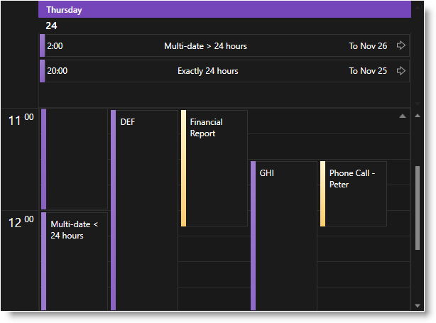
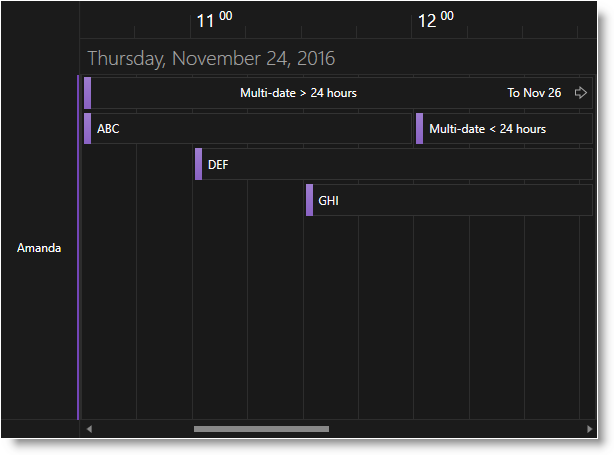
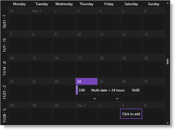
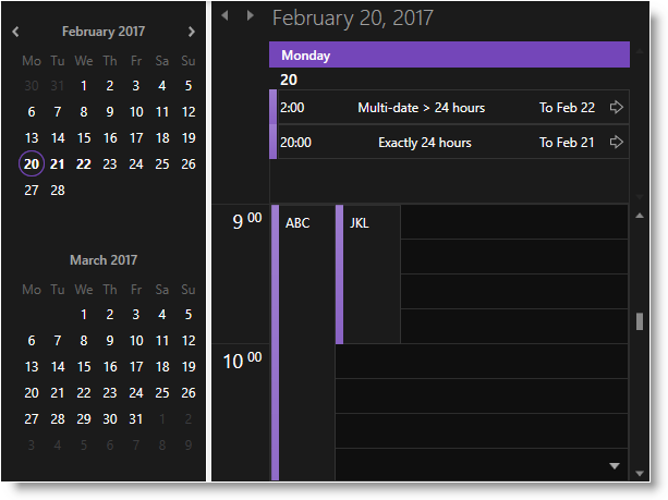
There is now a Royal Dark Theme for all views of the xamSchedule control.
xamDayView:
xamScheduleView:
xamMonthView:
xamOutlookCalendarView and xamDateNavigator:
The xamDiagram control now supports properties for restricting certain user interactions like entering editing mode, resizing and deleting.
Related topic:
Configuring User Interactions Restrictions (xamDiagram)
The xamDiagram control now supports configuring of the behavior when the Enter key is pressed in editing mode.
Related topic:
General Overview (xamDiagram)
The control now supports an easy way to hide the toolbox’s header using the HeaderVisibility property.
Related topic:
Configuring the Toolbox (xamDiagram)
The control now supports rendering of "line jumps" in case when two connections are intersecting.

There is a change in some properties' behavior when an item is dropped from the toolbox or copy-pasted:
DragDropData - this new property is copied using "shallow copy"
Content - this property is copied using "deep copy"
Related topic:
Dropping an Item from the Toolbox (xamDiagram)
The control now supports visualizing of error indicators when the data items are implementing the IDataErrorInfo interface.

Related topic:
IDataErrorInfo Support (xamDiagram)
The xamMaskedEditor and all other editors which extend from it (i.e. xamCurrencyEditor, xamNumericEditor, and xamDateTimeEditor) are now exposing a new property - SpinWrapBehavior of type SpinWrapBehavior which determines the value spinning behavior of the editor. Its default value is WrapAcrossSections which breaks the default spin wrap behavior of the editors comparing to the previous versions. This new property replaces the obsolete xamMaskedEditor's SpinWrap property.
The xamDateTimeEditor control now supports Japanese Imperial date format.

Related topics:
A new property IsNaNValueSupported of bool type is added to the xamNumericSlider and xamNumericRangeSlider controls.
The purpose of this property is to enable the support for NaN values and to allow further interactions with the slider. Until now, if a NaN value is set to the slider value – interactions using the mouse (thumb dragging, clicking on the +/- buttons for example) and the keyboard were disabled.
Related topics:
The xamPropertyGrid control now supports a new configurable Brush Resources panel in the brush editor.

Related topic:
Configuring Brush Resources (xamPropertyGrid)
The xamPropertyGrid control now supports a configurable option to hide the value of bound dependency properties.
Related topic:
Features Overview (xamPropertyGrid)
The xamPropertyGrid control now exposes a new AllowExpansionWhenUsingCustomEditor property on the PropertyGridPropertyItem class which allows you to configure the control to expand properties with custom editors defined via PropertyGridEditorDefinition.
New properties were added to deprecate properties for enabling chart zooming. The older properties are still useable to support backwards compatibility.
XamDataChart.HorizontalZoomable → XamDataChart.IsHorizontalZoomEnabled
XamDataChart.VerticalZoomable → XamDataChart.IsVerticalZoomEnabled
Related topic:
Chart Navigation
New properties were added to make styling various aspects of the pie chart simpler. These properties are:
A new property was added to the Geographic Map imagery called CacheSize. This property allows control over the maximum number of tiles that get cached by the map.
The property TilePath was also added to the OpenStreetMap imagery. This allows you to specify a URL pointing to the location where the OpenStreetMap tile images are obtained.
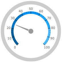
The gauges have had their default visuals updated for this release.
xamRadialGauge:
xamLinearGauge:

xamBulletGraph:
