
This topic provides systematic instructions on how to define an Application Menu 2010.
The following topics are prerequisites to understanding this topic:
This topic contains the following sections:
This procedure demonstrates adding a xamRibbon control to your page and defining an Application Menu 2010 therein.
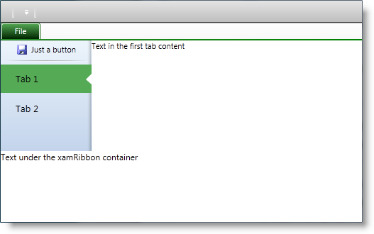
The following screenshot is a preview of the result.
To complete the procedure, you need the following:
Know how to add a xamRibbon control to you page
Following is a conceptual overview of the process:
Add a xamRibbon control to your page
Add an Application Menu 2010 to the xamRibbon control
Add a button to the Application Menu 2010
Add a separator to the Application Menu 2010
Add two tabs to the Application Menu 2010
The following steps demonstrate how to define an Application Menu 2010.
Add the xamRibbon control to your page and set its ApplicationMenuMode property to Office2010 . To change the accent color, used by the Application Menu 2010, set the ApplicationAccentColor property.
For more information look at the Code Example: Add a xamRibbon
Create an instance of the ApplicationMenu2010 class and set it to the ApplicationMenu2010 property of the xamRibbon control. The ApplicationMenu2010 class is an ItemsControl derived class adding all of the buttons, tabs and separators to its Items collection.
For more information look at the Code Example: Add an Application Menu 2010
Create an instance of the ApplicationMenu2010Item class and add it to the Items collection of the ApplicationMenu2010 class instance created in the previous step. Being derived from HeaderedContentControl class, the ApplicationMenuItem class allowing you to set the Header and Image properties to customize your button.
For more information refer to the Code Example: Add a Button
Create an instance of the ApplicationMenu2010Separator class (derived from the System.Windows.Controls.Separator class) and add it to the ApplicationMenu2010 class’ Items collection.
For more information look at the Code Example: Add a Separator
Create two instances of the ApplicationMenu2010Item class and add them to the ApplicationMenu2010 class’ Items collection. Set a name to the tab using the Header property. Set the Content property of both tabs to a value of your choice. The content renders on the right side of the backstage.
For more information refer to the Code Example: Add a Tab
The following table lists the code examples included in this topic.
Demonstrates adding the xamRibbon control to your page.
In XAML:
<igRibbon:XamRibbon
    x:Name="myRibbon"
    Theme="IGTheme"
    ApplicationMenuMode="Office2010"
    ApplicationAccentColor="Green">
<!-- add Application Menu 2010 here -->
</igRibbon:XamRibbon>Demonstrates adding the Application Menu 2010 to the xamRibbon .
In XAML:
<igRibbon:XamRibbon.ApplicationMenu2010>
    <igRibbon:ApplicationMenu2010 Caption="File">
        <igRibbon:ApplicationMenu2010.Items>
        <!-- add buttons, tabs and separators here -->
        </igRibbon:ApplicationMenu2010.Items>
    </igRibbon:ApplicationMenu2010>
</igRibbon:XamRibbon.ApplicationMenu2010>Demonstrates adding a button to the Application Menu 2010.
In XAML:
<igRibbon:ApplicationMenu2010Item
    Image="/Ribbon.WPF;component/Images/Save_16x16.png">
    <igRibbon:ApplicationMenu2010Item.Header>
        <TextBlock Margin="5,0,0,0" Text="Just a button" />
    </igRibbon:ApplicationMenu2010Item.Header>
</igRibbon:ApplicationMenu2010Item>Demonstrates adding a separator to the Application Menu 2010.
In XAML:
<igRibbon:ApplicationMenu2010Separator />Demonstrates adding a tab to the Application Menu 2010.
In XAML:
<igRibbon:ApplicationMenu2010Item Header="Tab 1">
    <igRibbon:ApplicationMenu2010Item.Content>
        <TextBlock Text="Text in the first tab content" />
    </igRibbon:ApplicationMenu2010Item.Content>
</igRibbon:ApplicationMenu2010Item>This is the complete code showing how to add an Application Menu 2010 with one button and two tabs.
In XAML:
<Window x:Class="Ribbon.WPF.MainWindow"
        xmlns="http://schemas.microsoft.com/winfx/2006/xaml/presentation"
        xmlns:x="http://schemas.microsoft.com/winfx/2006/xaml"
        xmlns:igRibbon="http://infragistics.com/Ribbon"
        Title="MainWindow" Height="350" Width="525">
    <Grid>
        <Grid.RowDefinitions>
            <RowDefinition Height="*" />
            <RowDefinition Height="100" />
        </Grid.RowDefinitions>
        <Grid Grid.Row="0"
            igRibbon:ApplicationMenu2010.IsConstrainingElement="True">
            <igRibbon:XamRibbon x:Name="myRibbon" Theme="IGTheme"
                ApplicationMenuMode="Office2010" ApplicationAccentColor="Green">
                <igRibbon:XamRibbon.ApplicationMenu2010>
                    <igRibbon:ApplicationMenu2010 Caption="File">
                        <igRibbon:ApplicationMenu2010.Items>
                            <igRibbon:ApplicationMenu2010Item
                            Image="/Ribbon.WPF;component/Images/Save_16x16.png">
                                <igRibbon:ApplicationMenu2010Item.Header>
                                    <TextBlock Margin="5,0,0,0"
                                        Text="Just a button" />
                                </igRibbon:ApplicationMenu2010Item.Header>
                            </igRibbon:ApplicationMenu2010Item>
                            <igRibbon:ApplicationMenu2010Separator />
                            <igRibbon:ApplicationMenu2010Item Header="Tab 1">
                                <igRibbon:ApplicationMenu2010Item.Content>
                                    <TextBlock
                                    Text="Text in the first tab content" />
                                </igRibbon:ApplicationMenu2010Item.Content>
                            </igRibbon:ApplicationMenu2010Item>
                            <igRibbon:ApplicationMenu2010Item Header="Tab 2">
                                <igRibbon:ApplicationMenu2010Item.Content>
                                    <TextBlock
                                    Text="Text in the second tab content" />
                                </igRibbon:ApplicationMenu2010Item.Content>
                            </igRibbon:ApplicationMenu2010Item>
                        </igRibbon:ApplicationMenu2010.Items>
                   </igRibbon:ApplicationMenu2010>
                </igRibbon:XamRibbon.ApplicationMenu2010>
            </igRibbon:XamRibbon>
        </Grid>
        <Grid Grid.Row="1">
            <TextBlock Text="Text under the xamRibbon container" />
        </Grid>
    </Grid>
</Window>The following topics provide additional information related to this topic.