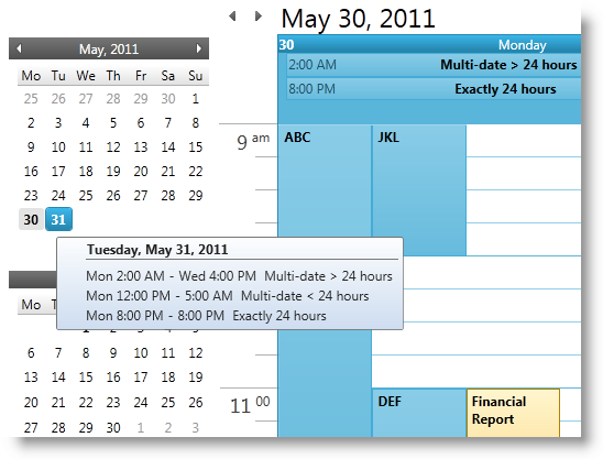
This is one of the five topics explaining the views of the xamSchedule controls:
xamDateNavigator (This is the current topic)
This topic is organized in sections as follows:
Introduction
Purpose
xamDateNavigator Configuration Options
Related Topics
The xamDateNavigator™ control replicates the date navigator portion of the Outlook 2010 user interface. As a part of the larger xamSchedule system, the navigator control follows many of the existing API patterns established by other schedule visual controls like xamMonthView and xamDayView. (Figure 1)

The xamDateNavigator is a Silverlgiht/WPF cross platform control derived from the CalendarBase class. Therefore, the control has both a visual and functional resemblance with the xamCalendar™ control. In addition, it exposes properties related to the schedule control suite:
The purpose of this control is to navigate the xamOutlookCalendarView and to provide visual representation of the days with activities and display tooltips with activities information.
DataManager - The xamDateNavigator requires its DataManager property to be set in order to synchronize its color scheme as well as highlight days with activity and display activity tooltips.
In XAML:
<ig:XamDateNavigator x:Name="myDateNavigator"
DataManager="{Binding ElementName=dataManager}" />ActivityToolTipTemplate – Use this property to supply a custom template that will be used to show a day’s worth of activity in a tooltip when the user hovers the cursor over a day. This is used only if the ShowActivityTooltips property is set to true.
In XAML:
<ig:XamDateNavigator x:Name="myDateNavigator"
    ActivityToolTipTemplate="{StaticResource toolTipTemplate}" />
ShowActivityToolTips – This property defaults to true. If left true the control displays a tooltip when the user hovers over a day. The tooltip contains a list of activities for the associated day. If the day doesn’t contain any activity then no tooltip is displayed.
In XAML:
<ig:XamDateNavigator x:Name="myDateNavigator"
    ShowActivityToolTips="True" />
HighlightDayCriteria – This enum property determines which days are highlighted (i.e. whose text is bolded). The values are ‘All’, ‘None’, ‘Workdays’ and ‘DaysWithActivity’ which is the default value.
In XAML:
<ig:XamDateNavigator x:Name="myDateNavigator"
    HighlightDayCriteria="DaysWithActivity" />