This topic explains the Application Menu 2010’s KeyTips feature.
The following topics are prerequisites to understanding this topic:
This topic contains the following sections:
KeyTips are visual cues that help users navigating through the information and controls placed in the xamRibbon and the Application Menu 2010. Although the xamRibbon control automatically assigns some of the KeyTips, they are customizable. However, there are other controls that do not support automatic KeyTips, you may configure these. The KeyTips are shown by pressing the ALT key and at this point the user have to press the key (or the keys one after another) shown on the KeyTip to activate a particular feature. The KeyTips are grouped based on the containers in which the controls are grouped. Pressing the key for a KeyTip assigned to a group, hides all of the KeyTips at the current group control and displays all of the KeyTips for the next group. Pressing the Escape key hides the current group KeyTips and shows the KeyTips from the parent group.
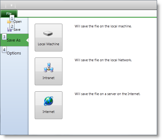
The screenshots below shows an Application Menu 2010 with KeyTips visible for the left side of the backstage:

The screenshot below shows an Application Menu 2010 after pressing the KeyTip “3” on the previous screenshot:
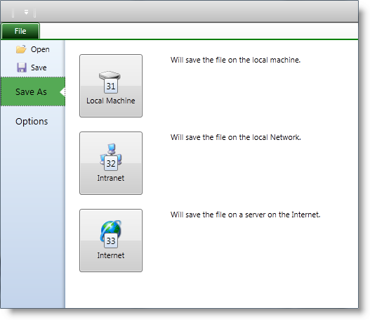
The xamRibbon control automatically adds KeyTips on the left side of the backstage. You can overwrite their default values by setting the KeyTip property of the ApplicationMenu2010Item class.
The xamRibbon control does not automatically assign KeyTips on the right side of the backstage. To assign a KeyTip use the attached property KeyTipProvider of the ApplicationMenu2010Item class, which is of an ElementKeyTipProvider type. You may set the KeyTip property of the ElementKeyTipProvider class to a value of your choice, or the xamRibbon will automatically generate a non-used KeyTip for you.
Access the KeyTips on the right side of the backstage based of the containers in which the controls are nested.
The screenshot below shows an Application Menu 2010, with KeyTips shown after selecting the second tab:
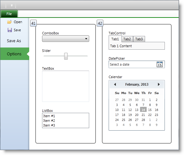
In this case, the controls on the right side of the backstage are grouped in 2 Border containers. Both Border containers have assigned KeyTips, and the KeyTips are shown – “41” and “42”.
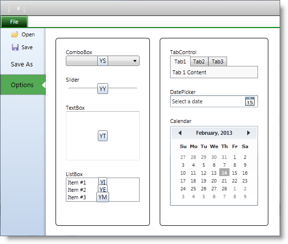
The screenshot below shows that the left Border was selected (using the KeyTip with value “41”) and now all control nested in the left Border are with visible KeyTips:
The following table lists the code examples included in this topic.
This example illustrates assigning a KeyTip to an ApplicationMenu2010Item object with a value of, “1.”
In XAML:
<igRibbon:ApplicationMenu2010Item KeyTip="1">
    <igRibbon:ApplicationMenu2010Item.Header>
        <TextBlock Text="Open" />
    </igRibbon:ApplicationMenu2010Item.Header>
</igRibbon:ApplicationMenu2010Item>This example illustrates assigning a KeyTip to a Button object with a value of, “B1.” That is to say that the user needs to press “B” and “1” sequentially to activate the button.
In XAML:
<Button Content="Press Me">
    <igRibbon:ApplicationMenu2010Item.KeyTipProvider>
        <igRibbon:ElementKeyTipProvider KeyTip="B1" />
    </igRibbon:ApplicationMenu2010Item.KeyTipProvider>
</Button>The following topics provide additional information related to this topic.