
This topic explains how to use the context menu provided by the xamDiagram™ control.
The following topics are prerequisites to understanding this topic:
This topic contains the following sections:
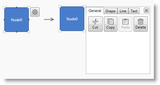
The diagram items of the xamDiagram control can be configured using the context menu functionality of the control. It is represented by an options pane which is opened upon diagram item’s (or items’) selection through a mouse click on the gear-like icon which then appears. By default, the context menu is disabled on the diagram.
It is possible to configure the placement of the options pane relative to the selected item(s). This allows for best user experience for diagram items configuration both by left-handed and right-handed users. The diagram provides a built-in functionality to read the system settings in terms of handedness, so that the menu appears at the most convenient place according to them. The so called “handedness” settings specify where menus would appear depending on the hand you use to write - if left, the menus appear to the right and in the contrary case, the menus appear to the left. They can be accessed via the “Tablet PC Settings” menu. For details, see the MSDN article on handedness. By default the options pane appears opens to the right of the item(s).
Opening and closing the options pane programmatically is also possible through the ShowOptionsPane and CloseOptionsPane commands. (For more information on commands used in xamDiagram , see Configuring UI Elements with Commands.)
Various properties of the diagram items can be configured using the options pane, such as fill, size, font family etc. They are logically grouped in relevant sections: Shape , Path and Line , depending on the type of the object they can be applied to. Copy-pasting operations’ (copy, paste, delete etc.) commands can also be invoked by an interaction with its UI. These options are placed in the General tab. (For details on the configurable aspects and operations see Options Pane Configurable Aspects of Diagram Items.)
It is possible to place the options pane of the diagram somewhere outside its space. In this use case, the DiagramOptionsPane instance should indicate the diagram it belongs to by providing it as a value to its DiagramOptionsPane.Diagram property.
The look of the options pane can be customized by overriding the template of the control. For the purpose of creating another implementation of a context menu (different from the options pane), the xamDiagram exposes a DiagramOptionsPaneDataContext class.
The following table explains briefly the configurable aspects of the diagram related to its context menu and maps them to the properties that configure them.
The visibility of the options pane (the ability to display it) is controlled through a property setting. It allows/ prevents the visualization of the gear-like icon ( ) which opens the options pane upon mouse click.
The following table maps the desired configuration to the property settings that manage it.
The screenshot below demonstrates options pane visibility configuration as a result of the following settings:

Following is the code that implements this example.
In XAML:
<ig:XamDiagram x:Name="diagram"
               Width="300"
               Height="250"
               Background="#F9F9F9"
               OptionsPaneVisibility=”Visible”>
    <ig:DiagramNode Position="5,125"/>
</ig:XamDiagram>The xamDiagram control provides functionality to specify the placement of its options pane relative to the selected item(s).
The following table maps the desired configuration to the property settings that manage it.
The screenshot below demonstrates the options pane placement as a result of the following settings:

Following is the code that implements this example.
In XAML:
<ig:XamDiagram x:Name="diagram"
               Width="330"
               Height="300"
               Background="#F9F9F9"
               OptionsPaneVisibility="Visible"
               OptionsPanePlacement="Left">
    <ig:DiagramNode Position="200,100"/>
</ig:XamDiagram>The copy-pasting operations which can be invoked using the options pane are always displayed in its first tab named “ General ” regardless of whether it is used to configure a node, a connection or a combination of them. The content of the buttons is self-descriptive for the operations which they control.

The following table visually illustrates the configuration options for the diagram nodes available in the options pane.
The following table visually illustrates the configuration options for the diagram connections available in the options pane.
As the context menu is used to configure both properties of diagram nodes and of diagram connections, if a selection has been done on the diagram space which contains both nodes and connections, the options pane will list only the properties which are common between the diagram items.

The following table visually illustrates the configuration options for a mixed selection of diagram items available in the options pane.
The following topics provide additional information related to this topic.
The following material (available outside the Infragistics® family of content) provides additional information related to this topic.


