Reveal allows you to change how the data in a visualization is displayed by sorting the data in ascending or descending order. In addition, it is also possible to sort your string and numeric fields by different fields in your original data source.
For more practical information, take a look at the following examples that showcase this functionality:
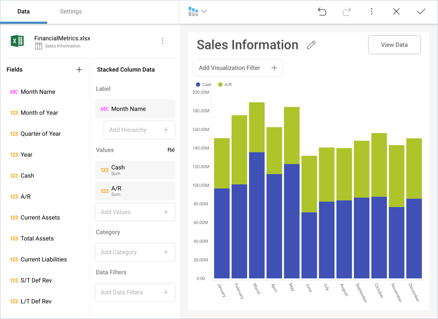
Let’s take a look at the following visualization, where we have plotted the cash and accounts receivable influxes for a company in a stacked column chart.
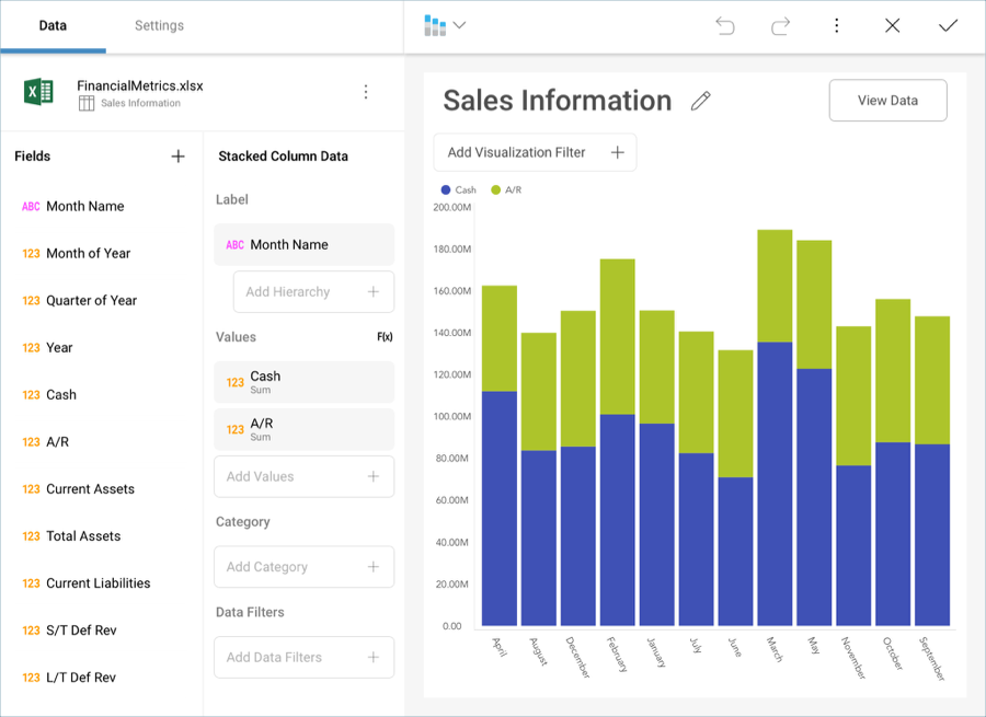
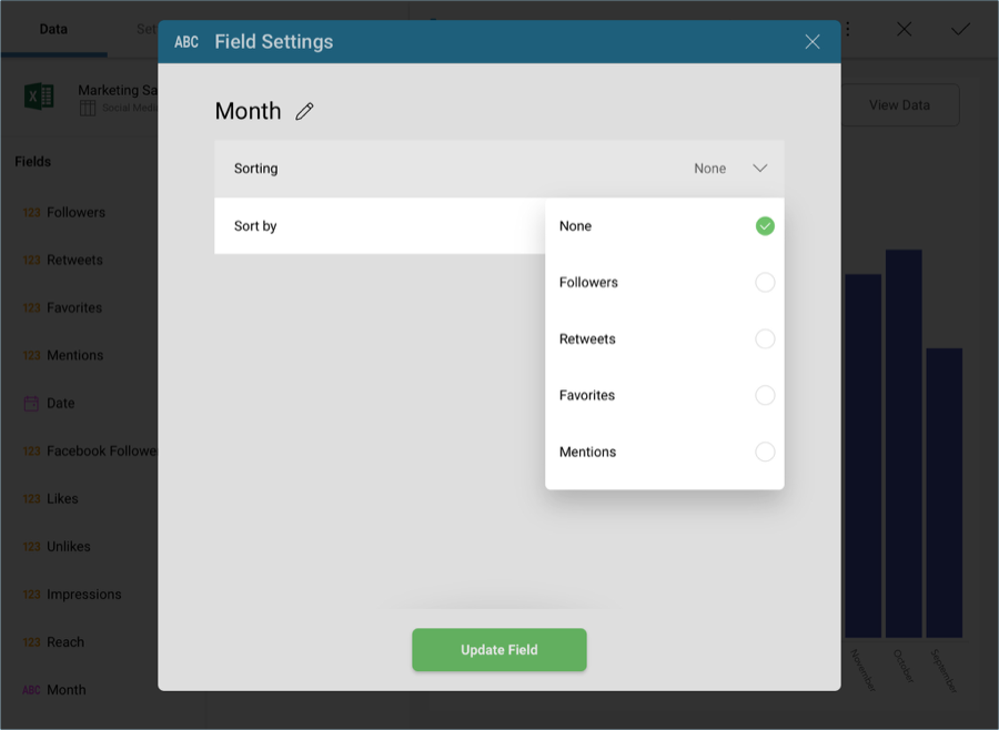
The values have been ordered by Month Name (a string field). However, the months have been sorted in alphabetical order by default, so the resulting visualization is not particularly useful for analysis.
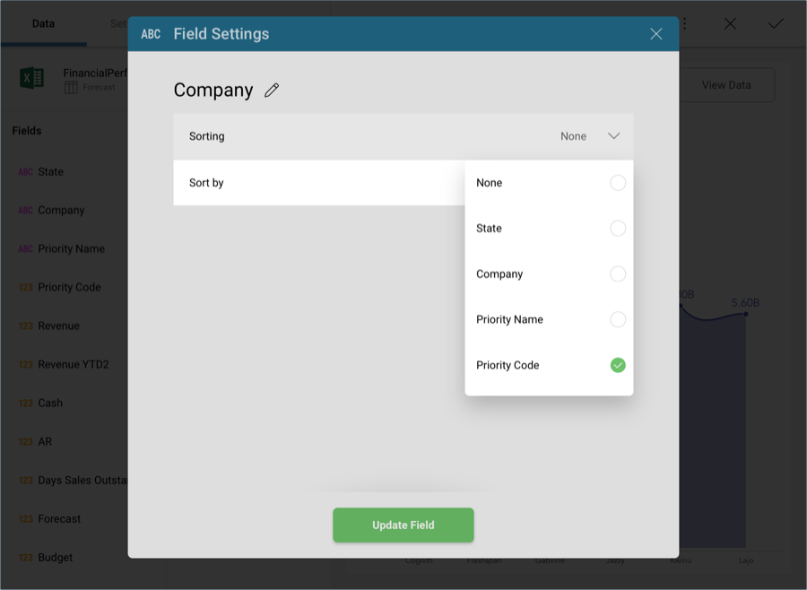
You can, however, change how the Month Name is displayed by changing its formatting and choosing to order the information by Month of Year. You might not necessarily want to display the 1-12 numbers in the Y axis (Month of Year), but you still want that order to prevail. Select the Month Name field in the label placeholder of the data editor, and select your desired sorting.
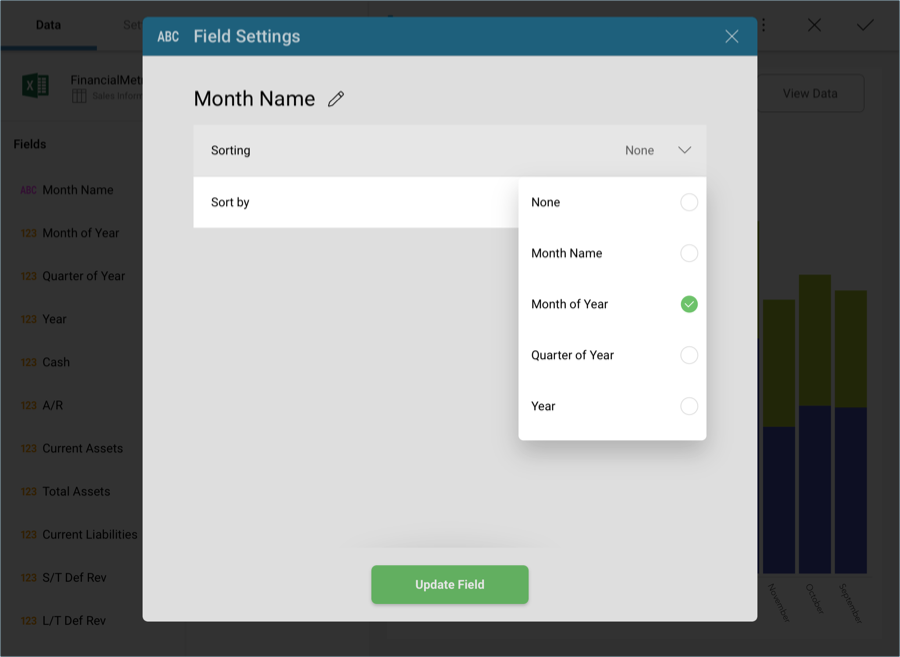
Once done, select Update Field. Your information will now be ordered in chronological order.
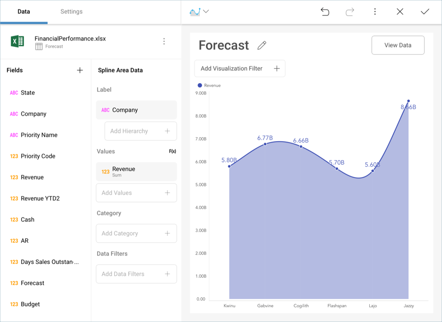
A different scenario, for example, would be to order a field based on a custom business logic in your spreadsheet. For example, the following is another visualization which displays the Revenue forecast for six companies in a spline area chart.
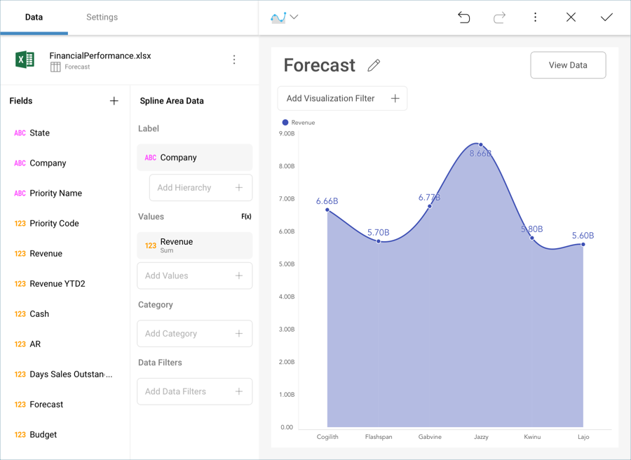
The names of the companies are ordered A-Z by default. However, the priority level assigned to them is different.
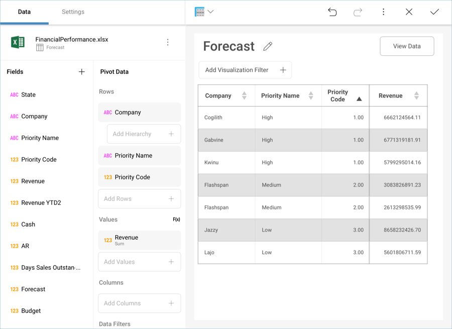
Organize the information in your chart by priority without actually dragging and dropping "Priority Code" into the data editor by using the "Sort By" field.
Your resulting widget, therefore, will place companies with "High" priority first, ordered A-Z, "Medium" priority companies after those, and, lastly, "Low" priority ones.