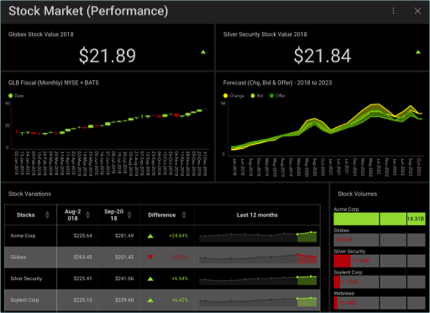
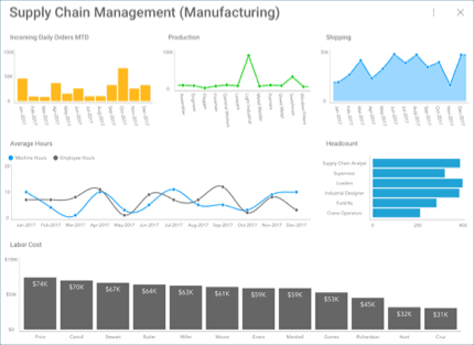
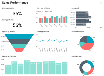
Dashboards are a quick and simple way to display minimal information at first sight. It is a data visualization composed of a collection of visualizations which are layed out to communicate the status, metrics, or performance of a business. Each visualization is meant to have different pieces of related information, enabling users to make sense of their data.
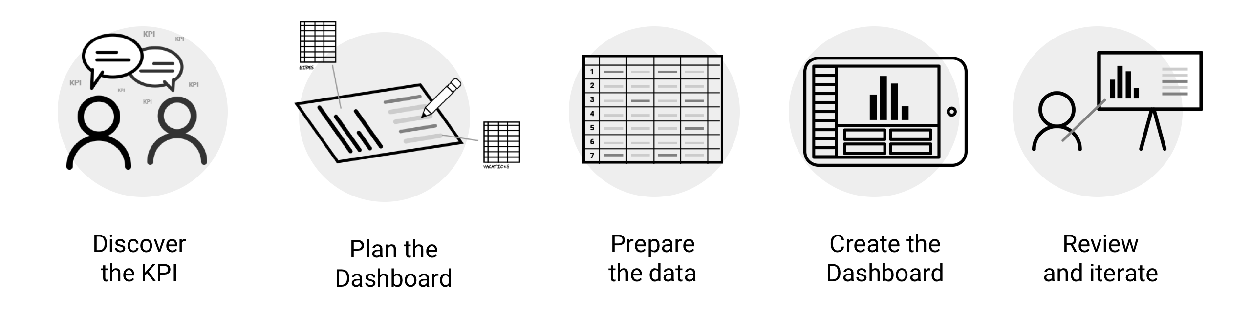
Discover the KPI: decide what you or your analysts want to show in your dashboard, and what it needs to revolve around.
Plan the Dashboard: how will you represent your information graphically? Will you use a grid, a map, gauges, category charts, or even a pyramid chart? Will you use any filters? If you want to see how to improve your data visualizations with any of the advanced Reveal features, check out this blog post!
Prepare the data to be used in Reveal. Here is a quick overview of how to work with spreadsheets in Reveal in older versions of Desktop and iOS.
Create the dashboard: for a complete walkthrough, access this topic.
Review and iterate: once your dashboard is ready, you can review it and make any changes you or your analysts deem necessary.
Within Reveal, you will be able to:
You can also import any dashboards created with previous versions of ReportPlus.
Learn the basics or refine your dashboard creation skills with tutorials designed to get you started and headed in the right direction.