Web Components Charts & Graphs Overview
Ignite UI for Web Components Charts & Graphs is an extensive library of data visualizations that enable stunning, interactive charts and dashboards for your web and mobile apps. Built for speed and beauty, designed to work on every modern browser, and with complete touch and interactivity, you can quickly and easily build responsive visuals into your next app on any device.
The Ignite UI for Web Components Charts support over 65 types of series and combinations that let you visualize any type of data, including Category Series, Financial Series, Polar Series, Radial Series, Range Series, Scatter Series, Shape Series, and Geospatial Series. No matter the type of comparison you are doing, or what type of data story you are trying to tell, you can represent your data in any of these ways:
- Change Over Time
- Comparison
- Correlation
- Distribution
- Geospatial
- Overview + Detail
- Part to Whole
- Ranking
Power your most demanding visualizations with Infragistics Web Components charting!
Web Components Chart and Graph Types
The Web Components product has over 65 different chart and graph types for any scenario – from a single chart display to an interactive dashboard. You can create Web Components charts like Pie, Bar, Area, Line, Point, Stacked, Donut, Scatter, Gauge, Polar, Treemap, Stock, Financial, Geospatial Maps and more for your mobile or web apps. The benefit of our Web Components chart vs. others is full support for features like:
- Responsive Web Design built in
- Interactive Panning and Zooming with Mouse, Keyboard and Touch
- Full Control of Chart Animation
- Chart Drill-Down Events
- Real-Time Streaming Support
- High-Volume (Millions of Data Points) Support
- Trends Lines and other Data Analysis features
Built with a modular design of axis, markers, series, legend, and annotation layers, the Web Components chart makes it easy to design a render any type of data story. Build a simple chart with a single data series, or build more complex data stories with multiple series of data, with multiple axis in composite views.
Category and Financial Chart vs. Data Chart
The Web Components Category and Financial Chart is what we refer to as our domain specific charts. It's a wrapper around Web Components Data Chart that assumes your domain is a category, or financial price series.
Choosing these specific domain charts allows to simplify the API and draw a lot of interfaces about the data to automatically configure the chart scenario, all without needing to explicitly define attributes such as axes, series, and annotations. In contrast, the data chart is very explicit and every critical part of the chart needs to be defined.
Domain charts are using a data chart at its core; so the same performance optimizations apply to both. The difference lies in whether they are trying to make things very easy to specify for the developer, or to be as flexible as possible. Web Components Data Chart is more verbose, unlocking all of our charting capabilities you need, allowing you to mix and match of any number of series, axes or annotation for example. For the category and financial charts, there might be a situation that cannot be easily done that the data chart is more suited for, such as a series with a scatter series with a numeric x axis.
It can be difficult to know which chart to pick at first. It's crucial to understand the type of series and how many additional features you want to present. For a more light-weight basic category or financial series, we recommend using one of the domain charts. For more advances scenarios we recommend using Web Components Data Chart, such as presenting something other than what is covered by the category chart's chartType property such as a stacked or scatter series, or numeric or time-based data. It's worth noting that the Web Components Financial Chart covers only column, OHLC bar, candlestick, and line series types.
We make Web Components Category and Financial Chart easier to use, the good news you can always switch to data chart in the future.
Web Components Bar Chart
The Web Components Bar Chart, or Bar Graph is among the most common category chart types used to quickly compare frequency, count, total, or average of data in different categories with data encoded by horizontal bars of equal width and differing lengths. They are ideal for showing variations in the value of an item over time, data distribution, sorted data ranking (high to low, worst to best). Data is represented using a collection of rectangles that extend from the left to right of the chart towards the values of data points. Learn more about our bar chart
Web Components Pie Chart
The Web Components Pie Chart, or Pie Graph, is a very common part-to-whole chart type. Part-to-whole charts show how categories (parts) of a data set add up to a total (whole) value. Categories are shown in proportion to other categories based on their value percentage to the total value being analyzed. A pie chart renders data values as sections in a circular, or pie-shaped graph. Each section, or pie slice, has an arc length proportional to its underlying data value. The total values represented by the pie slices represent a whole value, like 100 or 100%. Pie charts are perfect for small data sets and are easy to read at a quick glance. Learn more about our pie chart
Web Components Line Chart
The Web Components Line Chart, or Line Graph is a type of category line graph shows the continuous data values represented by points connected by straight line segments of one or more quantities over a period time for showing trends and performing comparative analysis. The Y-Axis (labels on left side) show a numeric value, while the X-Axis (bottom labels) are showing a time-series or comparison category. You can include one or more data sets to compare, which would render as multiple lines in the chart. Learn more about our line chart
Web Components Donut Chart
The Web Components Donut Chart or Donut Graph, is a variant of a Pie Chart, proportionally illustrating the occurrences of a variable in a circle to represents parts of a whole. The donut chart has a circular opening at the center of the pie chart, where a title or category explanation can be displayed. Donut charts can support multiple concentric rings, with built-in support for visualizing hierarchical data. Learn more about our Donut chart
Web Components Area Chart
The Web Components Area Chart is rendered using a collection of points connected by straight line segments with the area below the line filled in. Values are represented on the y-axis (labels on the left side) and categories are displayed on the x-axis (bottom labels). Area Charts emphasize the amount of change over a period of time or compare multiple items as well as the relationship of parts of a whole by displaying the total of the plotted values. Learn more about our area chart
Web Components Sparkline Chart
The Web Components Sparkline Chart, or Sparkline Graph is a type of category graph intended for rendering within a small-scale layout such as within a grid cell, or anywhere a word-sized visualization is needed to tell a data story. Like other Web Components chart types, the Sparkline Chart has several visual elements and corresponding features that can be configured and customized such as the chart type, markers, ranges, trendlines, unknown value plotting, and tooltips. Sparkline charts can render as a Line Chart, Area Chart, Column Chart or Win / Loss Chart. The difference between the full-sized chart equivalent to the Spark-chart, is the Y-Axis (left side labels) and X-Axis (bottom labels) are not visible. Learn more about our sparkline chart.
Web Components Bubble Chart
The Web Components Bubble Chart, or Bubble Graph, is used to show data comprising of three numeric values. Two of the values are plotted as an intersecting point using a Cartesian (X, Y) coordinate system, and the third value is rendered as the diameter size of the point. This gives the Bubble Chart its name - a visualization of varying sized bubbles along the X and Y coordinates of the plot. The Web Components Bubble Chart is used to show relationships of data correlations with the data value differences rendered by size. You can also use a fourth data dimension, typically color, to further differentiate the values in your Bubble chart. Learn more about our bubble chart.
Web Components Financial / Stock Chart
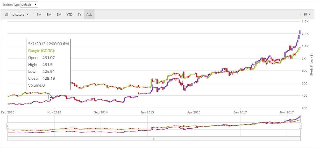
The Web Components Financial or Stock Chart, is a composite visualization that renders stock data and financial data in a time-series chart that includes interactive visual elements in a toolbar like day / week / month filters, chart type selection, volume type selection, indicators selection and trends lines selection. Designed for customization, the Web Components Stock Chart can be customized in any way to give an easier visualization and interpretation of your data. The financial chart renders the date-time data along the X-Axis (bottom labels) and shows fields like Open, High, Low and Close volumes. The type of chart to render the Time-Series data can be Bar, Candle, Column, or Line. Learn more about our stock chart.
Web Components Column Chart
The Web Components Column Chart, or Column Graph is among the most common category chart types used to quickly compare frequency, count, total, or average of data in different categories with data encoded by vertical bars of equal width and differing lengths. They are ideal for showing variations in the value of an item over time, data distribution, sorted data ranking (high to low, worst to best). Data is represented using a collection of rectangles that extend from the top to bottom of the chart towards the values of data points. Learn more about our column chart.
Web Components Composite Chart
The Web Components Composite Chart, also called a Combo Chart, is visualization that combines different types of chart types in the same plot area. It is very useful when presenting two data series that have a very different scale and might be expressed in different units. The most common example is dollars on one axis and percentage on the other axis. Learn more about our composite chart.
Web Components Polar Chart
The Web Components Polar Area Chart or Polar Graph belongs to a group of polar charts and has a shape of a filled polygon which vertices or corners are located at the polar (angle/radius) coordinates of data points. The Polar Area Chart uses the same concepts of data plotting as the Scatter Chart but wraps data points around a circle rather than stretching them horizontally. Like with other series types, multiple Polar Area Charts can be plotted in the same data chart and they can be overlaid on each other to show differences and similarities between data sets. Learn more about our polar chart.
Web Components Scatter Chart
The Web Components Scatter Chart, or Scatter Graph, is used to show the relationship between two values using a Cartesian (X, Y) coordinate system to plot data. Each data point is rendered as the intersecting point of the data value on the X and Y Axis. Scatter charts draw attention to uneven intervals or clusters of data. They can highlight the deviation of collected data from predicted results and they are often used to plot scientific and statistical data. The Web Components Scatter chart organizes and plots data chronologically (even if the data is not in chronological order before binding) on X-Axis and Y-Axis. Learn more about our scatter chart.
Web Components Shape Chart
The Web Components Shape Charts is a group of chart that take array of shapes (array or arrays of X/Y points) and render them as collection of polygons or polylines in Cartesian (x, y) coordinate system. They are often used highlight regions in scientific data or they can be used to plot diagrams, blueprints, or even floor plan of buildings. Learn more about our shape chart.
Web Components Spline Chart
The Web Components Spline Chart, or Spline Graph is a type of category line graph shows the continuous data values represented by points connected by smooth line segments of one or more quantities over a period time for showing trends and performing comparative analysis. The Y-Axis (labels on left side) show a numeric value, while the X-Axis (bottom labels) are showing a time-series or comparison category. You can include one or more data sets to compare, which would render as multiple lines in the chart. The Web Components Spline chart is identical to the Web Components Spline chart, the only different being the line chart is points connected by straight lines, and the spline chart points are connected by smooth curves. Learn more about our spline chart.
Web Components Step Chart
The Web Components Step Chart, or Step Graph, is a category charts that renders a collection of data points connected by continuous vertical and horizontal lines forming a step-like progression. Values are represented on the Y-Axis (left labels) and categories are displayed on the X-Axis (bottom labels). The Web Components Step Line chart emphasizes the amount of change over a period of time or compares multiple items. The Web Components Step Line chart is identical to the Web Components Step Area Chart in all aspects except that the area below the step lines is not filled in. Learn more about our step chart
Web Components Treemap
The Ignite UI for Web Components Treemap displays hierarchical (tree-structured) data as a set of nested nodes. Each branch of the tree is given a treemap node, which is then tiled with smaller nodes representing sub-branches. Each node's rectangle has an area proportional to a specified dimension on the data. Often the nodes are colored to show a separate dimension of the data. Learn more about our treemaps.
Web Components Charts Key Features
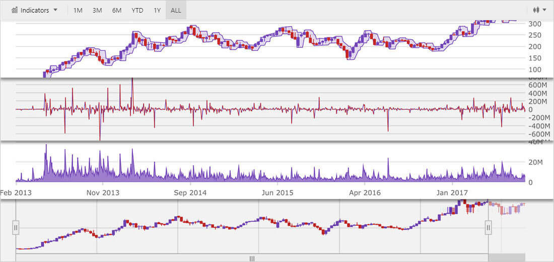
Show how your data changes over time with our built-in Time Axis. We’ll dynamically change time scales and label formats, as you interact with your chart. We’ve included a complete Financial Chart with all of the features you’ve come to expect in your financial charts, like Yahoo Finance or Google Finance.
Dynamic Charts
Visualize your data by creating new Composite Chart and overlapping multiple series in single chart. In the Chart, you can display and overlap multiple chart columns to create stacked columns.
Custom Tooltips
Visualize your data by creating new composite views and overlapping multiple series in single chart. In the Chart, you can create Custom Tooltips with images, data binding, and even combine tooltips of multiple series into single tooltip.
High-Performance, Real-Time Charting
Display thousands of data points with milliseconds-level updates in real time with live, streaming data. You will experience no lag, no screen-flicker, and no visual delays, even as you interact with the chart on a touch-device. For a demo, refer to the Chart with High-Frequency topic.
High-Volume Data Handling
Optimize Chart Performance to render millions of data points while the chart keeps providing smooth performance when end-users tries zooming in/out or navigating chart content. For a demo, refer to the Chart with High-Volume topic.
Modular Design
The Web Components chart is designed for modularity. Only features that are needed are part of your deployment, so you get the smallest possible footprint in your rendered pages.
Smart Data Binding
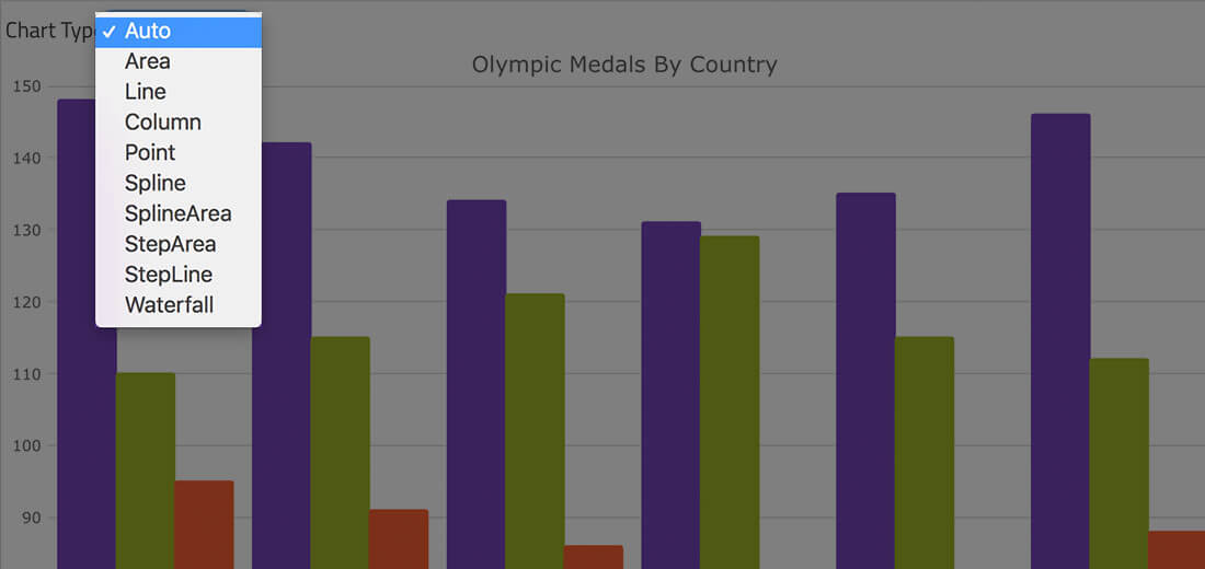
Let us choose the chart type. Our smart Data Adapter automatically chooses the best chart type for the data. All you do is set the data source and we do the rest.
Trendlines
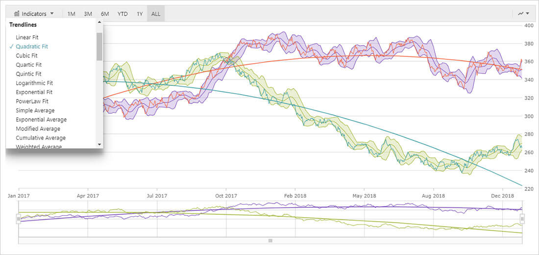
Web Components Charts support all Trendlines you’ll ever need, including linear (x), quadratic (x2), cubic (x3), quartic (x4), quintic (x5), logarithmic (log x), exponential (ex), and power law (axk + o(xk)) trend lines.
Interactive Panning and Zooming
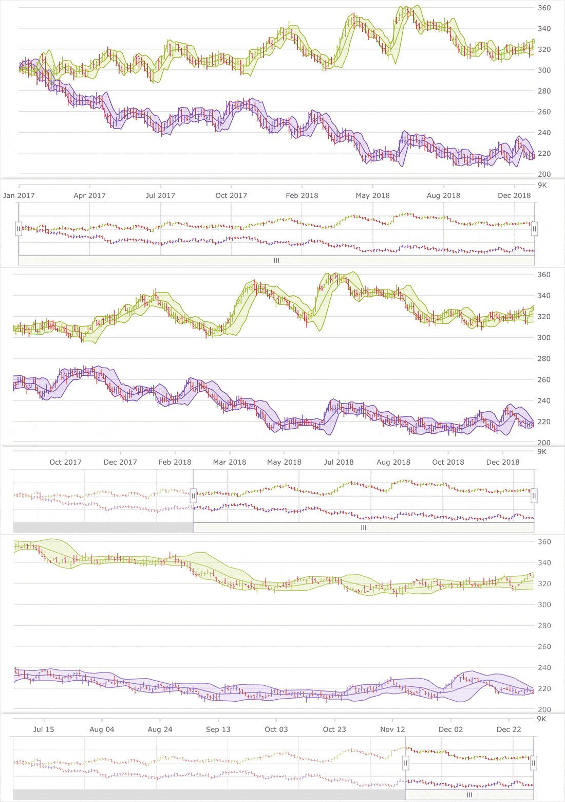
Use single or multi-touch, keyboard, zoom bar, mouse wheel, drag-select for any rectangular region with the mouse to zoom in for close-up look at data points, scroll data history, or pan data regions.
Markers, Tooltips, and Templates
Use one of 10 Marker Types or create your own Marker Template to highlight data or use simple Tooltips or multi-axis and multi-series chart with Custom Tooltips to give more context and meaning to your data.
But Wait, There’s More!
If you are considering any other Web Components Charts on the market, here are a few things to think about:
- We include over 65 Web Components chart types and combination charts, with the simplest configuration on the market with our smart data adapter.
- Our charts are optimized on all platforms including Angular, Blazor, jQuery / JavaScript, React, UNO, UWP, WPF, Windows Forms, WebComponents, WinUI, and Xamarin. They support the same API and same features on every platform.
- Our stock chart and financial charting gives you everything you need for a Yahoo Finance or Google Finance-like experience – all with a single line of code.
- We test against everyone elses performance. Everyone says they are fast and can handle lots of data, but we can prove it. See for yourself how we handle high-volume data and real-time data streaming.
- We are here 24x5. Infragistics has global support that is always online. For North America, Asia Pacific, Middle East, and Europe, we are on the clock when you are!
- We have many more UI controls in Web Components besides the Charts. We offer a complete Web Components solution to build your applications!
API References
All types of chart types mentioned in this topic are implemented in these API components: