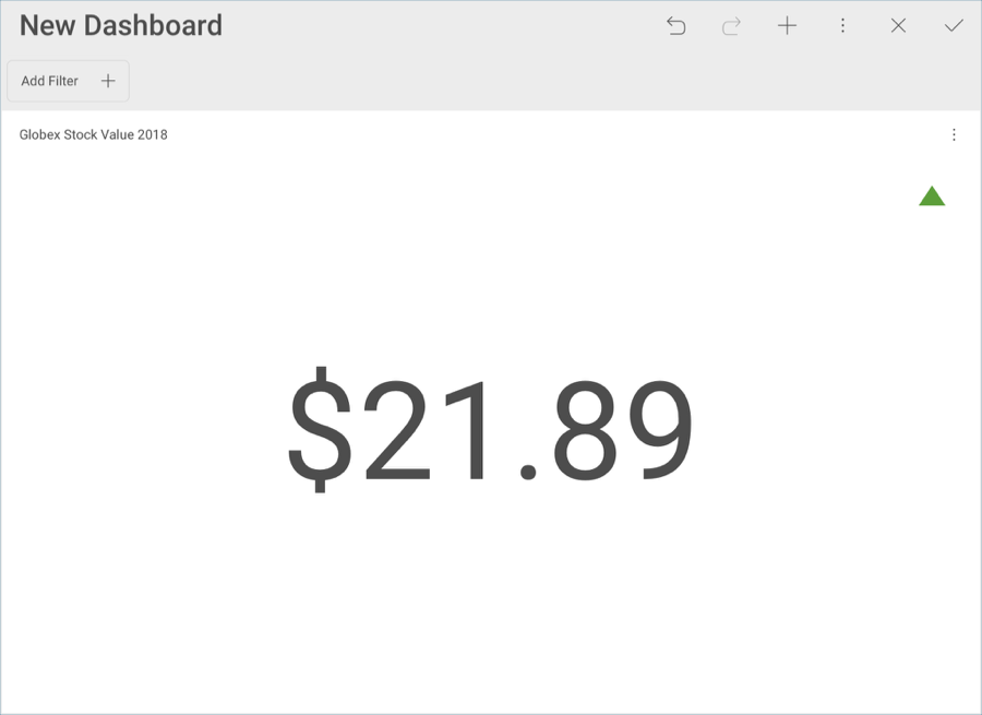
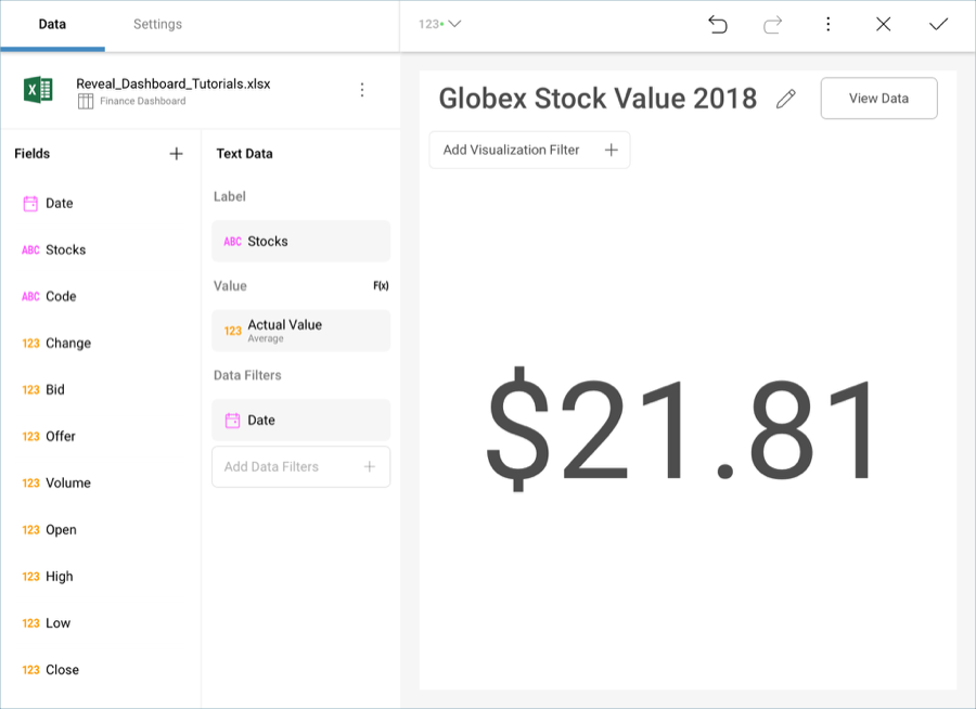
The raw data that you drag and drop into the data editor placeholders will not be formatted by default; you will need to modify each field you have dragged individually. This particular widget displays the average 2018 stock value for the stock with the highest value (in this case, it will be Globex). You will need to introduce additional filters to select the specific data.
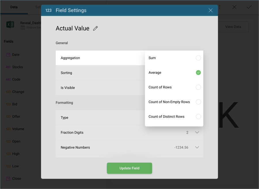
In order for your visualization to display the average actual values for Soylent Corp, you will need to modify the field in the data editor. Select Actual Values in the Value placeholder. Then, change the Aggregation to Average in the General menu.
Then, change Type to Currency under Formatting.
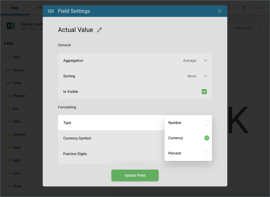
Then, select Update Field.
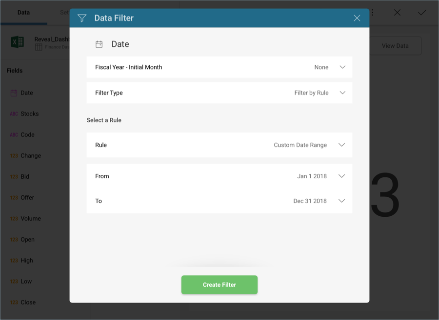
For this widget, you want to filter the dates to only display 2018 and not the complete data range in the original spreadsheet. In order to do so, drag and drop the Date field into Data Filters and, under Filter Type, select Filter by Rule.
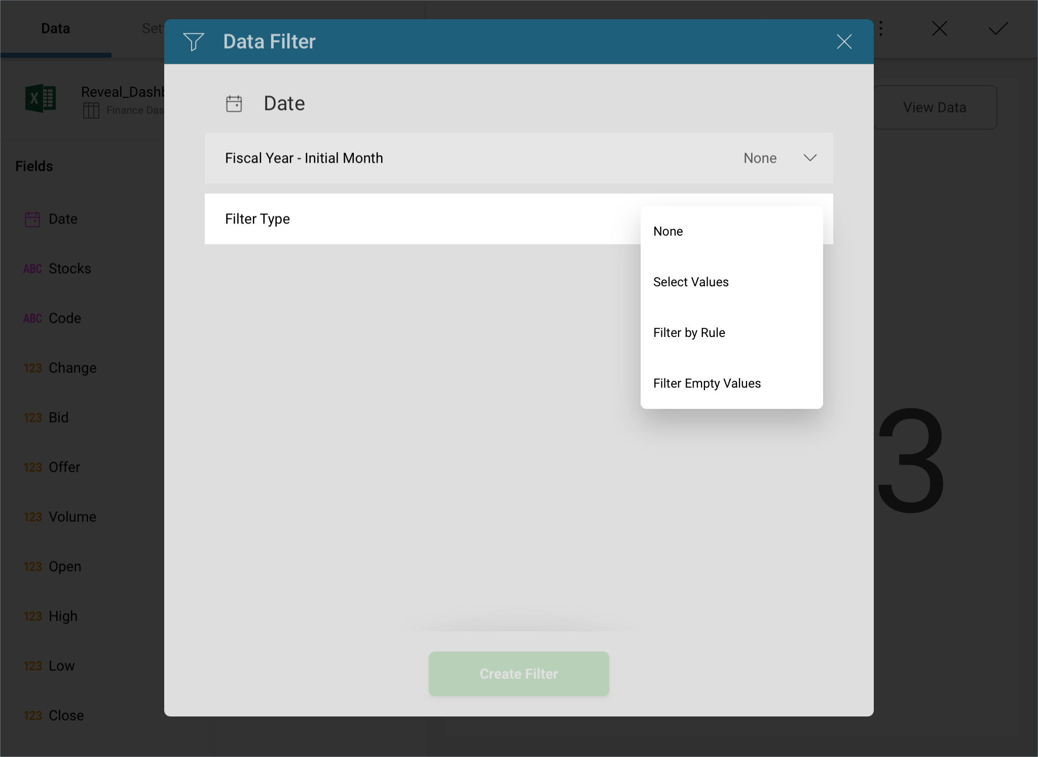
In the new Rule menu, select Custom Date Range.
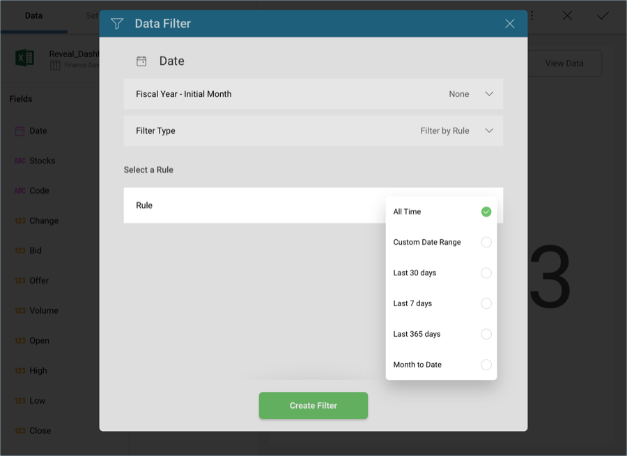
Then, enter January 1st through December 31st and select Create Filter.
By now, your visualization should look like the following one:
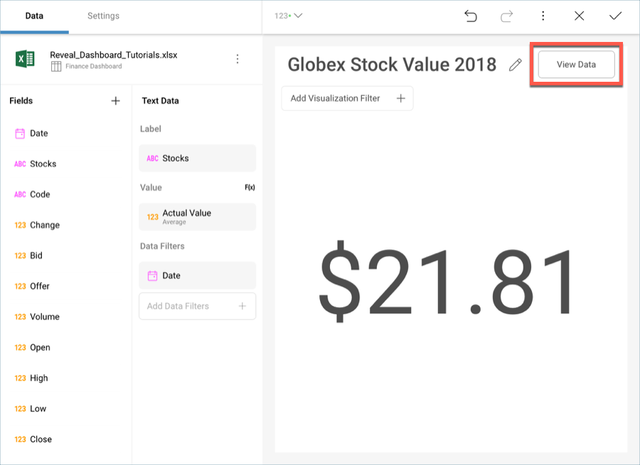
Text Gauges only display the value in the first row of your data, but you can still filter the data behind it to show the specific row you want. Let’s take a look at the data behind this visualization. Select the View Data button in the top right corner of your visualization.
You will see the following table:

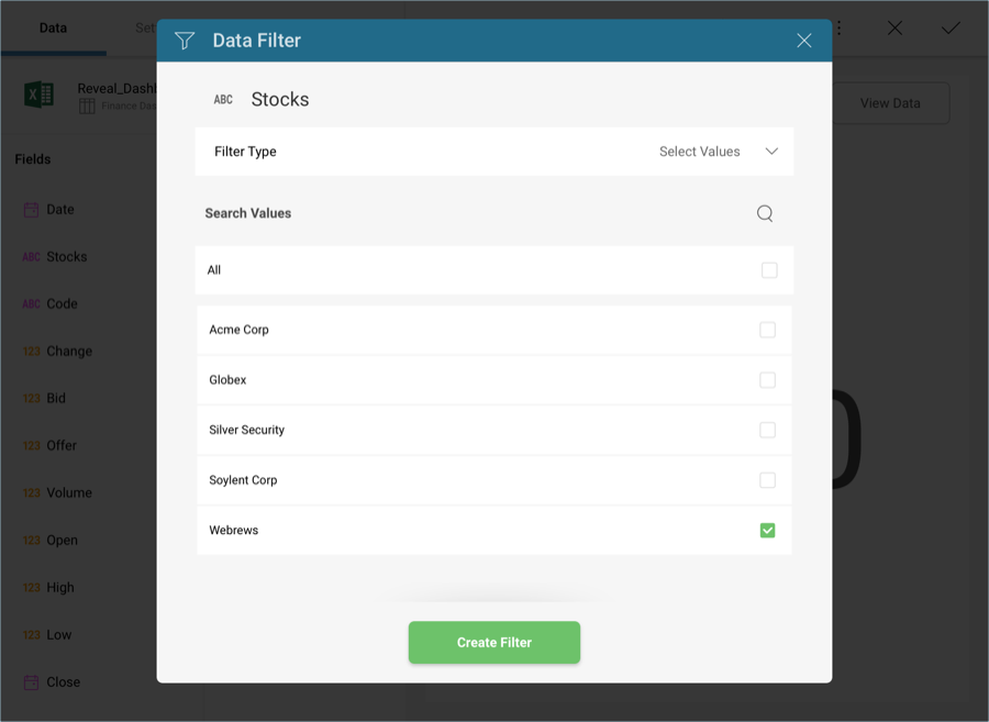
In this case, Globex is the stock with the highest average value. In order to display it, you will need to introduce an additional filter. Drag and drop Stocks into Data Filters and, in the Filter Type menu, choose Select Values.
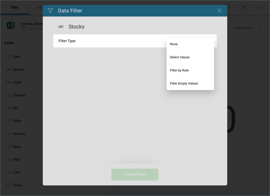
Select Globex and then Create Filter.
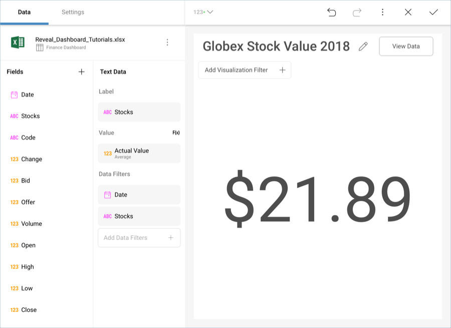
Your visualization will now look like the following one.
If you want to verify that the visualization is displaying the correct data, you can once again select View Data in the top right-hand corner.
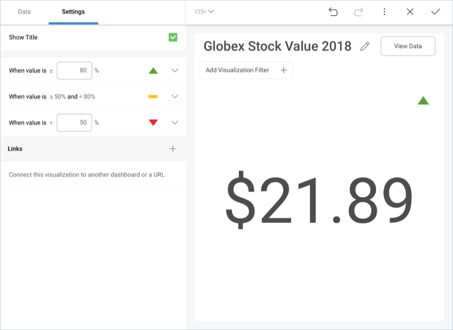
You can add additional information to the visualization in the form of a colored indicator, which will indicate where the value of your stock stands in a three-value data range you can define yourself.
Go to the Settings section of the Visualizations Editor. You will see a Conditional Formatting section, which will, by default, have the following three ranges configured:
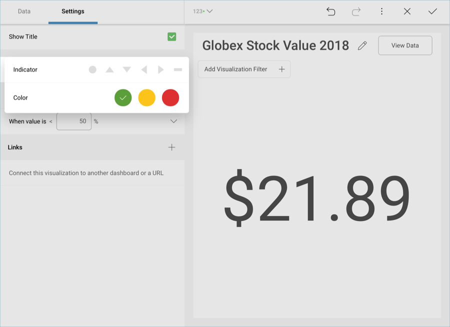
Open any of the dropdowns in order to add indicators and colors to your visualization. In this case, we will add a green up arrow for the highest range, a yellow line for the mid range, and a red down arrow for the lower range. The visualization will be updated to display the corresponding indicator.
Once you have finished editing the visualization, select the tick button in the top right-hand corner to return to the dashboard editor.