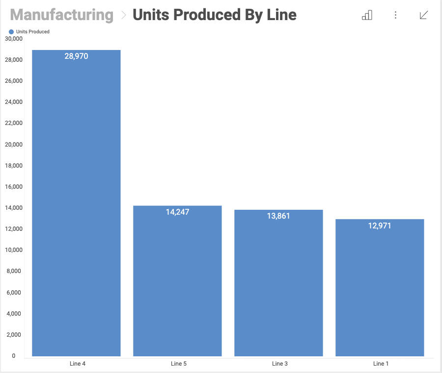
Visualizations are individual pieces of information. Any dashboard is composed by one or more visualizations. The image below shows the quantity of units produced by different lines in a Column Chart visualization.
In order for users to get the most insight possible out of business data, Reveal provides several options to customize the way information is visualized. These are called "visualizations".
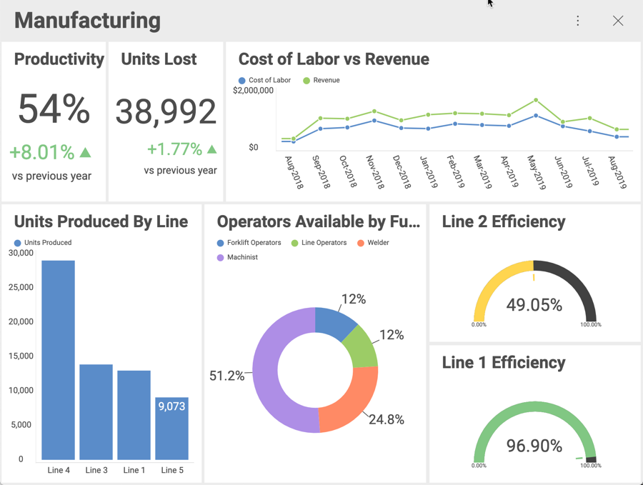
On the screenshot above, you see the following visualization types:
Productivity: Text Gauge
Units Lost: Text Gauge
Cost of Labor vs Revenue: Line Chart
Units Produced by Line: Column Chart
Operators Available: Doughnut Chart
Line 1 Efficiency: Circular Gauge
Line 2 Efficiency: Circular Gauge
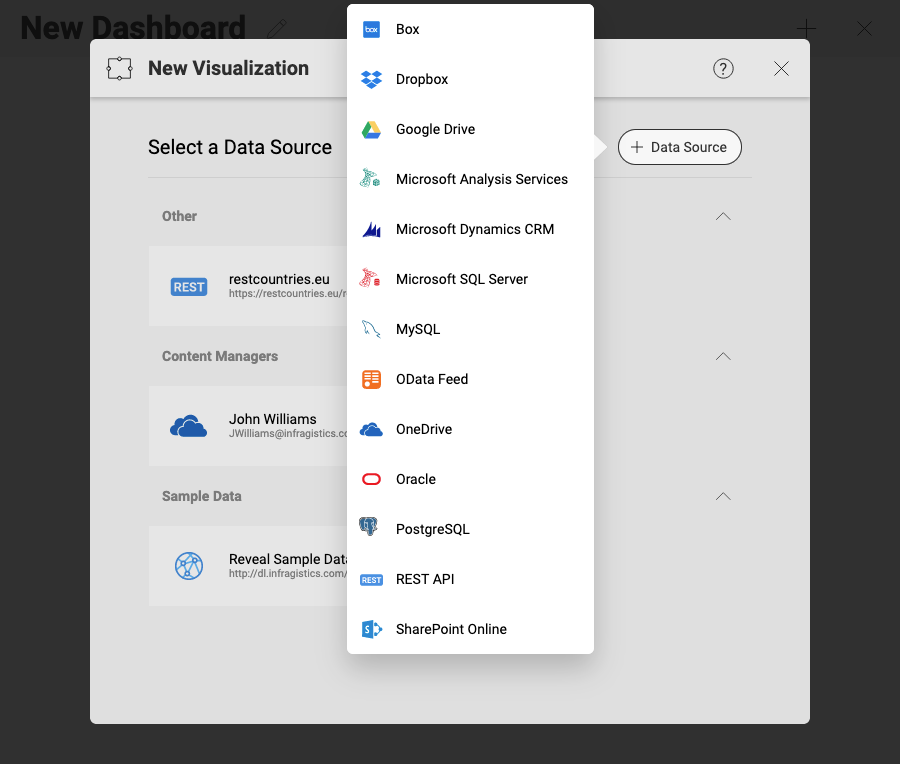
Once you select the + sign to add a new dashboard, you will be prompted to enter a new or an existing data source. This will be the first step towards creating your visualization.
With the data source selected, the visualization will be created. You can edit it through the Visualizations Editor.
Once a dataset is selected for a dashboard, the Visualizations Editor is automatically displayed. This helps you work with the data to get the most desired view. There are three main areas in the visualizations editor:

Data section, where you will find the list of available fields in the selected dataset and the data editor. This tool is meant to help you slice-and-dice data according to your needs.
Settings section, where you can access the settings for the specific visualization you are using and the General Settings for the visualization.
Visualizations selector, where you can choose your desired visualization and preview the final result.
Within the visualizations editor, you can select the most suitable visualization for your information, making it as easy to digest as possible.
